0

Well, let me mention that is not my design, but my designers. He started it 3 days ago and I was wondering what the community thinks about it.

HERE

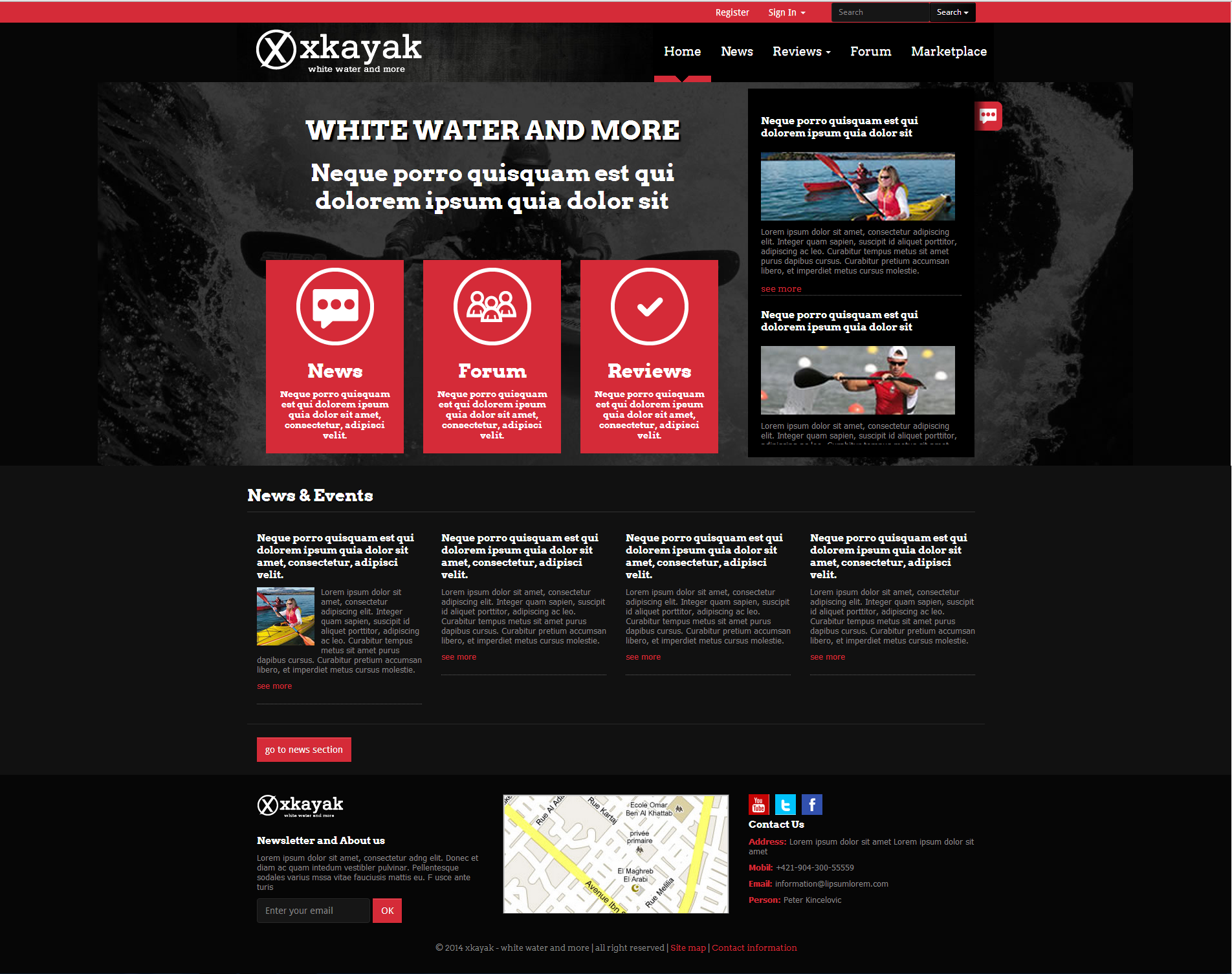
Here are two screen shots joined together to include the full homepage;

enter image description here

I would also like to get some opinions on whether the work is original or not because when I got my first design sent to me I found the footer to be the exact same one used in another website. I yelled at him a bit for stealing other people's work. He changed it up.

Back to the design portion:

Do you like it?

What should I change(within reason)

Note: All images are stock and will be changed

The main thing someone notices when they visit is this text:

                   WHITE WATER AND 
                        MORE
             Neque porro quisquam est
              qui dolorem ipsum quia 
                     dolor sit

What do you think it should say? I was think of making it an inviting and informative message, like:

 Let's make this community rock
You could help make that happen

:^ Only displayed to guests.

Please provide constructive feedback :)

7
  • Hi there! Two suggestions that will help you get better answers: Add an image instead of a link, so the question doesn't become invalid when you change your site, and try to ask more specific questions. What things are you not happy about? "Do you like it?" is subjective and considered almost off-topic. Take a look at this guide: What are the guidelines for asking for a critique of my work?
    – Yisela
    Commented Jun 13, 2014 at 1:19
  • Yes, I like it. Except my opinion is irrelevant in the views of the general public. And I will add in some images later. I also can't ask a too specific question because I would be given specific answers. I prefer having a general idea and general suggestions Commented Jun 13, 2014 at 1:21
  • I understand, however I recommend that you phrase your question in such a way that answers can be objectively voted, so they are potentially helpful for other people and sites. We follow a strict Q&A format, so maybe you would have more luck in a design feedback site, specifically thought for this sort of questions :)
    – Yisela
    Commented Jun 13, 2014 at 4:15
  • Is this a forum or a company site?
    – benteh
    Commented Jun 13, 2014 at 10:28
  • 2
    I'm not sure the logo is included for critique but I would fix that kerning (too much space on both sides of the y compared to the rest)
    – curious
    Commented Jun 13, 2014 at 11:49

2 Answers 2

3

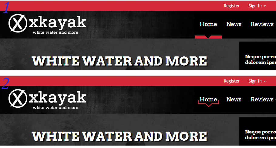
Going on a point that Jenna mentioned about the nav highlight; she has a good point about it looking like a separate element but I don't think it needs to be re-designed, I think it just needs to have the text lowered so it sits closer to the highlight:

enter image description here

4
  • I prefer your approach. The design she made actually looks weird :P Commented Jun 13, 2014 at 15:50
  • Haha it's ok that you don't like the design, it was made with the intention of supporting a point and providing scope for brainstorming if you were interested. Altered positioning is also fine as the point was that the highlight seems like a separate component, this targets that so all in all I hope that you found the feedback constructive :)
    – Jenna
    Commented Jun 14, 2014 at 20:30
  • 1
    @Jenna no hate on your idea :) I just felt that there was a simpler approach than re-designing elements.
    – SaturnsEye
    Commented Jun 16, 2014 at 7:27
  • 1
    That's no problem @SaturnsEye, I agree that the solution is simpler and I actually prefer it.
    – Jenna
    Commented Jun 16, 2014 at 9:11
2

So just to mention, I think that it would have been good to highlight some of your points of concern to receive quick and efficient feedback in relation to those points and the overall design. It makes for a little more of a focused answer, however, let's see how I do :)

I have 3 main points that I think are applicable to most websites and certainly to your own.

Firstly navigation the point of any website is to communicate information this is done through presentation of content and great UI of course. I think that an element that you may want to revise is the highlight that indicates to a user what tab they have selected from the bar.
enter image description here

So in #1 as the site is currently I think that the red indicator seems like a separate component from the Home button, I would suggest playing with an idea similar to that of #2 to make this a more cohesive element within the design. This will help to be sure that it is very clear to users where they are at all times - without needing them to think about it.

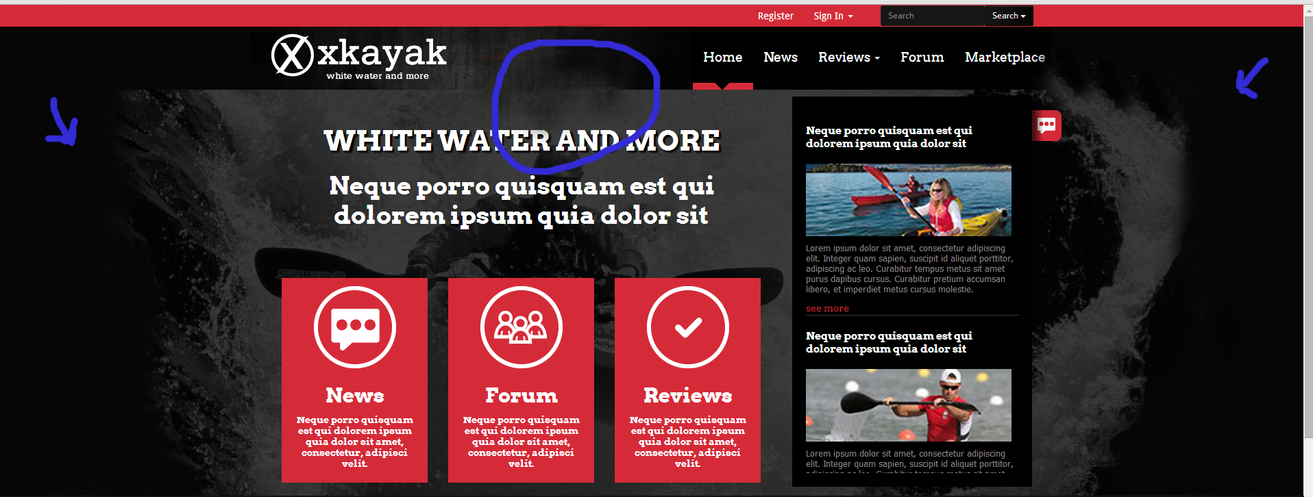
Secondly, the background image. It's great but I think that it should be blended into the background a little more. As it is it seems like there's background with a background image over it, with some content boxes over that, with some content in them. This can become distracting to a user you want to keep your background as just that - background. Blending your two backgrounds together would achieve further clarity as the user will no longer be distracted. You will simply have a background image, you boxes for the middle ground and content as foreground, again emphasizing the communication of information.

Here's a quick example of course it would be much tidier than this;
enter image description here

Lastly, it would be to simply tidy things, for example the lower case 'e's in News and Events seem to be of a lower quality than the text elsewhere so I don't think that this is a style thing. And also the first column in the News and Events section is longer than the rest making the stroke beneath it be lower down than the strokes in the other columns. I think it would be good to ensure that these strokes fall along the same horizontal line.

Hope I've helped. In sort as with any website it is advisable to analyse it in terms of how clear the communication of information is. This is the priority and often times (as above) design tweaks will be determined by methods that optimize that all important communication.

Here is some further points on what to consider - it starts with domain names and hosts but quickly addresses points of design, navigation and colour.

Hope I've helped!
Your Answer

By clicking “Post Your Answer”, you agree to our terms of service and acknowledge you have read our privacy policy.

Not the answer you're looking for? Browse other questions tagged or ask your own question.