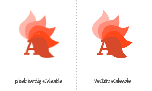
This is my first try designing a logo. Firstly, I do not like the geometry, it seems like it's out of shape a little bit. Also, whenever I try to scale, everything just collapses. Can anybody inspect my logo and give advice on how should I design it properly?
2 Answers
Universal/Cross-media useage
- Every logo has to work in black/white only.
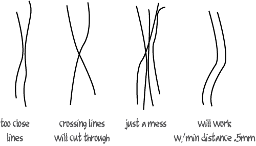
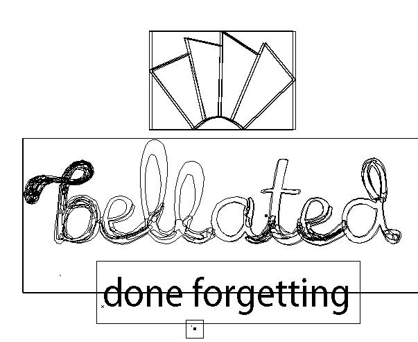
- A logo needs often to be "cut". Logos attached to t-shirts, caps, cars & signs, so you need clean outlines for foil cutting. Which means: Keep it simple and your lines clean. No one can cut the lines you see in the pathview below.
- Your logo has to work even on low resolution devices and else. Avoid too much detail.
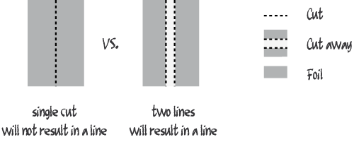
- Never ever use hair lines (below .75mm). You can't cut them, hardly print them and they won't be visible from enough distance.
Care about printing limits
- Avoid gradients. Those can really get ugly with high compression or no-high-profile printers:
- CMYK spectrum is smaller than the RGB spectrum. Avoid starting in RGB. Converting is not recommended.
Before conversion
After conversion
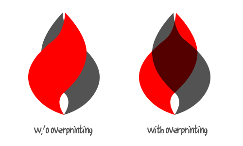
- Never ever leave 'overprinting' in your files. If you got a black flat and a light red above, then you'll see that your images red flat darkens above the black flat.
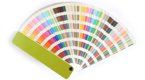
- Go with a save color chart (for eg. Pantone, RAL, etc.)
- Get a real color chart that you can compare - Normally your print shop should have the big ones.
Img taken from here.
Care about data sharing
- Transform text to outlines - I haven't got your font and so will do others. Which means: The font will fall back by the system to some installed.
- Or: Pack your font (incl. licensing readme) with your distribution package.
Typo
- Typo is not about beauty - It shall represent the image of the company. If it's cheap, go with a bold condesed font. If it's luxury, go with a thin font with wide spacing. And so on...
- Ad Slab Serif: (Imho) Only use for transportation stuff. Check the logo of Renault or Ferrari for examples. Hard to use somewhere else (aside from old italian cowboy movies).
- If you can't read it from distance: Choose some other font.
Choose the right tools
- Always use vetors & path tools.
- If you're doing your logo in a pixle program (eg. Adobe Photoshop), then you're doing it wrong. Even if you're using the pen tool, then you're still doing it wrong. To quote a colleague of mine:
It's like trying to cut a 2m wood sculpture with a pocket knife.
- My personal recommendation: Stay away from Adobe Flash vectors and Correl Draw.
- Save as a low profile (old) version. You will be often in the situation where you need stuff quick (eg. 100 buisness cards), so you have to go to a local digital printing shop. Those shops got cheaper printers (and often older) printers that often not able to print everything that's supported by the newest AI version. If you can't do it with an Ai8 or old EPS file: you're doing it wrong.
OPs original image in pathview:
-
thanks with the tips, but I am wondering what tools in illustrator I should use to produce the logo. Now you can see that it is a mess. What I did is, I took a font and I drew a lot of lines on top. Well, what would you advice me with this? Commented Sep 7, 2011 at 6:39
-
-
1
-
1
-
1
From an aesthetic standpoint:
Your type needs some better line contrast. It's a script face, meant to mimic handwriting. If using a broad-nibbed pen, you'll notice your line weight changes depending on the angle of the stroke...vertical strokes tend to be wider than horizontal ones. This has carried over into many typefaces as well. Alternatively, a ballpoint pen will have a consistent stroke. In your lettering, the line weight varies, but not in any identifiable pattern. This needs adjusting.
The bottom connecting strokes are quite heavy compared to the overall feel of the word. I'd lessen the weight of the connecting strokes. Also note how your connecting strokes flow into the letter that follows. In this case, they end abruptly into the next letter without any natural flow.
As for the symbol, it's extremely geometric, while the type is extremely organic. Contrast like that can work, but it'd not in this case. The mark is also overly generic and I'd say isn't helping a whole lot. I'd consider dropping it and focus on the type more. I think the type could become a strong enough mark on its own.