4

When you see toilet signs, they look more or less like this:

enter image description here

It is clear who can enter either of them.

Now, say you are designing the signs for showers and you want to distinguish between the ones for men and the ones for women. How would you do it?

Considering the women (and the men) have showers without clothes, the dress-shape-for-women is not valid. What can be painted to clearly indicate the difference without any kind of text?

I found this one but it is still a bit creepy:

enter image description here

4
  • Unfortunately questions requesting Icon Suggestions are off topic. While the subject of icons is on topic, there's very little value in soliciting suggestions for a specific icon in a specific context. See this meta post for more information about this topic.
    – tohster
    Commented Apr 2, 2015 at 20:08
  • @tohster I understand your point but I also see a good reason about closing this specific question. From Ben Brocka's answer, "Good metaphors absolutely are a vital part of the user experience. By pretending metaphors are too localized in all context (they're not, that's why they're metaphors) we're harming the usefulness of the site.". In this case the metaphor is clear: how to represent a women when clothes cannot be used.
    – fedorqui
    Commented Apr 2, 2015 at 20:17
  • Fedorqui, I think you are overthinking the problem. The icon you shared in your question is absolutely fine, just need to separate them. Remember what you are trying to represent using an icon is "gender/sex" and "shower", Representing shower is quite straightforward as for female gender limiting the icon to the contours of the hair should suffice. Not directly related to your question but you might find it usefull: en.wikipedia.org/wiki/Semiotics
    – Okavango
    Commented Apr 2, 2015 at 20:50
  • The question is interesting but not quite appropriate for this forum.
    – Mayo
    Commented Apr 2, 2015 at 21:47

2 Answers 2

8
  • User experience is more important than precision. Take the phone icon for example. Phones haven't looked like this for a long time, but the icon is still very effective for communicating.

    enter image description here

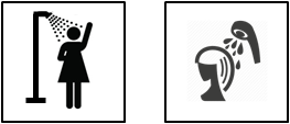
  • The two concepts you are trying to communicate are shower and woman. Luckily, there are common icons for both so it's most communicative to just combine the icons. It doesn't matter that the woman has clothes on....you are striving to be communicative rather than accurate.

  • For example:

    enter image description here

The right icon avoids the clothing issue, but the left icon is more communicative because it combines two familiar icons.

3
  • 2
    Beautiful! Many thanks for the kind and useful answer.
    – fedorqui
    Commented Apr 2, 2015 at 21:11
  • Agreed, splendid answer. You could also look at what seems to be a default on the net when someone has not chosen an avatar, such as facebook.
    – benteh
    Commented Apr 3, 2015 at 11:47
  • The woman on the left seems to be wearing one of those bathing suits that looked more like billowing skirts than bathing suits and were quite popular in the 1940s and 1950s. The woman on the right, on the other hand, looks rather like she’s being spat on by half a flying telephone receiver from around the same period—and without even being aware of it. Poor woman. Commented Apr 3, 2015 at 16:02
8

Bathroom icons don't describe what you do in there, they describe who goes in.

It's become a universal sign for restrooms as it's one of the few spots that's segregated by sex in most locations. But it can work equally as well for showers/changing rooms.

Your Answer

By clicking “Post Your Answer”, you agree to our terms of service and acknowledge you have read our privacy policy.

Not the answer you're looking for? Browse other questions tagged or ask your own question.