38

A regular challenge that I face is balancing two (or more) logos. Whether they need to be equal or one needs to be given priority. Some logos however might be squares, others rectangles, circles, etc...

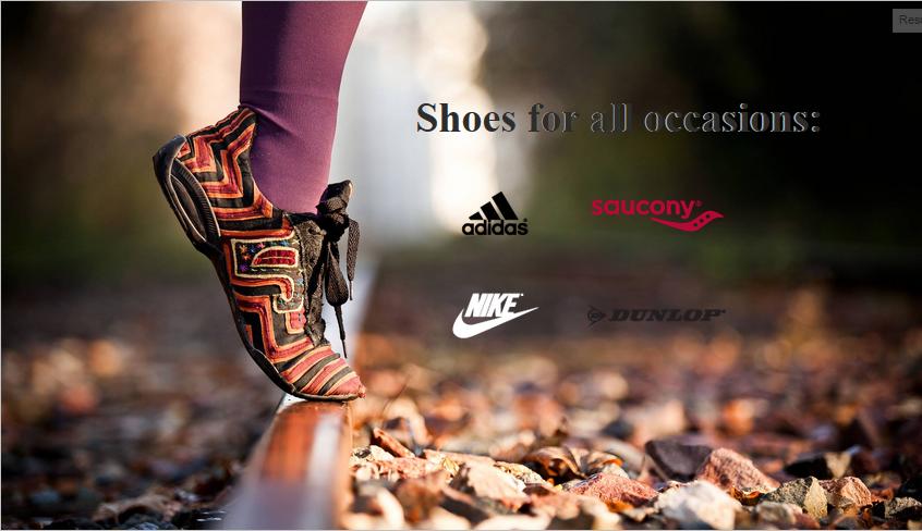
As a quick sample I snagged a nice high resolution photo from Unsplash and pretend its going to be an advertisement that needs to show some footwear brand logos on it. In this case I used Adidas and Saucony.

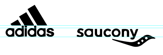
This is certainly not balanced even though they're height is the same:
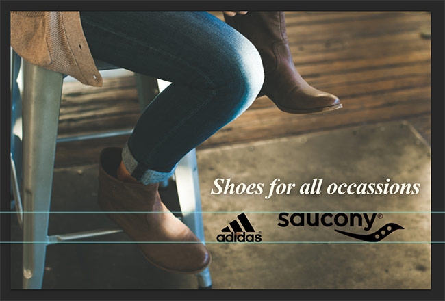
Logo Same Height

Likewise this is not balanced even though they're width is the same:
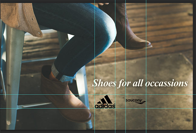
Logo Same Width

So then the question becomes when are they in balance, is this balance:
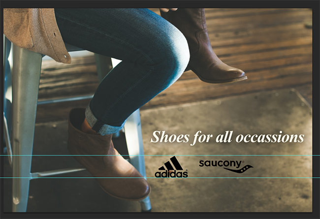
Logo Balance One

Maybe a little more adjustment, is this balance:
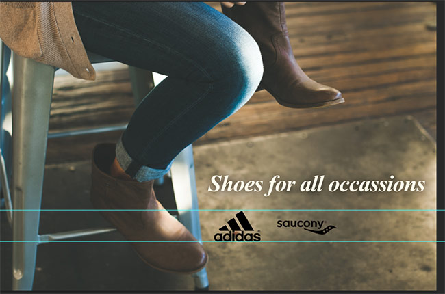
Logo Balance Two

And in these examples I'm only working with two Black Logos. Factor in color and it can get even more difficult to balance. Another issue being when there's tiny text as part of the logo.

So the question is, other than estimating / eye-balling it, what tips, methods or even tools are there to balance different sized logos?

9
  • 6
    I honestly think it comes down to visual preference in most cases. There's no solid method to size several logos the same.
    – Scott
    Commented Apr 9, 2015 at 19:45
  • Agree. Do it by hand. The number 3 looks to me better. You as a designer must make desigh desitions.
    – Rafael
    Commented Apr 9, 2015 at 20:17
  • There's really no answer to this other than "scale them until you think they look good"
    – DA01
    Commented Apr 10, 2015 at 2:34
  • @DA01 I know there might not be a great solution but still suspect some have tips to do it well which is all I expect from answers. Dom's for example seems like a nice method to go about it.
    – Ryan
    Commented Apr 10, 2015 at 2:55
  • @Scott See above
    – Ryan
    Commented Apr 10, 2015 at 2:55

6 Answers 6

29

The Lowest Common Denominator vs. Highest Common Factor Approach

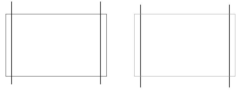
  1. Define how much available space you have by creating, placing, and balancing empty elements within your design.

    Click to see jsFiddle

    I chose to use the Golden Ratio for the above (100px x 161px) because it's better to work with a horizontal rectangle, than it is with a perfect square based on most logos being wider than they are tall, and the golden ratio is as good a number as any when I don't have a good reason for it. Working with a bunch of particularly wide logos such as typographical ones, I'd probably go with wider canvas.


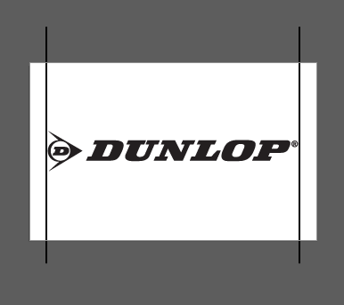
  1. Set up a canvas the same size as the "available space" you defined earlier.

    enter image description here

    I usually choose to add some space / bleed / padding on the left and right and create guides to keep the logos away from the absolute edge, but it isn't a necessity.


  1. Find your widest logo and place it on the canvas, before scaling it to fit to the edges of the horizontal guides (or canvas if no guides exist).

    enter image description here


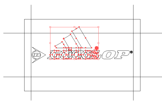
  1. Find your tallest logo and place it into the same canvas. Scale it until the main text in it is roughly the same size as the main text in the other placed logo.

    enter image description here


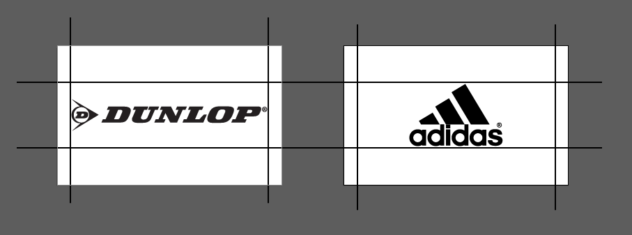
  1. Place it onto a separate canvas, vertically and horizontally center it, and then place horizontal guides above and below it.

    enter image description here


  1. Scale all other logos to fit within these boundaries.

Now this method is not guaranteed to work with every logo, there's simply too much variation for any single workflow to cover it all. However, adjusting the original canvas (available space) based on the average shape of the logos you're specifically working with can produce better results.

Just keep in mind, the best thing you can do is:

Balance either the width or height, the amount of white-space, and the font-sizes for text across the group of logos.

Setting standards, even if they're arbitrary, can help to create a stronger consistency. These consistent invisible boundaries are unconsciously noticed, but still noticed.

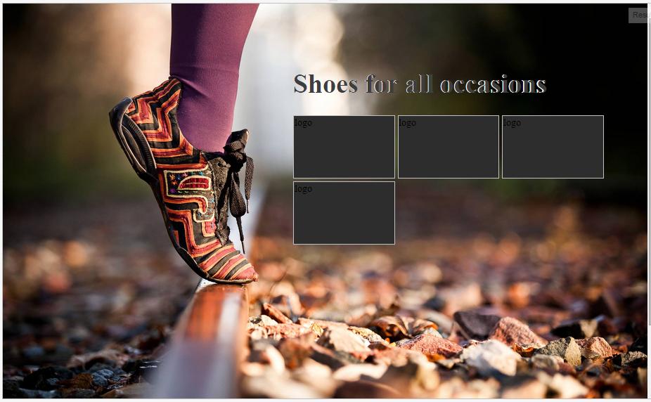
I used the guides to produce the Nike and Adidas logos to sit alongside the others. See a live jsFiddle aswell:

finished version

I have to confess, after I sized all four, I chose to manually tweak the Saucony logo a touch smaller because it was slightly larger than the rest. This method is useful for creating an overall baseline, and then once you have all logos at roughly the same size, you can select the few that need manual tweaking and finish them by eye at the end.

4
  • 2
    This is good, though I still think you need to 'eyeball' it in the end. The DUNLOP logo, for example, feels way to small visually compared to the other three and could stand to be a tad larger, IMHO.
    – DA01
    Commented Apr 10, 2015 at 4:22
  • 2
    It seems balanced by size, but there's not nearly enough contrast between the Dunlop logo and the background, which is making it appear much less "significant" to the other 3 logos. Putting it underneath the Nike logo would fix that, but I don't know how the Saucony logo would work on top of the rocks.
    – Voxwoman
    Commented Apr 10, 2015 at 13:33
  • 2
    This is an amazing approach. I have always eyeballed them but I love this formalized method. +1! And stealing the method : )
    – cockypup
    Commented Apr 10, 2015 at 14:43
  • 2
    I kind of agree with DA. This is a good basis, but ultimately you have to eyeball things at the end.
    – Scott
    Commented Apr 10, 2015 at 15:49
14

I think in that particular example you should scale the two logos both to one reference which is the text ... because when it comes with aligning two logos having texts, you should consider the text proportions first. and in your example the two fonts of the logos looks similar.

  1. align the text to the same base line
  2. scale the two text in logos to have the same height.

you will achieve the balance you seek as adidas logo is more to top direction while the other logo is going down. as shown hereunder

enter image description here

3
  • Nice answer, what if the logos don't have text or very different text? The actual logos I most frequently work with one has 3 letters in Sans Serif, one has large Sans Serif plus smaller Serif text beneath, and a third has a circle with only text inside the circle. This shoe thing was just a quick example.
    – Ryan
    Commented Apr 10, 2015 at 12:12
  • Thank you @Ryan Actually it is hard to say, that's why I said "in that particular example" I deal with that type of problem case by case, in that case I align using text baseline some other I balance using colors (heavy and light colors) in some case I balance Mass Vs. Void. and so. and one of the factor you must not ignore is the container? is is free like that example or a web footer lineup?
    – hsawires
    Commented Apr 10, 2015 at 12:34
  • I generally work in print ads, I can design it however I want as long as it fits the content. Typically any sort of solid footer though would be for our contact information, the logos are generally organizations we're members of and would be placed elsewhere with less emphasis
    – Ryan
    Commented Apr 10, 2015 at 12:37
11

For those of you looking to do this automatically with a CMS or Javascript, there's a short formula I came up with that can take in most all logo sizes and make them visually consistent.

Here it is in Javascript:

(function() {

  "use strict";

  window.onload = function() {

    var images = document.querySelectorAll(".media-images.media-images--config-dynamic .media-images__image");

    function adjustImageWidth(image) {
      var widthBase   = 50;
      var scaleFactor = 0.525;
      var imageRatio  = image.naturalWidth / image.naturalHeight;

      image.width = Math.pow(imageRatio, scaleFactor) * widthBase;
    }

    images.forEach(adjustImageWidth);

  };

}());

Proportional Logos

Then you can grid them and do whatever you like with them with CSS.

Here's a Codepen to play around with: https://codepen.io/danpaquette/pen/jXpbQK

And a more detailed write up on what it's doing: https://danpaquette.net/read/automatically-resizing-a-list-of-icons-or-logos-so-theyre-visually-proportional/

1
  • I wish I could upvote this again (four years later). Here's an improved CodePen with a slider to more easily change the scale factor.
    – Tamlyn
    Commented Jul 21, 2023 at 21:40
9

I work at a non-profit and have to do this frequently when including sponsor organizations on flyers and invitations. What I generally do is start by sizing the logos so the type sizes are equal, and then tweaking individually based on the overall size of the logos in proportion to each other.

5

I have also had to do this frequently and it gets really difficult to keep the printed piece from looking like a NASCAR race car.

My process is that I start by making things the same size and then tweak them by eye (sometimes using "soft eyes" - defocusing so you only see "blobs") so they are visually balanced.

1
  • +1 because this is usually what I end up doing after alignment and sizing. Stand back an defocus. ... I think weight, contrast and coloring also factor in, and this helps you to see those things.
    – Rsiel
    Commented Apr 10, 2015 at 15:05
0

https://contador-de-pixel.vercel.app/ you can count the number of transparent pixels, then comparing it with the total pixels number of the image you will obtain a the percentaje of logo´s mass

Your Answer

By clicking “Post Your Answer”, you agree to our terms of service and acknowledge you have read our privacy policy.

Not the answer you're looking for? Browse other questions tagged or ask your own question.