2

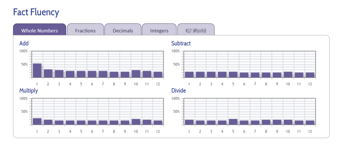
Here's a typical graphic from my web app:
enter image description here

It shows the performance of grades 1-12 on each of four tasks (Add, Subtract, Multiply, Divide). But this is only for whole numbers. Behind each of the other tabs (for different types of numbers), the exact same thing is repeated.

I'd like to be able to represent the contents of all five tabs in one chart, so that the overall performance can be seen in one glance, without having to jump around the tabs, hiding one view to see another. It would also be nice to be able to combine the four charts that are shown into one, but that's secondary.

Can anyone suggest a better type of chart to condense this information into a more useful and visible form?

2
  • Have you thought about using line graphs?
    – Leslie P.
    Commented Apr 30, 2015 at 15:57
  • I have, but I'm still not sure how to condense 5 tabs X 4 operations X 12 grades into a graph. Do you have any suggestions for how to do this? Commented Apr 30, 2015 at 17:12

2 Answers 2

1

Are the fraction/whole number/decimal, etc... actually the same value but different types of numbers? If so, I'd group them together and have it dynamically shown on the graph.

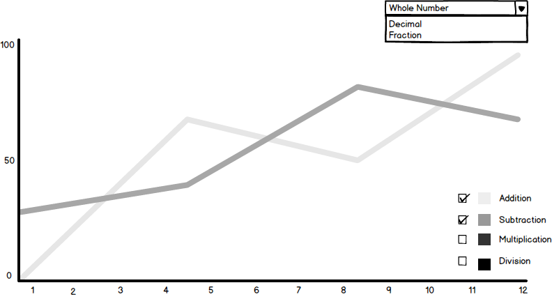
Having it on line graph also allows for multiple types of values easily viewed. Take inspiration from Facebook Pages' Analytic!

Here's a quick wireframe I did up. Graph Sample

0
0

I would look into creating a chart with interactivity:

enter image description here

If the side values of your chart are not going to change include a legend calling out the color of what each means.

You could code the whole chart with <canvas> and use jQuery with some checkboxes so that someone can cycle on and off what is displayed.

Your Answer

By clicking “Post Your Answer”, you agree to our terms of service and acknowledge you have read our privacy policy.

Not the answer you're looking for? Browse other questions tagged or ask your own question.