5

I am looking to create a high quality watercolor effect in illustrator. My question essentially is: Is this created by scans and then tracing it? If so, what kind of tracing options would you use for that?

Something like this:
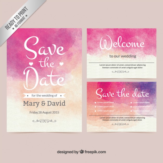
Freepik Watercolor image

I'd like to note that this is not my image, I did not create this.

When I downloaded the illustrator file and opened it, I wasn't expecting the background to be vector, because it looks so real. Inspecting it closer I found that it had a lot of points and was very detailed.

Is this created by using brushes? If so, what kind of brushes should I look for? All the ones I tried so far looked really fake and didn't have the speckling effect this one has, and I did not achieve a look as detailed as the one mentioned. I also tried making a real watercolor and scanning + tracing it but that leaves me with blotches of color, not the detailed points and specks in the given example.

1
  • 1
    Is there a particular reason you need it as a vector?
    – DA01
    Commented May 29, 2015 at 16:03

1 Answer 1

2

The basic process is fairly well explained here.
Bottom line: Illustrator isn't good at creating watercolor effects.

The best approach for a believable look

  1. Use physical source material (a painting) to scan at 300dpi or higher (final size).
  2. Choose a live trace setting that roughly achieves the effect — emphasis on the rough. You'll rarely get what you're after out of the box.
  3. Play with the trace settings until you get the level of detail you're after.

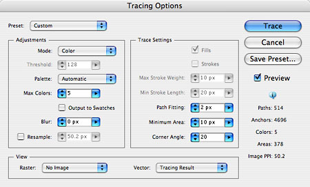
Tips for tracing options

  • Modifying Threshold can produce wildly different results.
  • Max Colors is the number of "swatches" the tracing will use. Increase this number until your gradations look natural.
  • You want to include Fills but not Strokes.
  • Path Fitting is going to adjust the amount of detail in your color transition boundaries.
  • Minimum Area will impact the rendering of small edge areas and things like paint splatter.
  • Corner Angle is often overlooked but can make a big difference in the realism of your transition areas. Low numbers will produce lots of sharp corners, which don't align with how paint absorbs into paper.

Illustrator tracing options

Bad news

Your computer will crawl with high levels of detail.
The watercolor look requires high levels of detail.

Your Answer

By clicking “Post Your Answer”, you agree to our terms of service and acknowledge you have read our privacy policy.

Not the answer you're looking for? Browse other questions tagged or ask your own question.