9

I would like to know if this is correct to use a background bokeh style, and combine it with content flat design?

Something like:

enter image description here

6
  • 4
    Welcome to GD.SE. I dont think there are any hard rules.
    – joojaa
    Commented Jun 2, 2015 at 13:01
  • Haha thanks for your awesome comment :D Does it shock when you see it ?
    – Zooly
    Commented Jun 2, 2015 at 13:02
  • In this case it doesent really work 100% but id say its more the particular images. Might work with a better combo and offcourse approprate foreground. Still not that bad. (for ne its more the colors)
    – joojaa
    Commented Jun 2, 2015 at 13:05
  • Sure, I just took the first bokeh I found, and the first flat color in my mind ^^
    – Zooly
    Commented Jun 2, 2015 at 13:06
  • 3
    This is a purely subjective question for the most part.
    – DA01
    Commented Jun 2, 2015 at 16:05

3 Answers 3

9

Flat design is not a religion

"Flat design" has gotten muddy over the last year. There are many designers holding it up like some kind of dogmatic system of standards. And the success of Material design (and MS's Metro, to a lesser extent) has created more imaginary hard lines that don't really exist.

Flat is what you make it. The underlying principle is to avoid excessive use of shading or modeling or faux life-like visual design, like we saw with Apple's grotesque skeuomorphism. That does not mean that shading, texture, photography, or decoration of any kind go away. You still have to design your interface.

Make it your own

In answer to your question: There is no rule against bokeh, or focus-challenged photography, or other background textures and images in any design style. It's how you interpret stylistic influences that make a brand stand apart. You should be developing a new dialect of visual language, not speaking someone else's.

The bigger consideration, as others have pointed out, is usability. Just make sure your photography doesn't make the interface a confusing mess. In some cases, it's even okay for the background to become a very dominant part of the experience — just make sure you still get the "conversion" you're after, whatever that may be.

In the wild

Windows Metro is arguably one of the most flat examples of Flat in recent memory. And yet it has stuff like this.
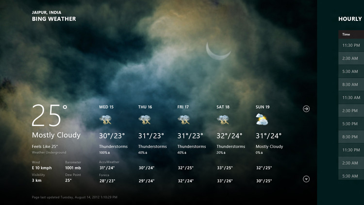
Windows 8 Weather screen

Google Material is pretty militant about Flat too, but big pictures are central to bringing some humanity to it's bright palette.

enter image description here

Apple's iOS 7 was a hurried attempt to catch up with the Flatness. For better or worse, someone there made background blur a central metaphor of the system — that is directly influenced by bokeh photography.
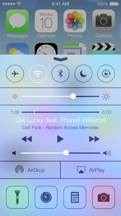
enter image description here

4
  • 1
    This is an absolutely superb answer. Commented Jun 2, 2015 at 18:59
  • 1
    Thx @LightnessRacesinOrbit! I think this topic deserves some demystifying (◠‿◠) Commented Jun 2, 2015 at 19:04
  • Thanks for your awesome answer. I'm wondering, if I add a relief to my flat element, in order to distinguish them, it will become something like Material Design ? Thing I prefer (on these examples) is the Google App : this is clear, but beautiful. If there's one thing I don't like in Flat Design without photography in the background is the plainness of it. I think it could be really boring for the user to see only square and rectangle.
    – Zooly
    Commented Jun 3, 2015 at 6:51
  • 1
    You're on the right track. I think that same concern is what the iOS team was trying to solve with things like background blur. Unfortunately, they just ended up with a messier and less usable interface. That's what I'm cautioning against. Commented Jun 3, 2015 at 15:49
5

Bokeh and flat design certainly can play well. It's not uncommon to see flat design used with images with similar properties such as subtle textures or soft-focus photographs.

But it's one to be careful with, because you're muddying the otherwise perfectly sharp foreground/background distinction you get with a flat design. This is particularly true of bokeh with its big, potentially attention-grabbing spots.

  • Part of the point of flat design is that it's simple, clean, uncluttered and clear where to look. You'll want to be careful that any bokeh effects don't break that. Make sure it's subtle and have even more whitespace than you would normally around the elements that must stand out as foreground. There's about the right amount of whitespace in your example.
  • You'll need to be careful with how the colour relationships work. Flat design tends to need simple and consistent colours that stand out clearly, and you'll need to be careful that the colourful bokeh background doesn't reduce this. E.g. in your example, I'd lower the contrast and saturation of the background so the foreground is clearer and sharper, and be careful about where the bright spots sit relative to the content (being aware that you'll have limited control over this on a responsive design).
  • It's quite common to see big clear-focus splash/"hero" photographs as foreground content used in flat design. If you're doing this, you'll need to take into account the fact that these won't stand out as sharply as they would against a clean flat background. Again, it's because you're slightly muddying the normally perfectly sharp foreground/background distinction.
  • All good design is driven by function over form - things' purpose coming before their aesthetics - and flat design is all about this. Make sure you know why you're adding the bokeh for this particular design and why it's worth the small compromises.
    • "Looks cool"? Not good enough.
    • "Brings out X characteristic of the brand which would otherwise be lost"? Better.

It certainly can be made to work, but you'll need to take these things into account.

2
  • Thanks for your full answer ! I agree with you, I would need an argument for why am I using this combo instead of only flat. And ... I don't have ! You're right, I just found it nice looking.. I thought it brings dynamism to my website (One Page pattern), but I have to try it in real conditions, and, as you said, think to the different layers, and choose the perfect colors to accentuate the information. Thanks for your point of view ;)
    – Zooly
    Commented Jun 2, 2015 at 13:24
  • @HugoTor As this answer notes, the bokeh background may be a bad idea if you're using a large hero photo. In that case, a good justification for the bokeh background may be if you're NOT using heros, and you think your flat design without a background is too visually bland. In that case, it may be a good substitute for foreground photos, as long as you're careful to maintain foreground/background contrast.
    – recognizer
    Commented Jun 2, 2015 at 20:53
1

I'd say: Bokeh and flat borders (w/o filling) work well. But you should restrict the use to headers and featured elements.

Update (sorry, I was in a rush and forgot to paste the rest of the answer):

As an example, we can take the following header: dribbble shot #848287

Despite of the strong bokeh, the thin lines of the logo + the hr are not too aggressive and fit well. A filling would not work the good (it would cover too much of the photo).

Another example: from @KinaoleCanada

0

Your Answer

By clicking “Post Your Answer”, you agree to our terms of service and acknowledge you have read our privacy policy.

Not the answer you're looking for? Browse other questions tagged or ask your own question.