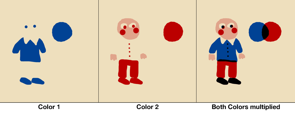
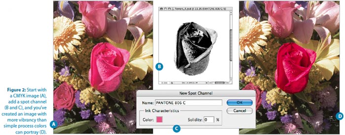
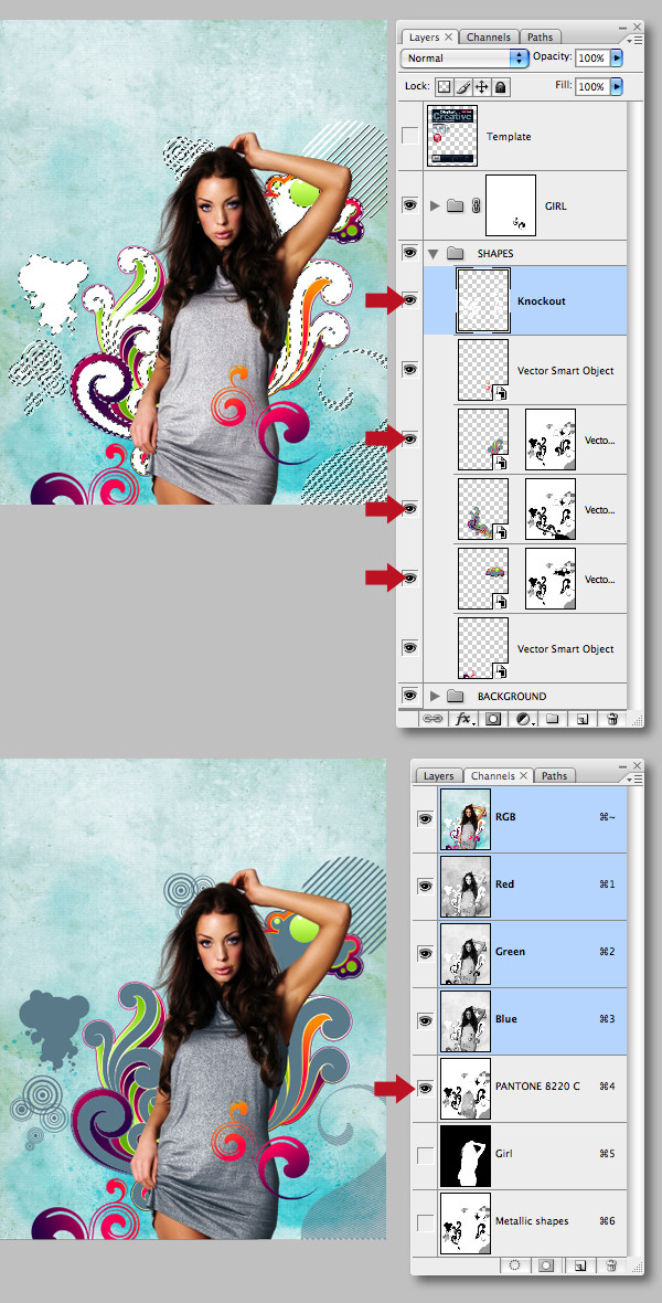
Over the years I have developed a technique to simulate printing with glazing colors (screen printing, offset printing etc.) while working completely non-destructive, remaining full editability through the whole process and being able to easily export greyscale/bitmap masters for each color.
Before we start we need to clarify what we want to do:
- We want to multiply two (or more) colored images so we get a simulation of what would happen when we would use glazed colors to print them each on top of each other
- Each image should be made up of as many layers as we want, while only being multiplied as a whole
- The color of each image should be easily changeable. This means we want the color separated from the actual image layers, to maintain edit-ability and also prevent us from accidentally using different colors (which wouldn’t make sense in printing, where only a single color is used for each part)
- Extracting a greyscale/bitmap version of each image should be as easy as possible.
Multiply an image made up of several layers
This one is pretty straight forward. All we need to do is create a Folder for the layers and set the Folders Blend Mode to Multiply. Everything inside the folder will be handled as a flat image for calculating the multiply by Photoshop. For more colors, we just create more folders.
Also if we use any Blend Modes inside the folder they won’t leak out and affect the content of anything outside beneath the folder.
Pro Tip: Name the folders after the colors you are using. To Avoid confusion
Make each color easily changeable
If we would use colors on the different layers of each folder it would be hard to change that color or get a greyscale version from it for printing.
What we want to do is use only greyscale colors inside the folder.
Then on the very top of each folder we put an Adjustment Layer — Color Fill and choose a color. This color will be the color we want to use in printing (or an approximation of it).
We set this layers Blend Mode to Screen. What this does is everything that is black will become the color we have chosen, everything that is white, will remain white. A 50% grey will look like a 50-50 mix of the color and white. Exactly what we want.
Bonus point is: If we double click on the Color Fill Layer we can change the color and immediately see the result in our image. This makes choosing spot color combinations for printing a lot easier.
Since this is inside a folder that is set to Multiply the effect of Screen won’t affect anything outside the folder (i.e. this won’t “screen” the other folders below)
Attention! The Blend Mode Screen handles transparency as if it would be black, which is confusing because we would rather assume to handle it as white. If your folder doesn’t have a solid white background, everything that is transparent will become the color you have chosen. To avoid this, but a white background at the end of each folder (e.g. by using a Color Fill set to white).
Summary

That’s basically it, now all our targets can be fulfilled.
Here is a summary of the setup we use:
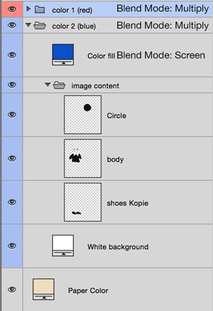
You file consists of a white Background (you can use a colored one too, to simulate paper color) and a folder for each print color you want to have. Each folder looks like this:
Folder (Blend-Mode: Multiply (simulates glazing colors))
    |
    |— Adjustment Layer: Color Fill (Blend-Mode: Screen (simulates the printing color))
    |
    |— Layer 1 of your image
    |
    |— Layer 2 of your image
    |
    |— Layer n
    …
    |
    |— White Background Layer for the folder (avoids weird behavior of of the Screen-Color Fill at the top of the layer)

Download a test-file that shows the setup
Exporting a single color separation
For getting a single color separation for screen printing or if you want to export a greyscale/back and white image so you can set sport colors in InDesign you need to manually export the image. Unfortunately this is the most cumbersome part of this. You need to do the following for each color:
- Hide all folders, except the one you want to export
- Hide the color fill in the color folder you want to export
- If necessary: Convert the image to Greyscale/Bitmap (for screen printing you might want to apply a raster effect, because you can’t print opaque colors)
- Print/Save the file. I recommend naming them after the colors they are supposed to be. Since they are colorsless now it might be hard to tell which one is which.
- If you want to use the image in an InDesign document, place every single color image in your file, assign them the spot color you want (only works if the image has the Color Mode Greyscale or Bitmap, set each of them to Multiply (I prefer this to using Overprinting) and place them all on top of each other.
This technique is also great to teaching/learning photoshop because it utilizes all the important basic Photoshop functions (layers, blend modes, folders, adjustment layers) and shows how you can use Photoshop in ways that are far beyond what it was intended for.


