9

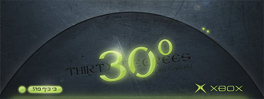
A friend of mine had a poster made for his business. Here is a segment of it:

Poster segment

I can't tell for sure, but I think the angle of the logo is not quite right... (I don't mean any pun with the business's name)

This leads me to an underlining question: are there angles that are aesthetically preferred? Are some angles easy on the eye while others look a bit "off"?

3
  • 3
    I think most ascetics prefer chanting scripture and self-flagellation over playing Xbox. Commented Jan 21, 2012 at 9:59
  • 1
    Umm...yea...I don't think you meant to say "ascetically" but rather "aesthetically". Entirely different meanings.
    – DA01
    Commented Jan 23, 2012 at 22:37
  • on the other hand, maybe hizki is designing an ad for self-flagellation equipment, and wants it to be as appealing as possible to that specific audience. You never know. :) Commented Jan 24, 2012 at 11:22

3 Answers 3

10

That actually looks to be about a 7° angle (although it's not exactly 7°. It's like 7.1° or 7.2°). There are no hard and fast rules on angles I'm aware of. But generally, I try to stick to 5° increments.

The real key to using angles which are aesthetically pleasing is to use them repeatedly in the same piece. One element at an angle will almost always appear to be a foreign object in the design. When you have multiple objects all at different angles you destroy any sense of continuity. However, if you repeat the same angle three or four times with different elements, or mirror the angle with other elements, the overal design will be far more cohesive.

For example, the two small green dots could have also been placed at a 7° angle. A few of the scratched in the texture could have purposely been made at a 7° angle. These would help the design overall.

I assume there's more to the image based on that green glow at the bottom of your posted image. If not, that green glow along the bottom does a great deal to make the entire design look misbalanced.

If the name is 30° and you want to use an angle to serve as an example... it may be a good idea to use some 30° angles on elements or not use angles at all. Kind of like naming a company "RED" then creating an entirely blue logo. The contrast in logic can be interesting, but doesn't serve the purpose of a logo, in my opinion, which is to be identified immediately.

Note the X in "Xbox" throws two very hard 40° and -40° angles in the piece as well. The "stencil" cut out of the 0 throws in a 60° angle. Contrasting those 40° angles and the 60° angle against the 7° angle of the type, then the various angles of the more prominent scratches in the background all lend to a non-cohesive feeling.
6
  • Thanks for the most elaborate answer! I see everything you are referring to... I makes a lot of sense... But just to make sure - isn't there a golden-ratio principle that can take effect in angles? Like preferring a 16.1 angle?
    – hizki
    Commented Jan 20, 2012 at 10:08
  • 2
    re "use some 30° angles on elements or not use angles at all" - I concur, the first thing I though looking at the logo is "aha - so that is tilted at 30 degrees - hang on it's not - what's going on?" -
    – e100
    Commented Jan 20, 2012 at 13:52
  • @hizki -- Not that I'm aware of. The only real key is simply repetition of the same angle. Most commonly I see angles in the 15-25° range but I don't believe I've ever heard of any golden-angle. Perhaps others have.
    – Scott
    Commented Jan 20, 2012 at 16:08
  • Note that 'degrees' isn't solely a unit of measurement for angles. So, the company name may have very little to do with angles.
    – DA01
    Commented Jan 23, 2012 at 22:37
  • I realize that.. but if it were referencing heat... surely there'd be no question about the logo being an an angle and the overal design would be, I imagine, different entirely. And thanks so much for the downvote.
    – Scott
    Commented Jan 23, 2012 at 23:56
1

"Are there angles that are [aesthetically] preferred?"

Not sure it's aesthetics as such, but I'd say that the only angles that can be clearly identified by eye are

  • multiples of 45 degrees
  • multiples of 30 degrees in some contexts (hexagons, isometric projections)
  • the artwork's overall diagonal, parallels and normals (right angles) to it - sometimes this will apply to clearly differentiated sections of the page
  • diagonals to simple rectangles in a grid context (eg 2 x 1, 3 x 1)
  • occasionally parallels to lines connecting key page elements

If you read up on grid systems, especially in the context of poster design, you should find some examples of each of these, e.g. http://www.smashingmagazine.com/2009/07/17/lessons-from-swiss-style-graphic-design/

0

There may not be angles that are considered preferred but it's common for angles to be used to create an unsettling response to the audience. Your question about the golden ratio would work the same way; if a pattern of geometry is repeated throughout nature, it is likely to be familiar with our psyche (comfortable).

That familiarity is why coordinating other elements at the same angle works. It creates a homogenous flow and rhythm.

Your Answer

By clicking “Post Your Answer”, you agree to our terms of service and acknowledge you have read our privacy policy.

Not the answer you're looking for? Browse other questions tagged or ask your own question.