4

I really have no idea with graphic design, but I was just wondering.

Comic sans is a very popular font for home-made signs to print out and tape to a door or something: enter image description here
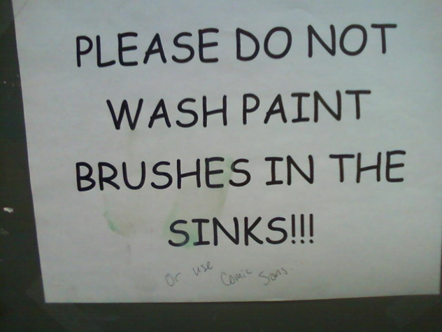
Sadly, it looks terrible (and I haven't even installed it on my OS). However, things like that always seem to look terrible (to me), regardless of the font used.

Are there any tricks to make "signs" like that look more ... professional?

9

3 Answers 3

4

These questions can have hundreds of answers. I will, however, try to give you some tips:

  • In design, you usually start by setting your goal. What do you want to say?
  • Seeing that it's just a typeset with a simple message, use a simple font. Overly styled fonts will draw the attention from the content (which should be your main component).
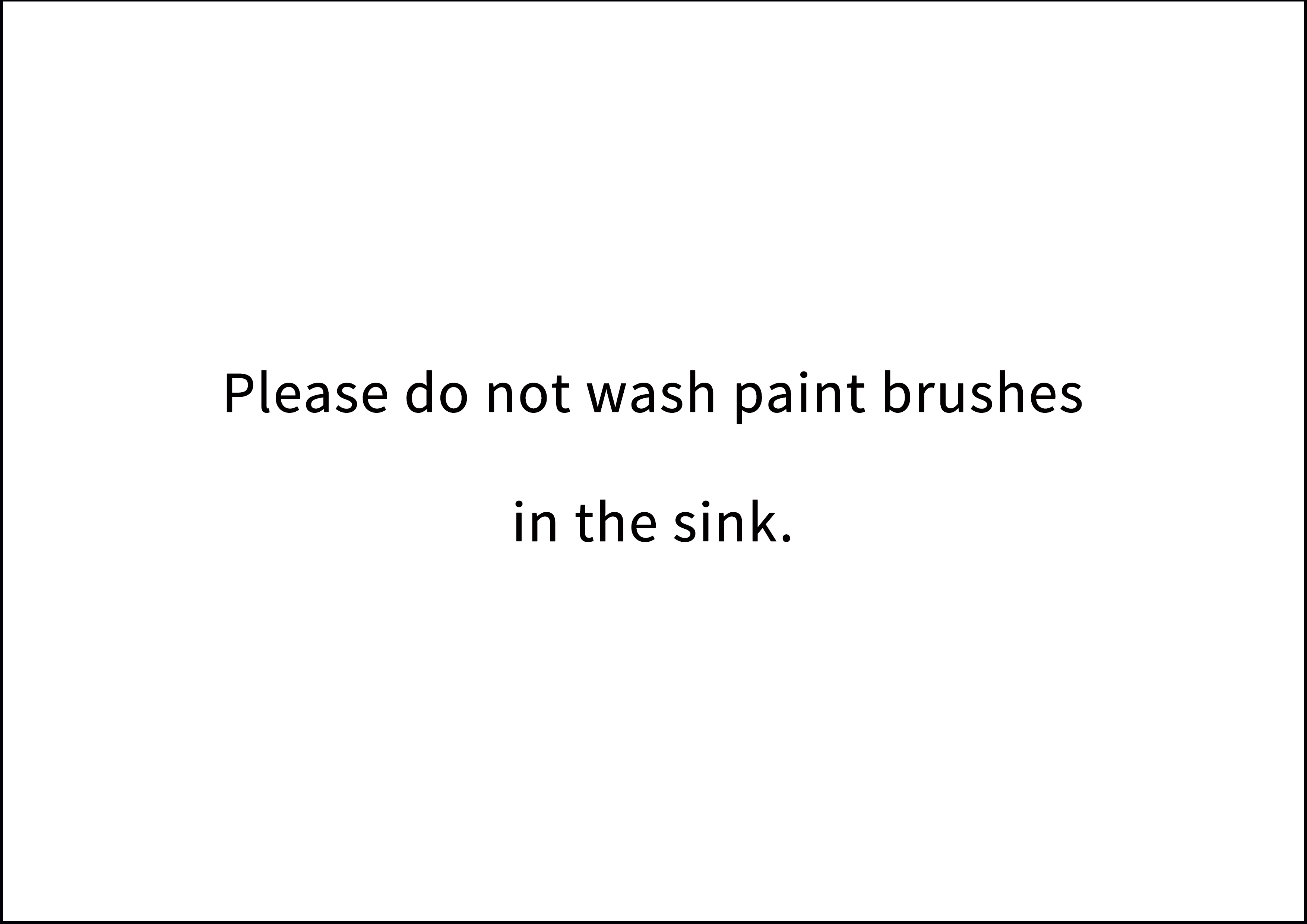
  • Make use of whitespace. Do not try to cover the entire area of your medium. It's a common mistake to think that those extra 10px at this scale will draw more attention to the message. It not (so much) the size, as it is the positioning of the text on your medium.

For ex.:

Example

4

As this 'sign' is merely typeset words, the key is to study up on typography.

Some books to consider:

  • The Elements of Typographic Style
  • Thinking With Type
  • Stop Stealing Sheep (And Learn How Type Works)
0

Using your companies branding/colour/logo, referring to a health and safety breach and putting the number to HR beneath might add a bit more sway

Your Answer

By clicking “Post Your Answer”, you agree to our terms of service and acknowledge you have read our privacy policy.

Not the answer you're looking for? Browse other questions tagged or ask your own question.