What is the reason behind using a white circle/spot in eye icon/logo in terms of visual or graphic design? Is there any specific meaning?
3 Answers
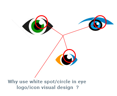
The circle (or otherwise white mark) is a meant to be a reflection.
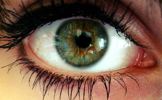
The reflection makes it more realistic and understandable as an icon. As seen in a google image search, our eyes are pretty reflective and we often perceive this even if we don't consciously think about it. As Andrew H notes, this reflection is called a catch light. Below is one for example:
For comparison take a look at these two icons below. I'd argue that the one with the dot looks more human like and friendly.
-
2Seconding their answer, but also adding that it adds depth and personality to the logos. Commented Feb 11, 2016 at 7:21
-
6Adding that it makes it look more friendly (as Zach mentions) because our brains are hardwired to detect staring eyes and interpret them as threats. The simplified pattern of the staring eye the brain looks for is a white circle with a dark cicle inside, perfectly centred. The right illustration makes a great job at making the brain go into warning mode because something is looking really really attentive at us. Softening it a bit (the left one) makes it less threatening.– cockypupCommented Feb 11, 2016 at 15:41
-
The second one creeps me out, but I don't think the first one is immediately recognizable as a human eye -- it just doesn't creep me out. Maybe there's a middle ground with a smaller white spot purely inside the iris? Commented Feb 11, 2016 at 19:27
-
1@gardenhead I don't think there's a "one size fits all", it depends on the design :) Commented Feb 11, 2016 at 19:47
It’s a “catch light” from portrait photography. That is literally a reflection of the photographer’s flash, or in some cases, a special light that is meant to light up the eyes. When you look at the portrait, the catch light draws you to the eyes, making the eyes pop out.
Illustrators look for details like these so that they can draw simple shapes, and yet make them recognizable as something much more complex. An oval is just an oval, and then you put a circle in it and it is eye-like, but if you put a catch light in, now you unmistakably have an eye.
So the catch light was at first a photographer’s trick, and then it became an illustrator’s trick.
I think it is, psychologically, to do with the eye looking more "alive" and animated. If you can see reflections in an eye (which this circle represents), it must be well-moistened, which means the subject is blinking, perhaps looking around, etc. The latter, without the reflection, looks kind of dead, or perhaps in a zombie-like stupor.
I think this is an unconscious perception but it influences how you feel when you look at the eye (you feel nicer looking at an eye with reflections). In films, when an actor has a close-up, special lights are often placed purely to create extra reflections in the actors' eye(s), to enhance this effect.
Sometimes this is really "overdone", to create a feeling that the character has got extra magical sort of stuff going on: eg Galadriel in the Lord Of The Rings/Hobbit movies.


