22

We encounter currency symbols every day as shorthand for a currency’s name, especially in reference to amounts of money. Most, like these common currency symbols,

some common currency symbols

have strikeouts in their sign. Even Bitcoin uses two strikes in its old and new currency symbol:

old and new bitcoin symbol

Do we use strike-throughs only because they make currency symbols easier to distinguish from other letters of the alphabet, even when the sign is written in an old-fashioned style like the pound symbol? Wouldn’t it be safer to invent a totally new symbol, rather than re-using a letter as @Rad Lexus pointed out?


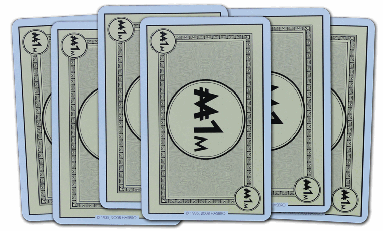
As a side note: I wonder if we can also assume that strikeouts in currency symbols have become a "pseudo standard", because even Monopoly uses them to associate real money with game money?

$1M money card from http://monopolydealrules.com

Edit I: As @Zach Saucier mentioned a (very) similar question was asked on quora.com. Unfortunately the answer provided there is IMHO not very satisfying, since only the (hypothetical) history of some major currency symbols is posted there and not any explanation why strikeouts are used in general for currency signs.

12
  • Same post on Quora Commented Mar 11, 2016 at 22:01
  • 4
    @Yorik - The $ for dollar and the ¢ for cent come from the peso and the centavo respectively, which were both in use (along with pounds, shillings and pence and a bunch of other things) in the US long before they created their own native currency. To most people at the time, a d — stricken or not — would have meant a penny. Commented Mar 13, 2016 at 1:14
  • 1
    @StanRogers: Yes you are right as Wikipedia states "The best documented explanation holds that the $ sign evolved out of the Spanish and Spanish American scribal abbreviation "pˢ" for pesos"(known as "Spanish dollar" and since 1792 used in the United States)". On the other hand what’s the reason that sometimes two lines are used inside the $ sign, when it evolved out of an P an S?
    – elegent
    Commented Mar 13, 2016 at 10:22
  • 2
    Every addition in "modern times" may be just mimicking a far older convention (as a "false friend", actually; "a line always indicates money"): underlining, overlining, and striking through indicates an abbreviation. From your list, the Pound symbol is the best example.
    – Jongware
    Commented Mar 13, 2016 at 10:29
  • 1
    ... see Wikipedia on Scribal abbreviations. It does not mention "£" as an abbr. but it would have been a good example.
    – Jongware
    Commented Mar 13, 2016 at 11:54

3 Answers 3

13
+200

Imitation of an older convention

It's clear that the designers of more recent currency symbols have their own rationale for including the slashes or 'strikeouts' in the symbol. It's also clear that these elements naturally evolved in older currency symbols through the use of abbreviation and shorthand.

It's more than likely that modern currency symbols are using this older convention, that originally evolved naturally, that slashes through a symbol indicate currency. This makes it much easier to distinguish from regular characters. As you said in your question, the practice has arguably become a pseudo-standard.


The EURO
High-res euro symbol

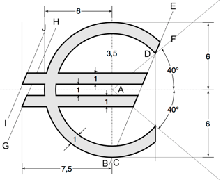
The Euro is a relatively new currency and the symbol was designed and presented in 1996. The explanation of the design given by the European Commission (emphasis mine):

Inspiration for the € symbol itself came from the Greek epsilon (Є) – a reference to the cradle of European civilisation – and the first letter of the word Europe, crossed by two parallel lines to ‘certify’ the stability of the euro.


Indian RUPEE
High-res rupee symbol

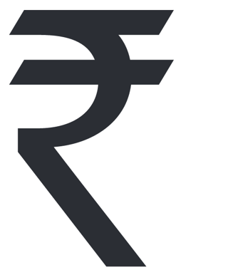
A number of explanations for the crossbars are given in Udaya Kumar's design proposal for the Indian rupee sign:

The use of Shiro Rekha (the horizontal top line) in Devanagari script is unique to India. Devanagari script is the only script where letters hang from the top line and does not sit on a baseline. The symbol preserves this unique and essential feature of our Indian script which is not seen in any other scripts in the world.

The two horizontal lines with an equal negative white space (imaginary space) between them create a foreground and background effect of three strips (tricolor). The strips subtly represent the tricolor of our Indian national flag flying at the top.

The horizontal lines also denote the arithmetic sign ‘equal to’. [...] The arithmetic sign denotes that relationship of comparison of currency values. The equality sign also signifies a balanced economy, our economy should be secured and stable forever.


The DOLLAR
High-res single-bar dollar symbol

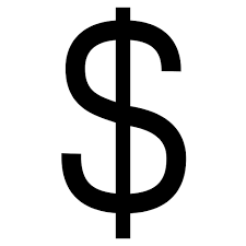
The origins of the Dollar symbol are somewhat more debated than more recent symbols. It originated when English Americans were trading with Spanish Americans in the 1770s.

The most credible theory is that it is derives from the abbreviation 'ps' for the Peso. Another theory is that the symbol originated as an '8' with a slash through it—denoting Pieces of eight or the Spanish dollar.

Theories for the origins of the dollar using two vertical lines include the idea that it originated as the abbreviation 'US' or as a representation of the Spanish coat of arms, which showed the Pillars of Hercules with a banner curling between them.
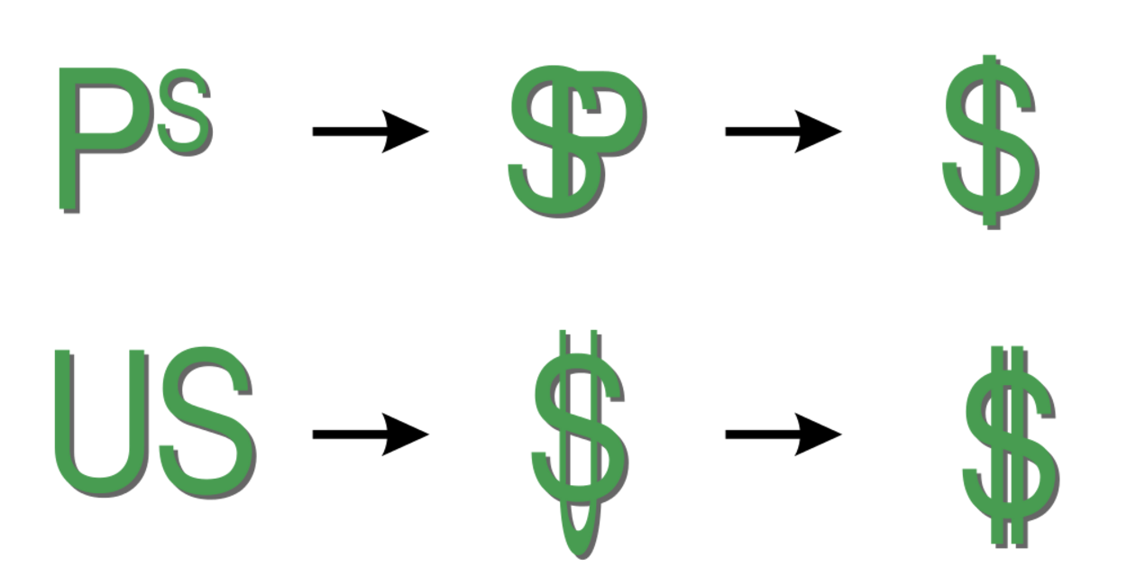
Progressions from abbreviations to symbols

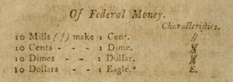
In The American accomptant, published in 1797 (a great find by @Yorik!), you can clearly see the notation used for 'Federal Money'. 1 Cent is expressed as //. 1 Dime overlays an S over the // and 1 Dollar overlays a double stroked S over //. This calls in to question the other theories of the Dollar symbols origin. The document doesn't however give any explanation for the notation (As far as I can tell—I haven't read all 320 pages!)

The POUND
High-res pound symbol

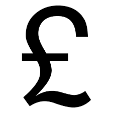
The Pound symbol is more obviously derived from a cursive majuscule 'L', which represented 'libra', the basic unit of weight in the Roman Empire.

The slash[es] through the Pound come from scribal abbreviations which were in common use in the Roman Empire and using shorthand became common around this time.

6
  • 1
    Nice summary! Wasn't the reason "L/weight ≈ money" used because payment was in 'weights of silver'? (Or salt – salary?)
    – Jongware
    Commented Apr 19, 2016 at 13:17
  • 1
    @RadLexus I believe so. Roman currency was all based on (literal) weights before coins and I believe there were a few terms that were used for weight and coins.
    – Cai
    Commented Apr 19, 2016 at 13:45
  • Interestingly the currency sign ("¤") which is "used in place of a symbol that is not present in the font in use" doesn’t have any slashes or strikeouts …
    – elegent
    Commented Apr 19, 2016 at 19:29
  • 1
    Is it a happy coincidence that the British pound symbol looks a little like an actual Roman beam scale and an L? (aka steel yard balance). The top hook hangs the whole scale, the cross-member is where the counter weight would hang and the farther out on the beam, the heavier the item hanging on the base of the L (a hanger for another hook)
    – Yorik
    Commented Apr 19, 2016 at 19:58
  • @Yorik that's an interesting point! I suspect it's a coincidence though :)
    – Cai
    Commented Apr 19, 2016 at 20:23
6

The lines across currency symbols make them easier to identify clearly in handwritten documents. An error in the identification of even one alphanumeric character or symbol in a handwritten document can result in a very costly mistake or a lawsuit. Clear, unambiguous documents are also harder to forge.

Having rational rules for currency symbols promotes public confidence in the government similar to the way that impressive looking government buildings in the capital city do. Aesthetic considerations must be harnessed to the other objectives of the design as in L'Enfant's design of the layout of the streets of Washington, D.C. as a system of intersecting diagonal avenues superimposed over a grid system, the L'Enfant Plan.

The use of an alphabetical character as a mnemonic device in many currency symbols makes them easier to identify and remember.

3
  • 1
    Then it would be safer to invent a totally new symbol, rather than re-using a letter.
    – Jongware
    Commented Mar 13, 2016 at 11:50
  • Although it would introduce unnecessary complications in case a mentally impaired person was unable to master the art of writing an unfamiliar handwritten character in cursive writing and decided to improvise by substituting an X or some other ambiguous character which would make the entire document unclear.
    – karel
    Commented Mar 13, 2016 at 12:04
  • 2
    @RadLexus That's what happened when the letter was changed. It became a new symbol.
    – go-junta
    Commented Mar 14, 2016 at 0:17
6

Designer Udaya Kumar author of the in INR (Indian Rupee) ₹ symbol explains:

The parallel lines at the top (with white space between them) are said to make an allusion to the tricolor Indian flag and also depict an equality sign that symbolizes the nation's desire to reduce economic disparity. (Wiki)

3
  • Hi Abhishek Sharma, welcome to GDSE and thanks for your very interesting answer. :) I found out that the Indian Rupee first appeared in 2010 … so unfortunately it isn’t the first symbol which uses strikeouts.
    – elegent
    Commented Apr 14, 2016 at 19:58
  • 1
    may be @Abhishek Sharma is right. but I just got a question. I know this page is not for discussion, but just curious, I had always been thinking if the above line is to match "indian writings". wasn't this like that?
    – MFarooqi
    Commented Apr 14, 2016 at 20:31
  • @MFarooqi i don't think so It must have some reasons behind that. Commented Apr 15, 2016 at 10:11

Your Answer

By clicking “Post Your Answer”, you agree to our terms of service and acknowledge you have read our privacy policy.

Not the answer you're looking for? Browse other questions tagged or ask your own question.