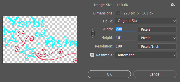
I'm trying to make the images on my website smaller in their px dimensions, but I'm having issues with quality loss when I resize them in Photoshop (I first tried “Bicubic Sharper,” then all other resampling options, but they all came out blurry).
When I let the browser do the scaling (by stating the smaller width in my CSS), they come out perfectly sharp. How can that happen? I would like to reduce my original images though. How can I make them smaller without quality loss? (I have Photoshop and Illustrator, both CC 2015)
EDIT I:
The image has transparency in it, so I can't save it as a JPEG.
The Bicubic Sharpener didn't help.
Here are the pictures:
This one is a screenshot of the original image scaled by the browser/CSS:
This one is a screenshot of the smaller image (showing at 100% in the browser):
This is the original image (not a screenshot):
Here is the image resized in Photoshop with Bicubic Sharpener (as shown in the second screenshot):
Edit II:
Thanks for your replies! I'm looking at it from my laptop, which has a touchscreen, but I don't think it compares to iPhone displays... (The specs say 16:9 IPS FHD (1920x1080) if that helps.) However, I would like it to look good on iPhones since I'm trying to make the website responsive.
That's what lead me to the problem in the first place. I'm using Bootstrap, and responsive images are automatically displayed at 100% for the largest possible screen size, but I want them to be smaller than that (63%). I thought making them smaller would be a good idea anyway as a smaller file size seems like a good idea as well.
I'm sorry if my picture explanations were confusing, that's probably because I am confused... I'll try to explain it better:
Both the 2nd and the 4th picture show the same smaller picture, with the 2nd one showing it on the website.
The 4th (which also looks bad to me) is shown at 100% width in the browser.
The 1st picture shows the 3rd picture (original size) scaled to 63% in the browser. At least that was what I intended.
@AndrewH Your explanation sounds right to me except that I wasn't trying to scale it larger (at least not on purpose). The 2nd image (screenshot) is just shown on top of the website background, so it has a different width that includes that background. Or what am I missing?

