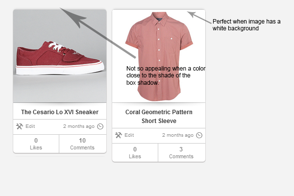
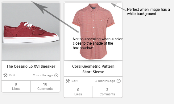
You could try to add a "frame" around the image by setting a 1px border (maybe the same grey as your outer border) and adding a 1px margin to create a separate white border between. This will appear as a "double" border, and with the white border part, it will make the shadow stand out in a way similar to the image where the background is already white.
Use rounded corners at top and square corners on bottom to make it follow the outer border.
Example for your image where I have just added the extra border:

The css code for the image would be something like this:
img.product_sample
{
  border: solid 1px rgba(0, 0, 0, 0.2);
  border-top-radius: 3px;
  margin: 1px; /* Causes the background color of the container work as an extra border */
}
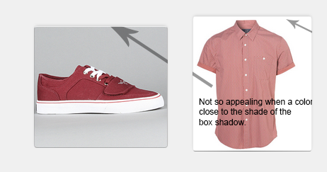
An alternative is to just have the white border. This will give no visible difference to your original version when the image content background is white:
img.product_sample
{
  border: solid 1px white;
  border-top-radius: 3px;
  margin: 0px;
}
