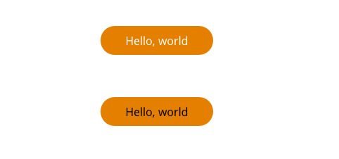
Here are two buttons. When I measure them with the W3C contrast score, the black text has a much better score, meaning it should be easier to read. But, to my eyes, the button with white text is easier to read. Why is that?
When I run a colour contrast check, the white on orange text fails, with a contrast of just 2.86:1. The black on orange passes at the AAA level, with 7.3:1. (The hex values are as follows: Button background, #E47F00; white text, #FFF; black text, #000.)
However, I find the white text easier to read under every lighting condition I've tried: Adjusting the screen brightness, viewing in direct sunlight, etc. Changing the background colour from white to 50% gray or black did not change the readability, either.
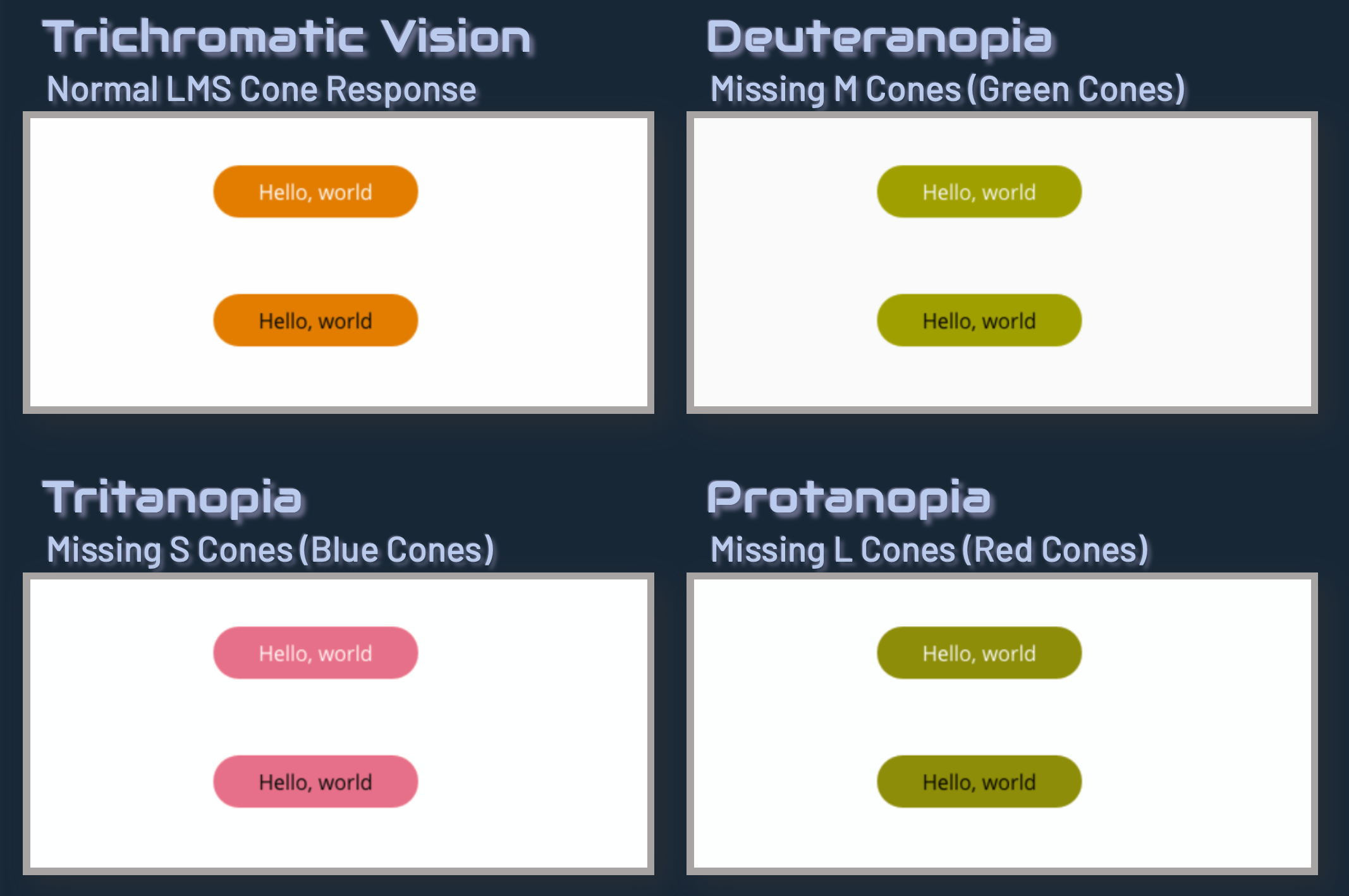
Why would the colour combination with the worse score be easier to read? I imagine the answer has something to do with the properties of this particular shade of orange causing the contrast formula to give weird results, but I'd like to understand that better. (And if there's something I don't notice as a fully-sighted person that someone with a visual impairment would notice, I'd definitely like to learn about that.)


