22

What is this technique called:

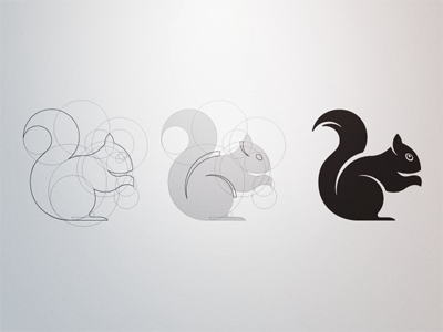
enter image description here

http://dribbble.com/shots/260469-Squirrel-Construct

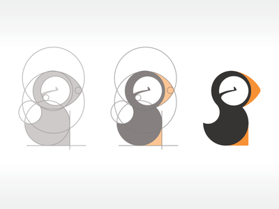
See how the image is the result of overlapping many circles to create the final drawing. Parts of the circles overlap with each other to form the desired figures.

Here is another example:

enter image description here

http://dribbble.com/shots/904051-Puffin

Do you know any good tutorial for learning this technique? I've been searching, but since I don't know what the technique is called, I've had no luck at all.

6
  • I do not think it has a name as such, other than circular construction, and the ability to see potential shapes via circles.
    – benteh
    Commented Nov 29, 2013 at 13:30
  • Hmmm... I was hopping there was a certain name for it. Do you know if they draw a sketch first and then "fix" it with circles, or they start with the circles right away?
    – Buzu
    Commented Nov 29, 2013 at 19:05
  • 2
    No, but here is my guess: what you see above is not necessarily the process of designing something, it is a stylised demonstration of creating a final shape. To start with a bunch of circles is not really going to help you; it is about being able to "see" circular, interlocking shapes.
    – benteh
    Commented Nov 29, 2013 at 19:10
  • I see. That actually makes a lot of sense. I'm not a designer, and have no formal training on anything design related, but I'm always interested on things like this.
    – Buzu
    Commented Nov 29, 2013 at 23:53
  • 1
    P.S. Keep your source circles or shapes. Use a duplicate on a diferent layer and modify thoose. If you don't like the result modify the position or size of your source geometry and try again. In Ilustrator you have an option to mantain the source shapes but filling with colour the diferent intersected sections. helpx.adobe.com/illustrator/using/live-paint-groups.html
    – Rafael
    Commented Jun 29, 2015 at 13:48

4 Answers 4

14

In all kinds of drawing, a formalised methodology has been attempted for centuries (ref. The Vitruvian man). Rules and guidelines for proportions of the human body etc. have been drawn out for the use in architecture and art (and in some cases to hunt for the magic golden section). This, in a way, is an engineering approach to imagery: laying down basic guidelines. The examples you show kind of refers to that tradition.
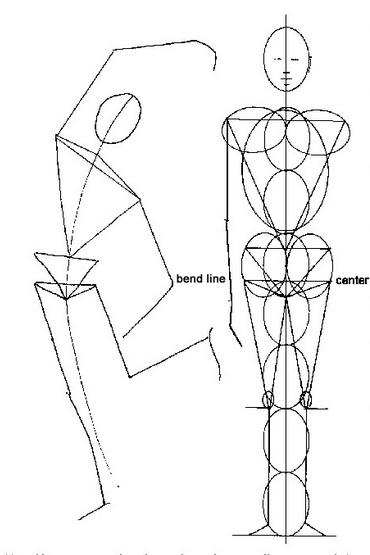
enter image description here

My guess is that the drawings you show are partly "reversed engineered" - someone doodled a lot, and then afterwards reconstructed the (seemingly sequential) process. I am not saying they did not work with circles in mind, they clearly did, but just pushing circles around in photoshop is probably not the way to go.

In this case, the resulting images are stylised animals; note that they are animals that are roundish by nature. I doubt you would find a similar image of - say - a horse or a snake :-)

If you want to make stuff like this, my suggestion would be as much "mindless" doodling as you have time for. I cannot stress the importance of doodling enough. There should be more doodling in the world :-)
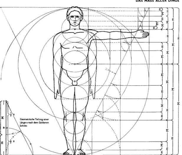
   

enter image description here

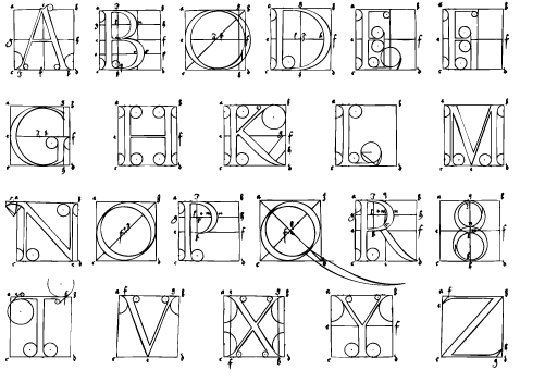
Edit: Albrecht Dürer (bow to the master! ) reconstructed latin letters. Note that circles are prominent:
enter image description here

5
  • 1
    I'm not sure both techniques are the same, but I could be wrong. However, I think you make a good point when you say that "just pushing circles around in photoshop is probably not the way to go." I spent quite some time yesterday trying to make an "s" shape just pushing circles around in inkscape, and it definitely didn't take me anywhere. I will take your advice and doodle all the things!!!. Thanks a lot for your detailed response. Those images really add a lot of value to it, and they make me wonder even more about geometrically based drawing.
    – Buzu
    Commented Nov 30, 2013 at 10:05
  • Glad to be of help. Doodling is the thing! :-) If you want to take it a little further (not related to your original question, but relevant to geometrically based art), take a look at math craft mathcraft.wonderhowto.com
    – benteh
    Commented Nov 30, 2013 at 10:26
  • oh, and by the way, my personal opinion is that it is not so much design as such, as it is the result of seeing.
    – benteh
    Commented Nov 30, 2013 at 10:28
  • Oh, and you touch on an interesting point; letters. Forgive me if my answers becomes more and more derivative, but see edit in my answer above.
    – benteh
    Commented Nov 30, 2013 at 10:41
  • 1
    Thanks, I'm going to look into the subject of math craft. It sounds interesting. Thanks for adding that image of the letters. I like typography, and type design.
    – Buzu
    Commented Nov 30, 2013 at 20:31
2

It's called 'sketching'. At least, the concept of using basic geometric shapes to create a 'wireframe' to fill in with detail is.

If it leans more towards hard geometry, one could perhaps call it reminiscent of CAD or engineering drawings.

Either way, what you see on Dribbble is often done after the fact. You'll see lots of logos and icons with these guide lines shown that were actually added after the fact merely for aesthetic presentation purposes.

3
  • 1
    I see, I don't really see the point of that. It makes sense if you use the geometric figures to guide your lines or to even make them, but if you just add the circles after you are done, it makes little sense to me. I guess people like to show off that way. I liked the idea of using the circles as an aid, rather than just some sugar on top of the design. My guess was that they sketched something and then they perfected the curves using circles.
    – Buzu
    Commented Dec 2, 2013 at 19:16
  • 1
    It made more sense historically when we tended to use more mechanical means for illustrating...pen, ink board, drafting tables, etc. I suppose it's a bit like the 'print grunge texture' you see on a lot of Dribbble work. It's, of course, purely faux, as it is all done via computers, but some people like to bring in the analog past as part of the aesthetic style.
    – DA01
    Commented Dec 2, 2013 at 20:06
  • 2
    I've followed the suggestion made by @boblet and I've found that it actually helps a lot to use circles while doodling, so I think that in fact those circles we see there were used in the process of designing the illustrations rather than being added after the fact just to show off, but I could be wrong. However, it does make sense that in the past this techniques were more used by designers since most of design was made by hand. I've found that starting with pen and paper is still a good thing to do though. It helps out a lot, rather than just starting in inkscape right away. Thanks!
    – Buzu
    Commented Dec 3, 2013 at 19:24
2

When creating something in Illustrator you tend to use the pen tool or basic geometric shapes to get to your idea. Depending on how you were taught in the beginning you will tend to use one tool over the other.

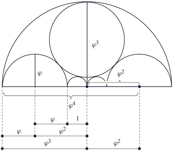
This is not a specific technique, it's just grid based design using the golden rule (math attached below).

golden rule

Most designers that studied graphic arts will understand and use this grid wisely, while others just tend to use whatever size they see fit for the job.

Everything begins with a pencil drawing, you import the image and then you begin to construct creating a single big circle. You measure the circle and set that as the primer circle from which you subtract different ratio circles to create your idea. After that, using the pathfinder tool in Illustrator, you divide all circles and delete the ones that you don't need in the logo. The final step is to merge the pieces depending on how you need them and that would be it.

Using this method will give you a nice refined image fast.

If TL;DR > It's called Grid Based Design.

3
  • Nice answer, welcome to the community. I went ahead and fixed a little bit of grammar for you - hope you don't mind.
    – Ryan
    Commented Jun 28, 2015 at 21:53
  • hi, I don't mind at all. it's not my native language and it was done right before I dozed off after a very very long day :) Commented Jun 29, 2015 at 22:33
  • Nice answer, Thanks. I had forgotten about this question, and it is nice to be reminded of this nice bit of information.
    – Buzu
    Commented Jun 30, 2015 at 16:38
0

I believe you are looking for the Designer's Golden Ratio. Here's a lesson from behance: https://www.behance.net/gallery/10698637/how-to-design-a-logo-using-golden-ratio Or just look it up and I'm sure you will find plenty of other sites.

1

Your Answer

By clicking “Post Your Answer”, you agree to our terms of service and acknowledge you have read our privacy policy.

Not the answer you're looking for? Browse other questions tagged or ask your own question.