7

Was searching for a site/forum where I can get some design critique about a logo I am creating for my brand, for the vtubing industry, and found this forum by chance! :D I am not a professional graphics designer (self-learnt Photoshop, Procreate etc.) so please pardon me if my language is too layman.

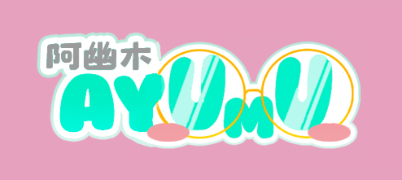
I am trying to create a logo with a type of style similar to Japanese vtubers (cute-sy) and came up with the following (purple background just for contrast, not part of the logo):

logo for critique

The colour of the Chinese words (which is basically a direct translation of 'Ayumu') and 'AY' is based on the hair colour of the vtuber. The 'UmU' portion is in black because I am trying to distinguish it from the rest of the words, and make it look like a face, where the 'U's are the eyes and the 'm' is a frowning mouth. I added the glasses of the character as well as red-pink circles for blushes to try and make it more obvious that the UmU is a face.

I have been working on this logo for the past 6h so my vision/opinion on the logo may be clouded - I am now seeing AY UmU instead of Ayumu.

So my questions are:

  1. Is it obvious that the word is supposed to be "Ayumu"? If not, should I move "AY" and "UmU" closer together, or should I standardise the colour for "Ayumu"?
  2. Is it obvious that the "UmU" is supposed to be a face?
  3. Is the green font too light against the white stroke? Please provide your opinion on both the green Chinese words and the "AY".
  4. Are the glasses reflection too glaring for the eyes?
  5. Is the overall logo balanced? I have thought about centering the Chinese words and moving them to the bottom of the "Ayumu" word, but because the "AY" is smaller than "U" so there is this empty space above 'AY', hence I moved the Chinese words to where it is now.
  6. Does the logo make you think of Japanese logos?
3
  • 1
    1) I understood it to be "Ay Umu". Maybe maybing AY bigger would help? 2) I got that impression though it's not the most clear what sort of face it's making. 3) Probably depends on the setting. It's not too bad. 4) They're fine, but I might try toning it down a touch. 6) I don't know much about Japanese logos. It definitely has an Asian feel to it. Commented Apr 7, 2021 at 15:10
  • 1
    Opinion: It looks like something Chinese+AY . Then a little later there's found UmU. Should OO be red somehow is a puzzle, but I decided after 10 seconds they are a decorative pair of spectacles.
    – user82991
    Commented Apr 7, 2021 at 15:11
  • 4
    To me, it's disjointed... but I'm not the target audience either.... the UmU seems thought out but everything to the left of that appears "tacked on" after the fact. There's little continuity or smooth eye motion. If anything the art somewhat compelled right to left reading.
    – Scott
    Commented Apr 7, 2021 at 21:04

3 Answers 3

0
  1. I think it's a good start, but looks a little disjointed which makes it hard to read.
  2. Yes, although it makes the logo harder to read.
  3. I think the colors are pretty good, but really depends on how large the image will be. For a large header image, the contrast is alright imo.
  4. I would reduce the glare.
  5. See 1. I've made a very rough suggestion below!
  6. Yes, looks like some Japanese plush brand, but my experience is limited.

Very rough, but I would change it into something like this;

Ayumu

0

The overall design is amazing.
However, there are a few things you could improve.

Answers


  1. Is it obvious that the word is supposed to be "Ayumu"?
    No. You should probably make the "AY" a bit closer to "UMU" - as you said, it looks more like "AY UMU" than "Ayumu".

  2. Is it obvious that "UMU" is supposed to be a face?
    Not at first glance, no - though the glasses are very obvious. It took me a minute or two to realize that the three letters were a face - but now that I've realized it, it looks a lot like one. It's best if you don't change anything to fix that - a few hidden gems is a good thing for all logos.

  3. Is the green font too light against the white stroke?
    No - it is very easily readable. In fact, in my opinion, the color scheme is just perfect. The chinese letters are also very clear, though this is a question best answered by someone who actually knows Japanese - I don't.

  4. Are the glasses' reflection too glaring for the eyes?
    No. Not at all - the reflection effect is perfect.

  5. Is the overall logo balanced?
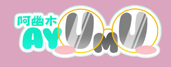
    Mostly. The structure of the logo is well thought out, and I love it - but the Chinese word is attracting too much attention, and "UMU" is getting less attention compared to "AY", seperating "Ayumu" even more. So, I would suggest you switch the colours of the Chinese word and "UMU" - make "UMU" green and make the Chinese word grey.

  6. Does the logo make you think of Japanese logos?
    DEFINITELY! With the cute style, the fun font, the bright stroke - saying it's perfect would be an understatement.

Extra suggestions


  • Maybe remove the pink ellipses?
  • Raise "AY" above the rim of the glasses.

Praise and Observations


I love the way that the part of the "M" that intersects with the glasses looks a bit different.
When converted to grayscale, the logo keeps its clarity and Japanese cuteness, and still looks amazing.
The logo feels like it fits best for makeup-related things.

1
  • You may also attempt to work with the coloring in addition to those things.
    – Bijutoha
    Commented Aug 3, 2023 at 6:31
-2

A logo must always look good in one color otherwise it is a graphic not a logo.

1
  • Not what's being asked here, also not entirely true if the target media is digital / video
    – Luciano
    Commented May 9 at 15:08

Your Answer

By clicking “Post Your Answer”, you agree to our terms of service and acknowledge you have read our privacy policy.