7

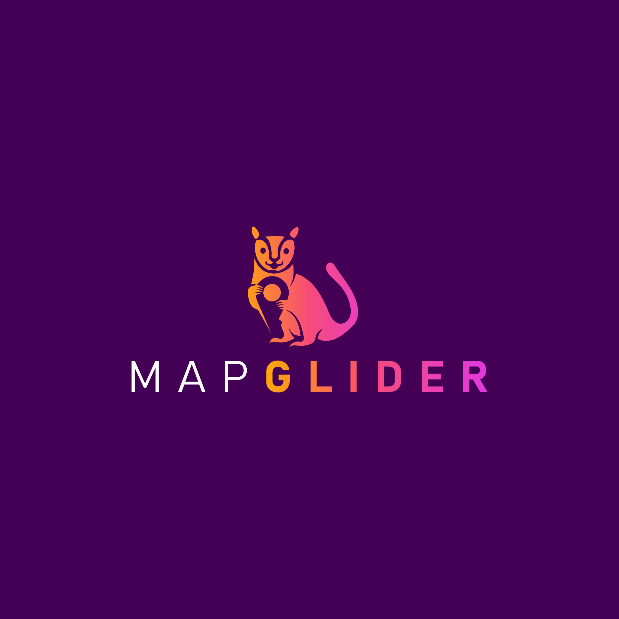
So I have a designer building out a logo and they're having a hard time coming up with a concept, but the attached is the best design that they have sent over so far. I want to get your honest opinion on what could be improved and what should go/stay/etc..

About the logo:

  • I'm building an app called MapGlider that is a map based app w/ points on a map of interesting destinations
  • It's based on a Sugar Glider jumping from destination to destination.
  • I am trying to keep it as a minimalist logo, something that will look good as an app icon (All app icons seem minimalist).

Questions:

  • Should I make the sugar glider more detailed? As in have more lines and/or sugar glider colors (Grey, Brown, etc..).
  • Is the neck too long?
  • How does the face match up?
  • Does the logo make sense?

enter image description here

All help that can either inspire me or the designer would be helpful!

13
  • 6
    I bet most people in the world have no clue what a sugar glider is anyway, so the logo will only make sense to Australians who do know already. Unless your user-base is entirely East coast Aus, you're rather limiting your market.
    – Tetsujin
    Commented Aug 12, 2021 at 12:57
  • 6
    Before reading your explanation, my first thought was that it's a kind of badly drawn squirrel holding a vinyl record. I didn't get the connection at all. I didn't even know what a sugar glider was. Had to look it up. Maybe it would be better to go with something more abstract, and not some actual representation of the physical words in the app name. Just a personal observation. Also this question is too opinion based TBH.
    – Billy Kerr
    Commented Aug 12, 2021 at 12:59
  • 1
    Hi MapGlider, welcome to GD.SE. I’m a little uncomfortable with providing feedback on your designer’s work, unless you have their consent (at least) or support (better) for posting it. Grateful if you can confirm.
    – pbasdf
    Commented Aug 12, 2021 at 13:02
  • 1
    Why is the sugar glider not shown flying? When the concept is that this animal is jumping from one destination to another having it sitting does not work well. Also this would prevent it looking like a Squirrel / Kanguru / Mouse. Main issue is the combination of animal and map marker I think as as app icon in small scale this wont look good. Commented Aug 12, 2021 at 15:14
  • 2
    @MapGlider The thing is you are buying taste from your designer. If you now substitute that taste with your own taste then you are getting only half of the product. Remember its not so much what you like of the logo, its how your potential clients react to the logo. Easy to read, memorable and understandable are better than fills emotionally good for the person doing the choice. Im afraid this logo wont work in appicon sizes thus not good.
    – joojaa
    Commented Aug 13, 2021 at 4:22

4 Answers 4

9

I'm American. I know what a Sugar Glider is. I am older though, that may be a factor. :)

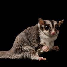
Yes I "got it" when view it immediately. I figured, given the name, sugar glider makes sense. However, I don't know how accurate the image is. In most cases, prior to this question, I couldn't spot a sugar glider on sight and know that's what it was unless I saw it gliding. I know they sort of look like a mix of squirrel and chipmunk to a degree. I (incorrectly) thought they were more of a solid grey. So I did google to see sugar glider images.

enter image description here

My comments...

  • I dislike the gradient. But that's more personal preference - or pet peeve. Gradients such as these, I feel, are "shortcuts" to try and FORCE something to look interesting which you don't feel actually IS interesting.
  • If one looks at images of sugar gliders, the head stripe pattern in your artwork is incorrect. Most Sugar Gliders appear to have large, dark, eyes and a prominent black stripe down the middle of the forehead/back. You've used smaller eyes and some "nose stripe" which is inconsistent with apparently biology. I saw no image with nose bridge stripes in my searching.
  • The mouth is far too prominent in the artwork. Almost all the images I saw the mouth was fairly indistinguishable. It's the very pointed head and large eyes that, to me, convey the animal best.
  • The neck is far too long. The head basically sits on the shoulders without any prominent neck.
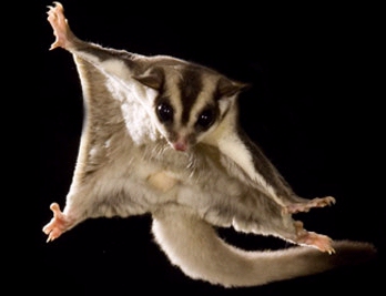
  • I think a far more dynamic pose could be used. One which conveys the "glider" aspect more by showing the webs of skin the Sugar Glider uses for gliding. Something more like:
    enter image description here
    There's so much one could convey if you think "motion" more. After all, if "gliding" is the conceptual connection, you should show the gliding to convey movement and motion. To be, perhaps a bit more blunt, you've used possibly the most boring pose one could use for a very dynamic creature.
  • I had no clue what it was holding. I don't perceive (still don't) a map pin in the hands, even though I know that's what it's supposed to be. You've cut off the bottom "pin" part and it merely looks like a circle or perhaps a "key" to some degree. To convey a map pin you really kind of need to convey the entire shape.
  • I do like the change in weight for the typeface. And I think it's a decent font - although somewhat forgettable. Beyond that, there's not much to the type aspect if the gradient were removed.
9
  • I've been composing an answer in my head, but have just found you've said it all, and more, and better.
    – pbasdf
    Commented Aug 12, 2021 at 18:48
  • 1
    But @ZachSaucier without the type, would you still? :) I see a squirrel eating a Ritz cracker. :)
    – Scott
    Commented Aug 12, 2021 at 19:52
  • 1
    I see a ferret holding a tiny steering wheel. I think the critique is fair. When using a specific animal it has to be spot on.
    – Wolff
    Commented Aug 12, 2021 at 20:50
  • 1
    Mongoose and an Oreo cookie?
    – Scott
    Commented Aug 12, 2021 at 22:33
  • 1
    MapGlider.. NOT poking fun at your work. Not at all. I think the work is good and looks clean and professional. It's more the concept I was commenting on in my answer. We're merely having a little friendly banter, that's all. I really don't want you to be offended by these comments.
    – Scott
    Commented Aug 13, 2021 at 1:06
5
  1. I had to google it to find out what a sugar glider is
  2. this does not look minimalistic. one symbol on top of another symbol is an accumulation of symbols, nothing minimalistic there. you minimize by reducing, not by adding
  3. that pin gets lost in the animal shape. in an app, on a phone, that's a tiny pin
  4. the logo probably makes sense for australians, when viewed on a full-screen phone view
9
  • This is awesome feedback! When you look at the name "MapGlider", what is the first thing that comes to your mind?
    – MapGlider
    Commented Aug 12, 2021 at 13:25
  • I can see a gliding map. Take a map icon a twist it a bit ? Simple shape !
    – lmlmlm
    Commented Aug 12, 2021 at 13:26
  • I get the whole small screens issue - So I didn't want to color in the pin because then it would be too much detail, but there was a design sent over with the pin having an outline of an map w/ color detail but it looked like it was too much.
    – MapGlider
    Commented Aug 12, 2021 at 13:32
  • Also, I didn't want to just use an map and be in confusion w/ Google Maps, Apple Maps, etc.. so I needed to distinguish and give some meaning to the name, since Sugar Gliders jump from destination to destination, the vision behind the app is to move from destination to destination.
    – MapGlider
    Commented Aug 12, 2021 at 13:33
  • Yes, I understand what the goal is, but it becomes so meaningful and complete, its impractical. You asked for opinions right :)
    – lmlmlm
    Commented Aug 12, 2021 at 13:55
1

Awesome Logo, it is not relevant so much that you know what a Sugar Glider is, or what it might be, but more important that the logo is simple and unique enough that once the users are introduced to it, that they will later associate that logo with your brand.

If you can incorporate some relevance between the logo and the brand or can strike up a conversation such that the customer now has a story to buy into, then this will only improve the retention of the brand, but you shouldn't try to put too much weight into the meaning of the logo if you can.

So as a logo on its own, good job. It has meaning, so when asked there is a clear response that all stakeholders can buy into. This is an important part of building brand ambassadors, if the logo has a clear visual meaning, then it is easier for everyone to be on the same page if anyone gets asked about what it means, being on the same marketing message is the key.

  • Should I make the sugar glider more detailed?
    NO - detail here might even be too much, certainly doesn't need more.
  • As in have more colors (Grey, Brown, etc..)
    NO - even consider ditching the gradient, 3 colours is plenty. In fact the gradient should probably be relative, notice the graident of the character vs the gradient of the text, that makes it look like it is out of alignment.
  • Is the neck too long?
    NO - its cute enough, don't make it look like a ferret ;)
  • How does the face match up?
    Yes? who cares, it looks happy
  • Does the logo make sense?

The gimmick of the (insert irrelevant animal here) holding the map pin is great, but if you can draw more focus to that, the map pin, then even better. More of the global community will make the association between the map pin and something to do with maps then they will with the chosen animal.

In Australia there is a great non-sensical marketing device for Compare the Market, they make a play on the name and use a Meercat as their brand ambassador. Does it have anything to do with their product, no, but they used it as a tool to focus many marketing campaigns over the years.

Will your product get to be as big as theirs? Who is to say, but if you didn't have grandiose plans to use your animated sugar glider in marketing campaigns, then you could probably afford to reduce the detail and go more abstract.

If the map association is important to you, then try to make the pin larger and look at inverting the color of the pin or the glider.

Gradient and detail fall into the similar categories. Your logo would presumably need to translate into a number of formats and shapes and sizes. Gradients play havoc when you try to scale the logo down automatically, meaning at some point you need to consider a monochrome and small variant would also drop the gradient for two tones. If you base logo has less detail then less effort needs to go into scaled versions and hopefully the overall shape can still be recognisable.

Recently Discord changed their logo, its interesting to see the response from the community and to read about their thought processes. This article isn't the one I had in mind, but has some good background: https://support.discord.com/hc/en-us/articles/1500009438682-A-Fresh-New-Look-to-Celebrate-Our-6th-Birthday

0

Speaking more as a pleb… . [I have written to make the below comment about the CD.]

[It is nice; this is just criticisms; sorry.]
• I thought that a gliding glider would be far more apt than a marsupial(?) that can glide but is sitting down. [Citing: I note that other people thought of this also.] I would suggest having it swooping [edit: in 2.5D] down towards a map marker (if for no reason other than that it can not swoop upwards [much?]). (…And also because, if it was swooping up, it would be below the map, I guess.)
(• The “I” suggests itself as apt to be substituted with a map marker, maybe.)
• I thought it was holding a CD.
• I would suggest thinking about the background colour — do you control that… and does it have to be so relatively big? (I like the colour, for what that is worth.)
• Just the generic comment that people like to use capitals for everything, but lowercase is actually easier to read (which is not an endorsement for proper nouns without capitals).
• (Hypothetically or theoretically) I am feeling that a more action look would be good. (Maybe you could progress the spacing, thickness and size of the letters, and maybe curve the word (and maybe have it pointing towards a map pin)?)

Your Answer

By clicking “Post Your Answer”, you agree to our terms of service and acknowledge you have read our privacy policy.

Not the answer you're looking for? Browse other questions tagged or ask your own question.