3

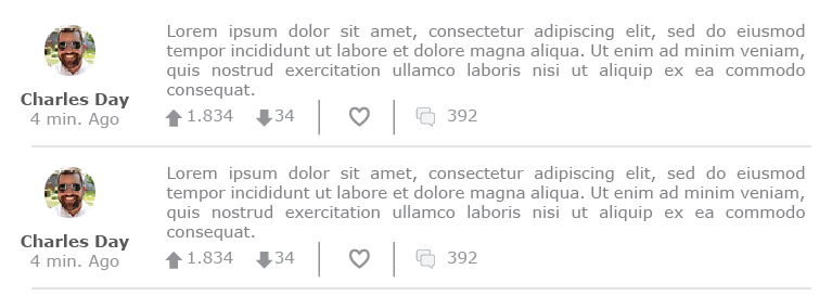
I have a design that currently looks something like this:

http://i.imgur.com/G4HgYoW.png

I feel that there should be some sort of visual split between the main content of the post and the options below it (the up and down arrows, etc.).

Note that the design isn't a block-styled design (like Facebook) where each post gets its own block. In this case, the next and previous post is immediately under the bottom border.

How can I make a visual distinction between the post options and the post content?

1
  • 2
    I think you already have a visual distinction--white space. I think it looks good as is. If anything, maybe add a few more pixels space between the text and the icon row.
    – DA01
    Commented Apr 10, 2015 at 4:25

3 Answers 3

1

Personally, I agree with DA that whitespace is most useful here, and maybe just increasing that will be enough.

A few other possible options:

  • Use a thicker line between the posts, and then use a thin line like the existing one to separate the post content from options.

  • Use a background colour such as grey, or the other colour in your scheme, on the post options. If you chose a proper colour (not grey) I'd recommend "washing it out" as much as possible beforehand, because absolutely any colour is likely to create a strong contrast against white.

  • Use a simple faded background pattern, such as faint diagonal lines. It depends on your overall design, but a simple pattern could work.

It's pretty difficult to offer suggestions when we can't see the overall context we're suggesting it for (the whole page), so I've given options for you try.

0

Design is looking well as it is, but if you want more integrated and visually distinct design for options(up-arrow,down-arrow,like,comments),

"Just put all options at right side".

1
  • Hi Kishan, welcome to GDSE and thanks for your answer. If you have any questions, please see the help center or ping one of us in chat once your reputation is sufficient (20). Keep contributing and enjoy the site!
    – Vincent
    Commented Apr 10, 2015 at 8:28
0

I would prefer "Grouping" before doing any layout. group the similar elements together according the the function and the main "element" you represent.

the post is the most important thing in that layout comes next the name and image then the helping tools like like share and comment, all are helpful tools for user participation, but they are not the main hero in the layout. I grouped them together.

so I did my preferred layout as shown below. as you can see I grouped the helpful user tools in the same block and keep the post the hero. and that layout reduced a little the white spaces.

enter image description here

as you can see I had aligned the post into two major columns one for the name and the author picture, the second for the post and its tools. the space between the two columns are for aligning what comes right alight it left and what come left align it right.

I hope I explained it well.

1
  • 1
    This is a valid option, but I worry that it has sacrificed some usability. The nice thing about having the image on top was that it provided a very nice separator between each block of text, making it a little easier to focus on the text one is reading.
    – DA01
    Commented Apr 10, 2015 at 16:33

Your Answer

By clicking “Post Your Answer”, you agree to our terms of service and acknowledge you have read our privacy policy.

Not the answer you're looking for? Browse other questions tagged or ask your own question.