2

I am redesigning a dental blog. So the focus is obviously content, they can read related news, download technical documents, watch videos, etc.

So I wanted the design to be subtle.

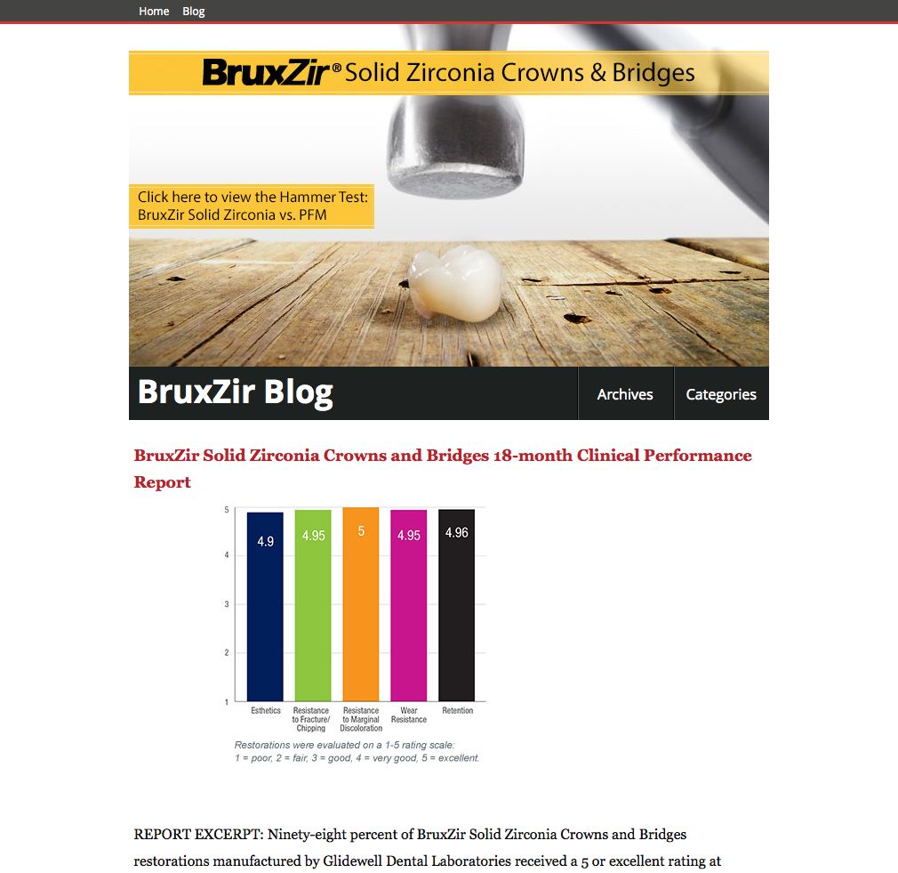
But the header I immediately wanted to grab their attention. Using Yellow to draw attention to the main selling point about the main product.

But it almost looks like there is too much attention there with that yellow and a little red. How can I calculate how much color contrast would be ideal? And should I perhaps put some dark background behind the header that expands full width?
enter image description here

1 Answer 1

1

I don't think this is an issue of color, but rather of elements competing with each other (using colors as well as other properties). For example:

  • Weight and type of Fonts: While the header uses thick sans-serifs (particularly in the logo and title), the content uses a bold yet small serif Georgia. The red title, for example, is similar in size to the report excerpt. The first time I looked at the image, I missed it completely.

  • Size: While the banner in the header is large, the content itself is quite small. The header looks more 'relevant' because it is simply larger. Might be too large, perhaps?

  • White Space: Content might be readable because of the white space, but in this case your readability is playing against the content's ability to stand out. Also, the graph being closer to the left, yet not left-aligned, confused me a little. At first I thought: Is that graph part of the banner? Is it another banner / service? I'd expect some text transition between the banner and the content, an introduction that makes it more obvious that the banner is not just an ad, it's actually a sort of presentation for what comes next. And I think this is something you need to be very careful about, because our spam-filled brains tend to ignore banners that look like ads.

  • Color: I think you shouldn't just look at the colors in the menu (red line) and the banner (yellow blocks), but also those in the graph, because they are also competing with the rest.

So, to sum up, while attention certainly goes to the main element (the banner), I think you still need to figure out a way to connect the content to it. As you mention, using a background could mean a huge difference, as color can be your connector.

1
  • Then again recent studies seem to suggest type sizes more appropriate for blind individuals. 16px for body type is huge. I suspect that the studies were done on devices which do not honor the pixel settings.
    – horatio
    Commented Oct 18, 2013 at 14:27

Your Answer

By clicking “Post Your Answer”, you agree to our terms of service and acknowledge you have read our privacy policy.

Not the answer you're looking for? Browse other questions tagged or ask your own question.