1

I have a workflow tree end users can build to:

  • Define conditions for execution
  • Perform action on condition met

Currently the UI looks like: enter image description here
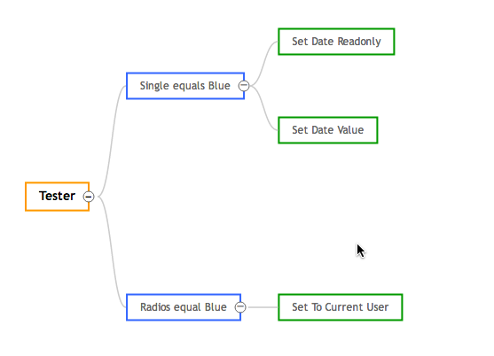
with blue being 'condition' and green being 'action' and root is orange.

Viso and other tools often represent the condition as a triangle, in order to represent the text correctly, that triangle might have to be pretty big.

I was thinking about just adding some sort of icon on the left of the words to represent but i dont feel that conveys the difference enough.

Any suggestions on how to accomplish the difference in the most effective way?

1 Answer 1

2

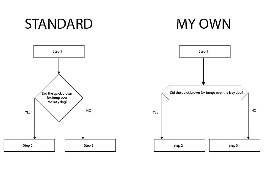
The diamond is the standard symbol for a decision node on a flow chart. Having said that, I always find it inconvenient, like you, to fit text inside the diamond. I often use this alternative (a very long hexagon), which is not standard, but at least is pointy. Mind you, if somebody else is looking at your chart and expecting for it to be standard it might take them a bit to figure out what kind of node is this.

enter image description here

Your Answer

By clicking “Post Your Answer”, you agree to our terms of service and acknowledge you have read our privacy policy.

Not the answer you're looking for? Browse other questions tagged or ask your own question.