2

I am new to UX design (zero sense on choosing colors) and designing my fist website (social networking) based on the logo I have. My logo colors are teal and orange. Based on these colors how do I determine what colors should go well for different elements?

For example; the background color for website (for example if we look at Facebook, based on their blue color logo they use an AliceBlue EDF0F5 background color), regular text color, heading color, link color, div border color, link hover color, subheading color, subheading background color?

Are there any tools to generate these colors automatically? I am following Google Material Design guidelines but when choosing the colors for the different elements it is all getting messed up (loosing clarity in typography).

2
  • Designing a social networking website as a first site is a bit ambitious!
    – Cai
    Commented Nov 30, 2017 at 14:31
  • Thank You @Cai for your response . I know it is a big task , but I have good knowledge on Vuejs and back end technologies . Also the front end the full flow is done , the only part I am really concerned is color combinations . It is not my subject , so became painful . ( I also tried giving the UI design to freelancers , but some how didn't like the output , So I went ahead and started this , the only part left is choosing good colors for front , back and for other )
    – Bujji
    Commented Nov 30, 2017 at 14:48

4 Answers 4

3

For color ideas go here: http://www.flatuicolorpicker.com/

Then take the hex value and play around in either of these color palette-generating tools:

https://color.adobe.com/create/color-wheel/

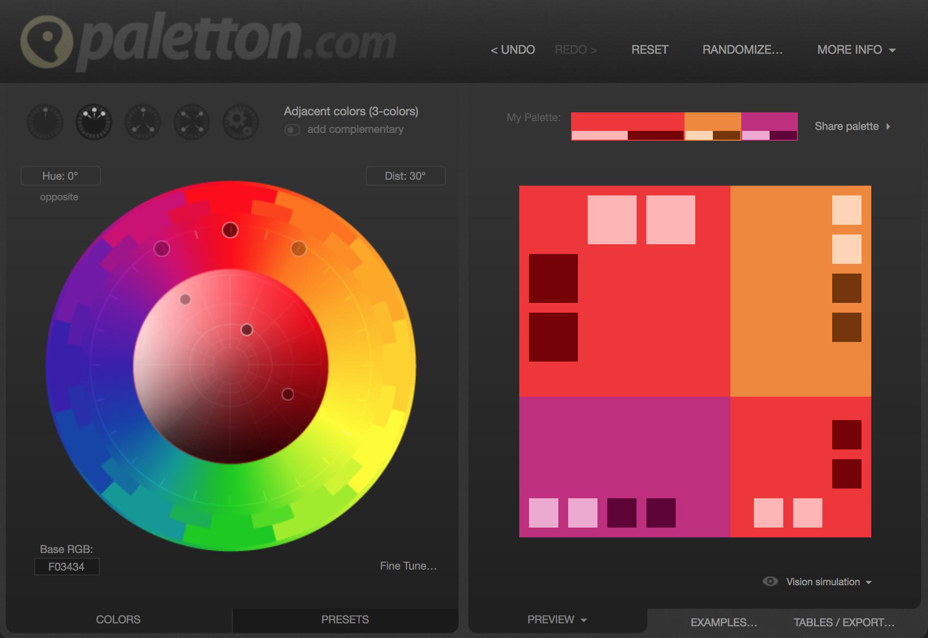
http://paletton.com/#uid=1000u0kllllaFw0g0qFqFg0w0aF

Here is a screenshot of Paletton in action using CINNABAR F03434 from Flat UI Color Picker (you can get the hex values by cliking on any of the colors in the palette on the right)

enter image description here

1
  • Thank you for your answer and the suggestions . Sure this helps me to think in that direction .
    – Bujji
    Commented Dec 2, 2017 at 12:33
1

It's best to stick to subdued neutral colors for most of the site, with teal and orange accents to pull the branding through.

Amazon has orange in its logo, and you can see matching orange in little pops throughout the site -- on buttons, titles, etc. Orange and teal are both strong, so a little goes a long way.

If you need other complimentary colors for elements (secondary buttons, call-out boxes), there are a lot of generators like http://colormind.io/ that will take a starting color and provide some harmonious options.

1
  • Thank you for your answer and the suggestions . Sure this helps me to think in that direction .
    – Bujji
    Commented Dec 2, 2017 at 12:33
1

Since you're experienced on back-end technologies, the tool part should be a snap, but color selection is subjective. In my opinion, you need a workflow to step through.

If you don't want to go with neutrals only, and you want other harmonious brights for alerts and other elements that need to win the bid for attention, find something in nature that contains your two colors, teal and orange, and photograph it. I said something in nature because chances are the other colors you find besides teal and orange won't clash with your logo.

Take the nature photo and open it in Photoshop. Pixelate the image into large-ish pixels. Then sample the colors manually, or pick the legacy menu item, "Save for web" and select a small number of colors to downsample that image to. Now you have a color palette that can get you started.

Here's an example using my daughter's cat, Shakira as the thing found in nature:

Shakira as basis of a color palette of griege and brown

You could try Themeroller to experiment with different color choices for common UI elements like headers, switches, buttons, and active, disabled and selected states. It will preview common widgets and layout elements for mobile web, and you can quickly spot less than ideal design choices and correct them. Then you can download your theme as a .zip file and use and share it.

1
  • Thank you for your answer and the suggestions . Sure this helps me to think in that direction .
    – Bujji
    Commented Dec 2, 2017 at 12:33
1

Well I am not very well-versed here in this case but a basic approach to do this is to use contrasting colors to your logo for your website theme. For example, if your logo is in a dark or shocking color scheme, I'd suggest using a light theme color with white background.

1
  • Thank you for your answer and the suggestions . Sure this helps me to think in that direction .
    – Bujji
    Commented Dec 2, 2017 at 12:33

Your Answer

By clicking “Post Your Answer”, you agree to our terms of service and acknowledge you have read our privacy policy.

Not the answer you're looking for? Browse other questions tagged or ask your own question.