2

I'm working on restoring an old drawing that wasn't stored properly. The paper (might be parchment) has yellowed, and the lines have faded. This results in the lines (the good part) being almost the same color as the background. And there is "dirt" on it as well, with the "dirt" appearing to be smears from other drawings, so it is extremely noisy as well.

In the RGB colorspace, red is the most different, at 10 percentage points. HSV and LCH is about the same as RGB. I'm trying to increase the difference between the lines and the background so I can remove the background.

I tried using curves to stretch the contrast on the red channel, but that didn't work very well. Next I tried decomposing the image using various color space models, then stretching the individual channels and recomposing. LCH, with stretching the L & C channels works best (H is left unchanged), but the result is still very noisy, and the lines I want to keep are "fragile". Any of the anti-noise filters I try either seem to do nothing, or make things worse.

Any other ideas for things I could try?

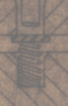
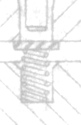
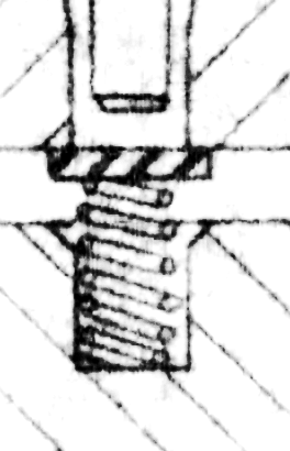
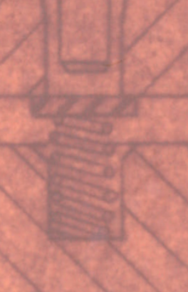
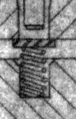
Update: Here's a small, but typical, piece of the drawing I'm trying to restore.

remove background how?

3
  • 2
    Always a good idea to post an extract of the image. And if the scan isn't an 8-bit image (JPG/PNG) post a URL where the scan can be retrieved in 16-bit format (TIFF...).
    – xenoid
    Commented Mar 26, 2018 at 6:09
  • This can't be answered properly without seeing the document in question. There are just too many unknowns.
    – Billy Kerr
    Commented Mar 26, 2018 at 10:59
  • Looking at the example picture... You can probably enhance it a tiny bit, but there's way too much noise to clean it up automatically.
    – Joonas
    Commented Mar 27, 2018 at 7:57

5 Answers 5

2

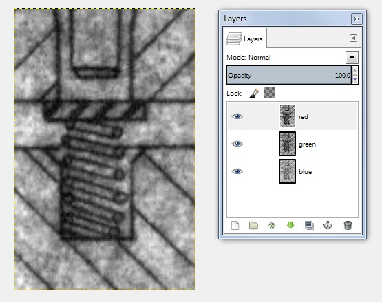
Spread the color channels to different layers. Use Colours > Component > Decompose to do it.

Stretch the contrast in all layers to cover the full scale 0....255. Do it with Colours > Auto > Stretch contrast. Now you have:

enter image description here

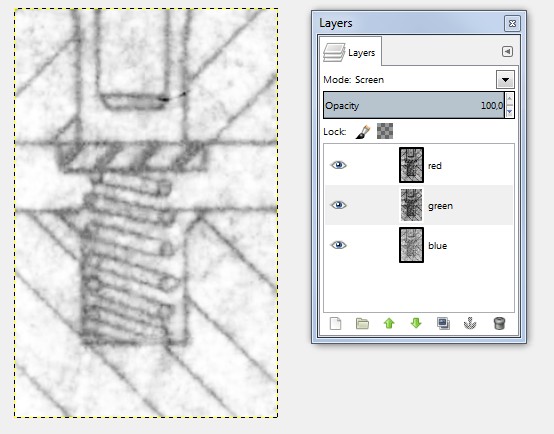
Now we assume that all color channels have some amount of same good from the original and different unwanted dirt.We can amplify the sameness by selecting blending mode=screen to the 2 topmost layers. The bottom layer can be normal:

enter image description here

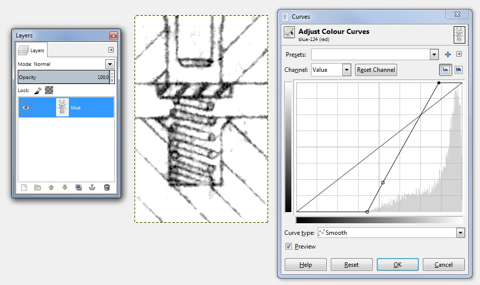
Finally we make it darker:

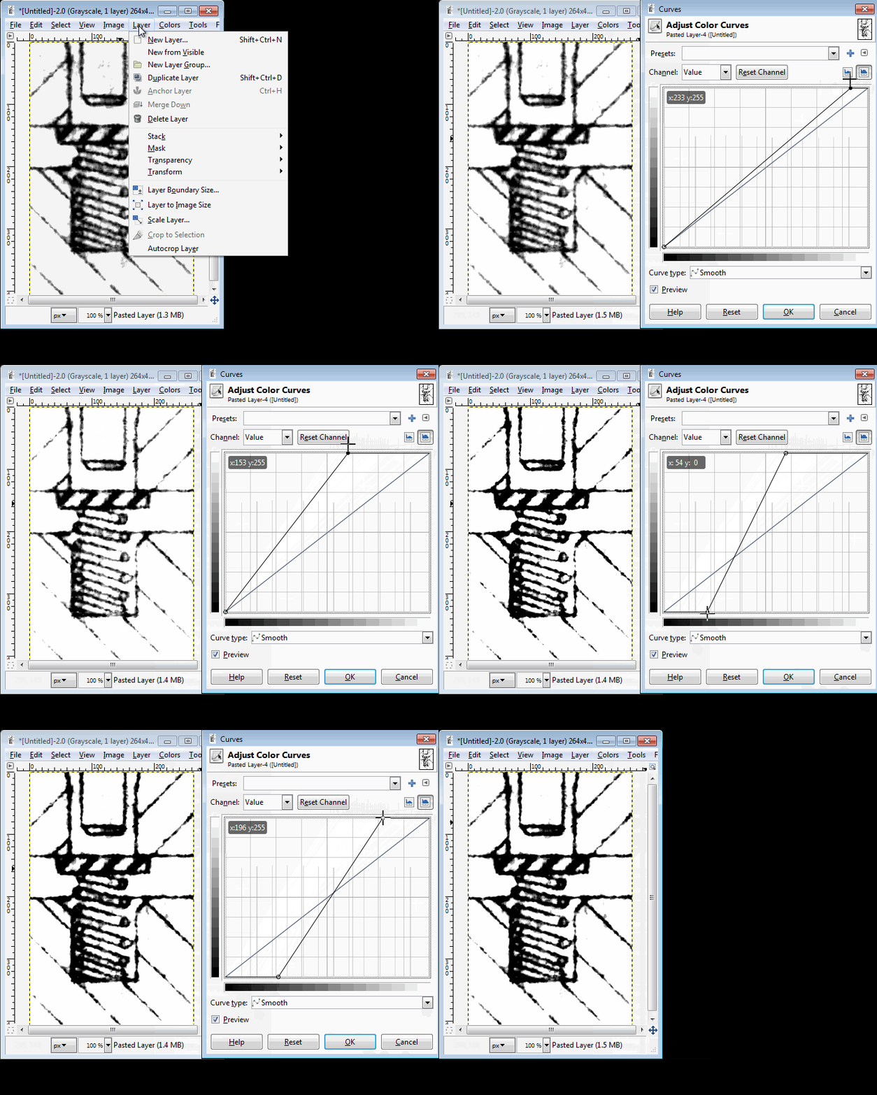
  • merge the layers "Merge Visible"
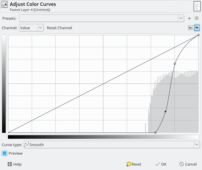
  • adjust the contrast with the Curves:

enter image description here

I am afraid that it do not become better in bitmap image editors. They have not a slightest idea that the image has originally been made of solid straight and circular lines, which also now should be the goal.

In theory a program which recognizes the ordinary CAD drawing objects (lines, circles, texts, numbers) with statistical pattern matching methods and replaces them with new ones, could redraw your image. I haven't met one which can extract something useful from images as detoriated as yours. That does not mean it's nonexistent.

If you have a possiblity to use AutoCAD, you can try its raster vectorizer, which is actually a guided redrawing tool. I haven't it.

1
  • Thank you for replying. Unfortunately in my case, the full original (which I can't post) isn't very uniform in dirt and good lines. The sample I posted is from a very bad section. As for autocad, I do have access, but I doubt it would help. I tried Inkscape's trace on this and the result was an unusable mess, except in the good areas. Commented Mar 27, 2018 at 13:24
1

Possible solution (a bit of a shot in the dark without seeing a sample):

  1. duplicate the layer
  2. Gaussian blur heavily so that the line disappear
  3. Set to difference mode
  4. Layer>New from visible
  5. Color>Desaturate (choose the option that seems to keep the lines best)
  6. Threshold to bring out the lines
  7. You can paint black over the remaining noise
  8. Open the Channels dialog, right click any RGB channel and Channel to selection

You now have a selection on your lines that you can use to limit the processing to the lines (may require `Select>Grow by a couple of pixels)

2
  • Interesting method, but in my case, this made it worse, not better. I have updated my question to include a sample. Commented Mar 26, 2018 at 14:39
  • Indeed. Looking at the histogram of your sample, the background smears seem to have stronger Red component than the drawing lines, so there could be a way to exploit this. Stay tuned.
    – xenoid
    Commented Mar 26, 2018 at 15:03
1
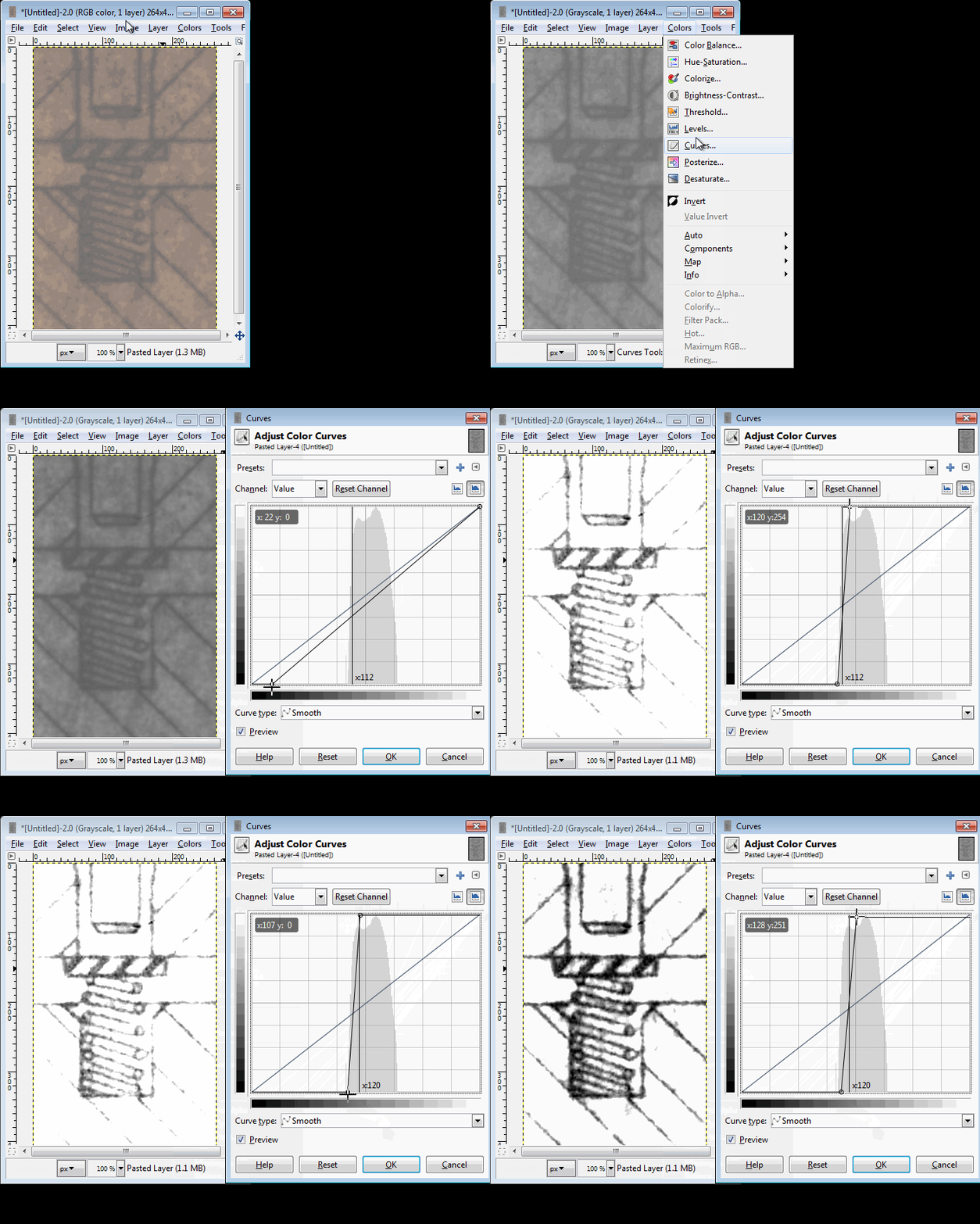
  1. Convert to Grayscale
  2. Open Curves
  3. Select the black line with the eye dropper for reference
  4. Play with those points until you are satisfied.

enter image description here

  1. Open levels again and fine tune it with more control.

enter image description here

enter image description here

1
  • Been using GIMP casually for years, and this is the first I've seen that you can use the eyedropper in levels. Thank you. I learned something I will use. Commented Mar 28, 2018 at 2:09
0

Another method:

  • Color>Compoments>Channel mixer and set output to Monochrome and use: R=200%, G=0%, B=-24%

enter image description here

  • Then improve the contrast with the Curves tool:

enter image description here

enter image description here

1
  • Thank you, although It does look bad to me. I did come up (independently) with the idea of using the channel mixer, although my method was different than yours. It's prob. a 2.9 thing, but I don't have a monochrome output option. Commented Mar 27, 2018 at 13:19
0

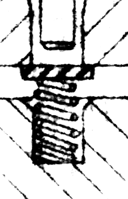
I had to get it submitted before you guys came up with your methods, so here's what I had to do.

First, as both I and xenoid noticed, the difference in the red channel was the greatest, so I enchanced that. Color>Compoments>Channel mixer and I set the red in the red channel to 200%.

red_enhanced

Next I decomposed to LCH (Gimp 2.9 only I believe; yes, finding LCH as the best was a lot of trial and error). The C channel looked horrible at first,

Inital C Channel

but after applying a Colors -> Auto -> Stretch Contrast HSV it looked better:

enter image description here

Next I duplicated the layer and ran a Filters -> Edge-Detect -> Difference of Guassians with the default settings (Radius 1 = 1, Radius 2 = 2). Then I set the layer to screen. Surprisingly, to me at least, it seemed to make it sharper.

After that, it was a lot of manual touch up using the lasso tool, quick masks, and bucket fill.

Thanks to all that responded.

enter image description here

Your Answer

By clicking “Post Your Answer”, you agree to our terms of service and acknowledge you have read our privacy policy.

Not the answer you're looking for? Browse other questions tagged or ask your own question.