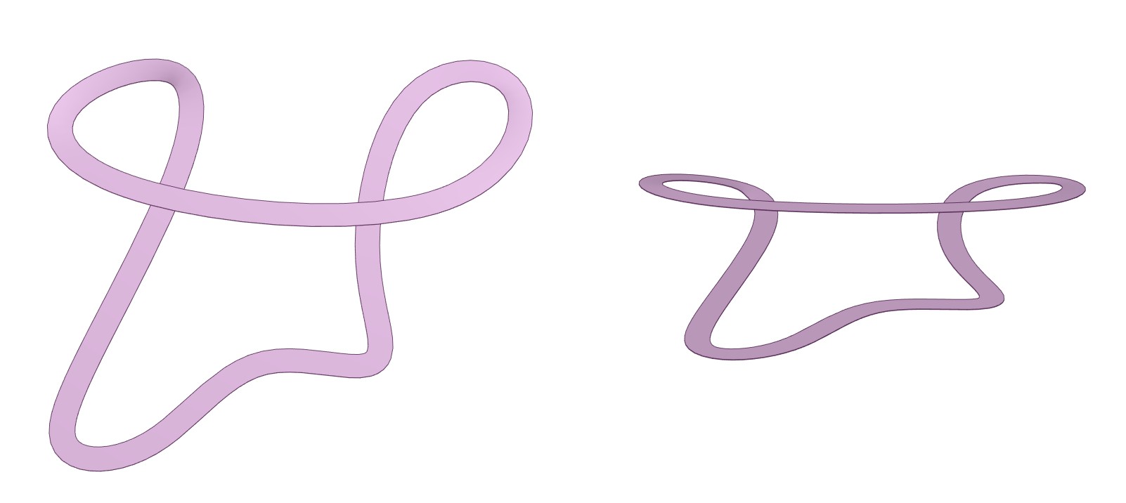
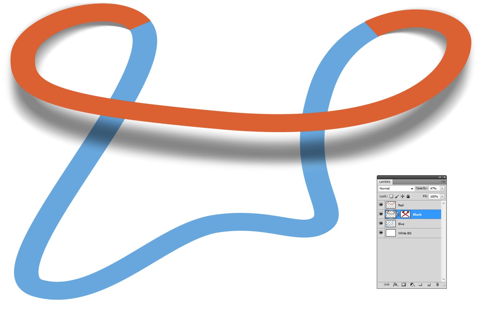
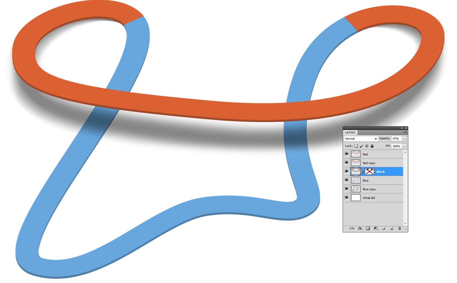
The apparent width of the path should be in accordance with the viewing direction if the path is uniformly wide. 3D CAD program is a good consult for this:

The left version is the top view and the other is a tilted view. In the top view the apparent width is constant, in the tilted view the apparent width varies.
Another reason for apparent width variations is the perspective. If you make distant parts substantially smaller be consistent. Every part of your composition should get the same treatment.
The shadow: Be skimpy! Do not waste the power to the whole path, present only the elevation differences if there's no reason to levitate the whole path. Rendering with light tells how the shadows could be:

See how the shadow gets wider and thinner as the path elevates. I guess you must visit in Photoshop and use the lens blur simulation filter to get easily the shadow density variation without painting it manually. Another option is to work with 3D program. Even this introductory version of KeyShot with its limited resolution and iteration count renders the shadow better than I would ever paint it manually from scratch with free hand.
Photoshop's 3D would render the whole thing properly with right shadows if one imports the 3D model. Photoshop doesn't have 3D modelling tools for space curves. Illustrator's 3D cannot help. The model must be created elsewhere.
Making it in 2D
The questioner obviously isn't going to jump into 3D to make this because it looks easy to be done in 2D if someone tells a few tricks. In 3D the light and path elevation defined the shadow. In 2D you have good possibilities to do the opposite: The shadow defines the apparent elevation. Of course this works only if the imaginary observer is much higher than the path.
User GeradFalla has already told the essentials how to place the shadow in a complex case. The next story shows how to draw a shadow.
This is one attempt in Illustrator:

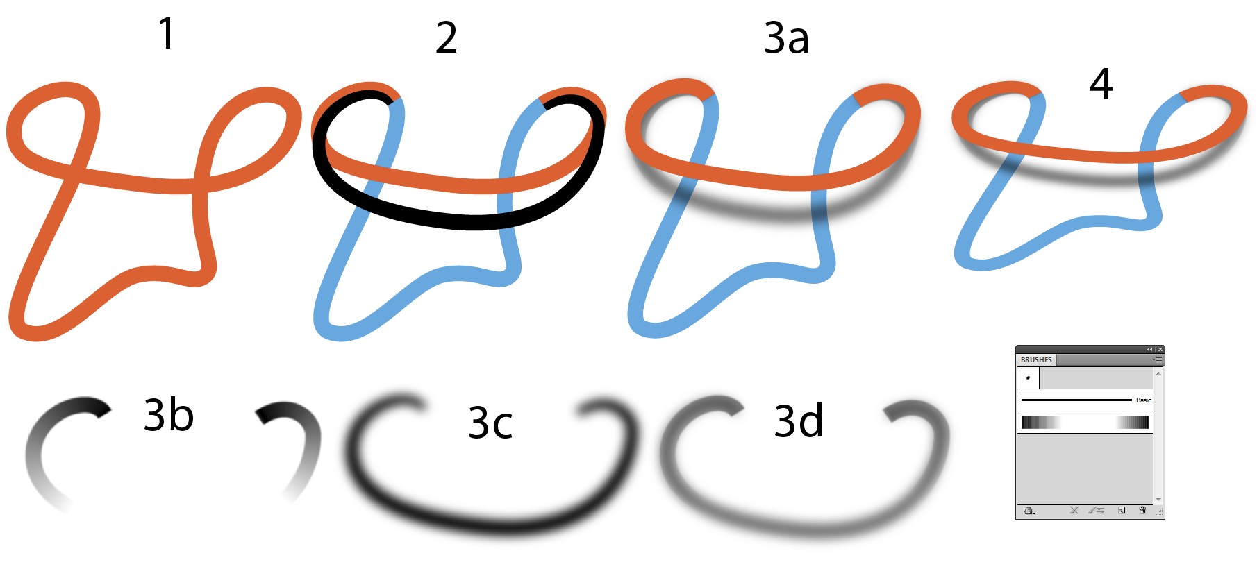
Top wiew of the path
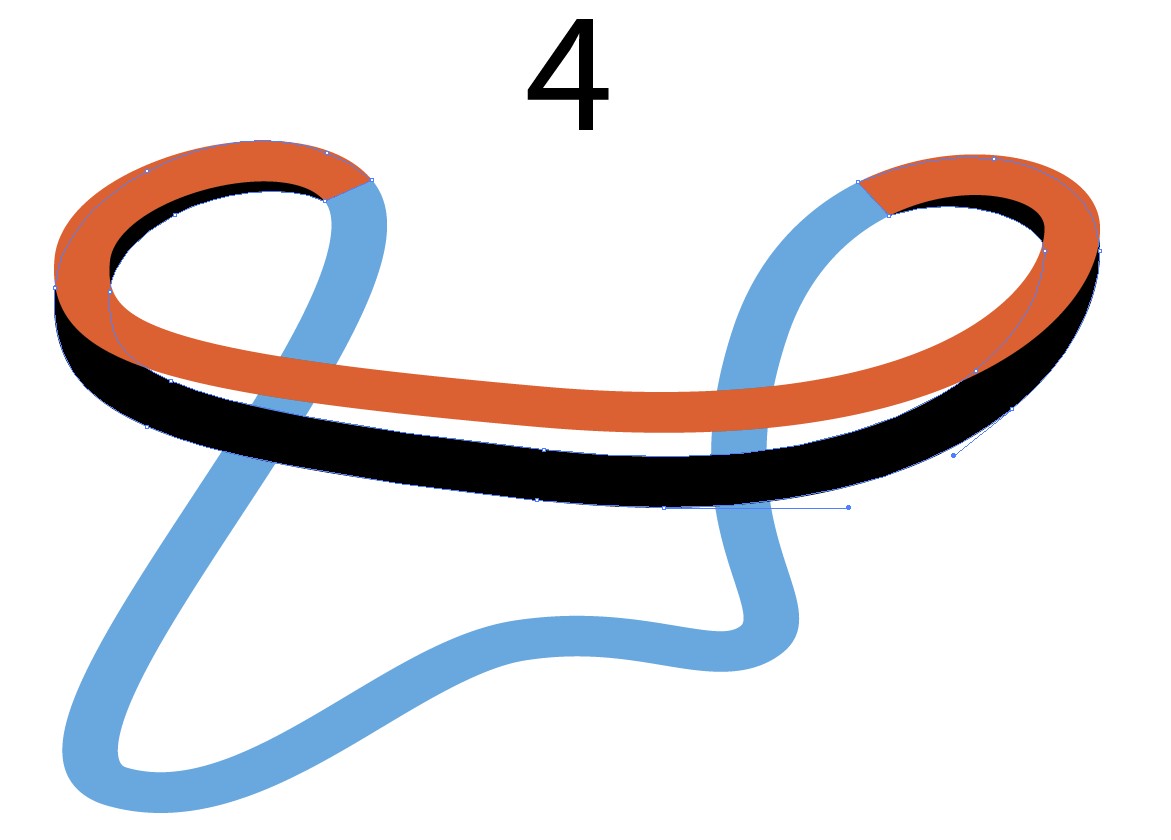
The path is splitted with scissors to 2 parts. The blue part is on the ground and the red part worms its way to the heights and back. A black copy of the red part is made. it's stretched and edited to present the placement of the shadow. The editing is tricky because there's no way to see the final result. Anchors, handles and path width needed to be tweaked.
3a. The final shadow is placed.
3b. One of the components is full width slightly blurred stroke which has gradient along path to make the mid part transparent. My museum grade Illustrator hasn't gradient along path, so it's simulated with pattern brush. The blending mode = multiply. The mid part cannot be transparent in my Illustrator, so it's white.
3c. The varying width black stroke with heavy blur
3d. Parts 3a and 3b are dragged to the same place, their opacity is reduced to 50%. Blending mode multiply makes the together still look thick
- All parts have got Path > Expand Appearance and Outline Stroke. Then all is squeezed vertically to get a tilted view with right path width variations.
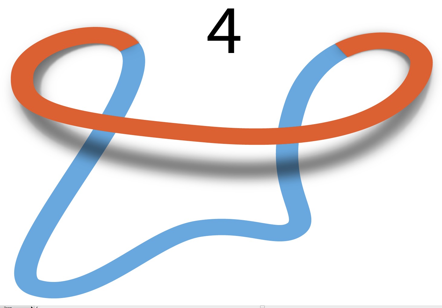
Watching image 4 in bigger size shows that it's not perfect. Blur is wrong, it makes the result dirty. Red and blue parts need also some thickness which is missing here.

There should be masks to prevent the spreading of the gaussian blur too much. In addition the whole process to edit the parts of the shadow was too tiresome because the result couldn't be seen during the edits.
Creating the shadow in Photoshop is far easier because there's perfect blur for this: The Lens Blur. The next version is made with it.
The process started in Ai image 4. The bad shadow is deleted. A new black shadow skeleton is made by duplicating the red part, stretching vertically, coloring to black and making the seam area to fit. Editing needs anchor manipulation with the direct selection tool.

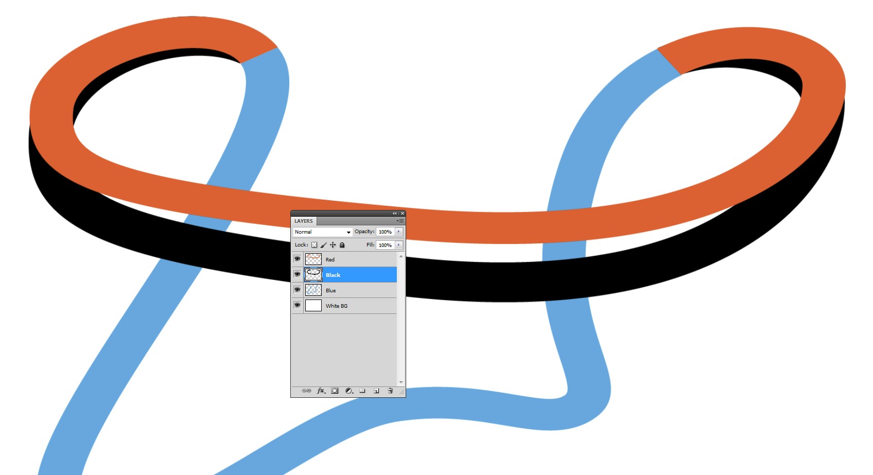
The next step is to copy the parts to an empty image in Photohop as separate layers. I have 1500 px wide PS image so everything can well be pasted as pixels without causing too much blurriness:

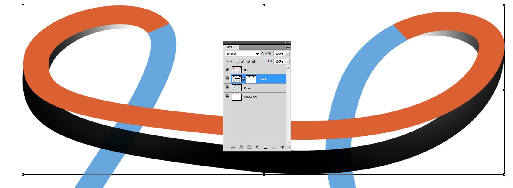
The lens Blur is controlled with a layer mask. A mask is inserted. The more transparent a point is due the mask, the less it will be blurred. I inserted two black dots to the mask with maximally soft brush.

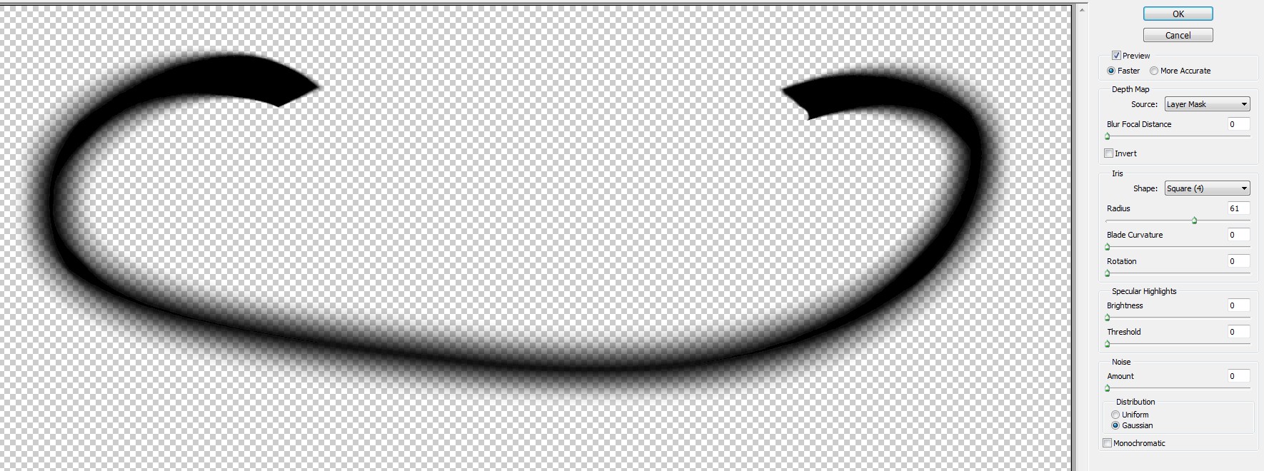
The black layer (not the layer mask) gets Lens Blur. Here's the blurring dialog:

NOTE: The mask inversion is ON
When the layer mask is disabled and the opacity is reduced to about 50%, the result is quite plausible:

The path looks more solid if it has some thickness. One can add darkened versions below the originals and shift them downwards few pixels. The seams must be fixed by deleting the extras of the dark red and painting the missing dark blue. The edits must be pixel perfect. The result is this:

BTW the shadow can be exported as PSD or PNG and placed to Illustrator if one can accept there rasterized objects. Copying and pasting inserts a background. White BG doesn't harm if the pasted shadow has blending mode Multiply in Illustrator.
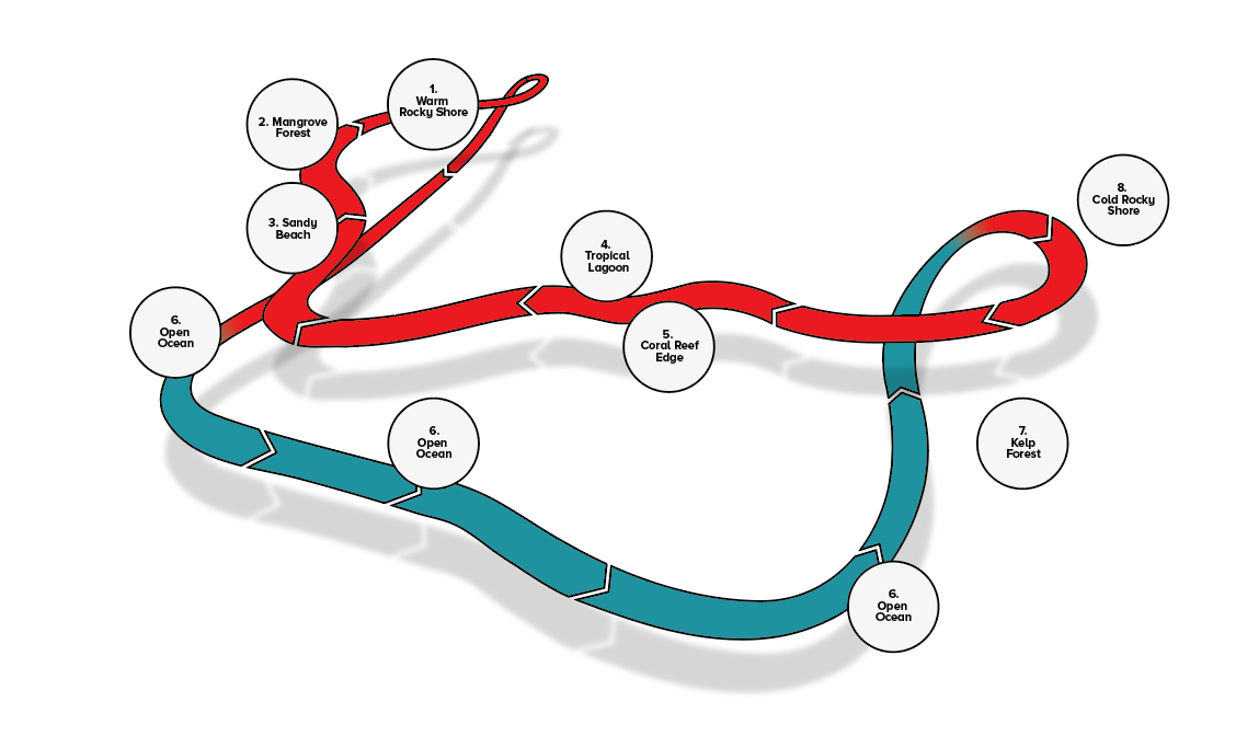
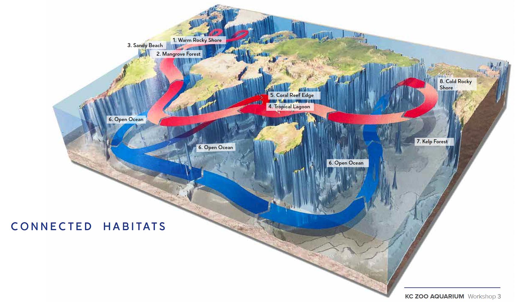 I would just trace the shadow in the image but it's too difficult because it's obscured in a few places.
