4

I work at a cabinet shop and I'm a software developer.

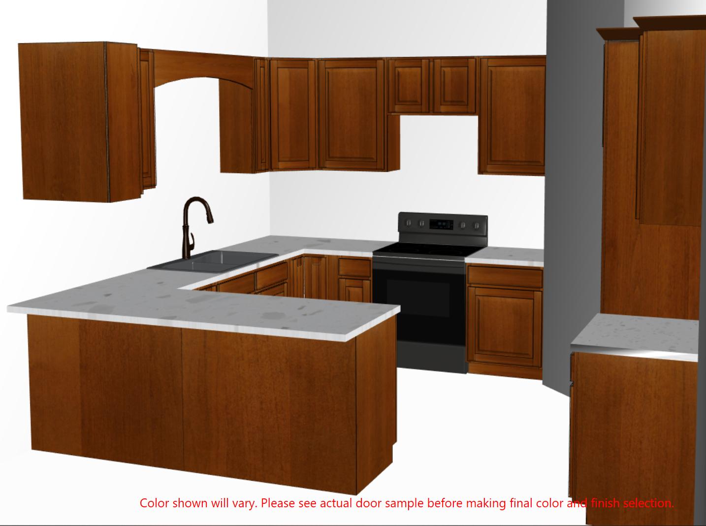
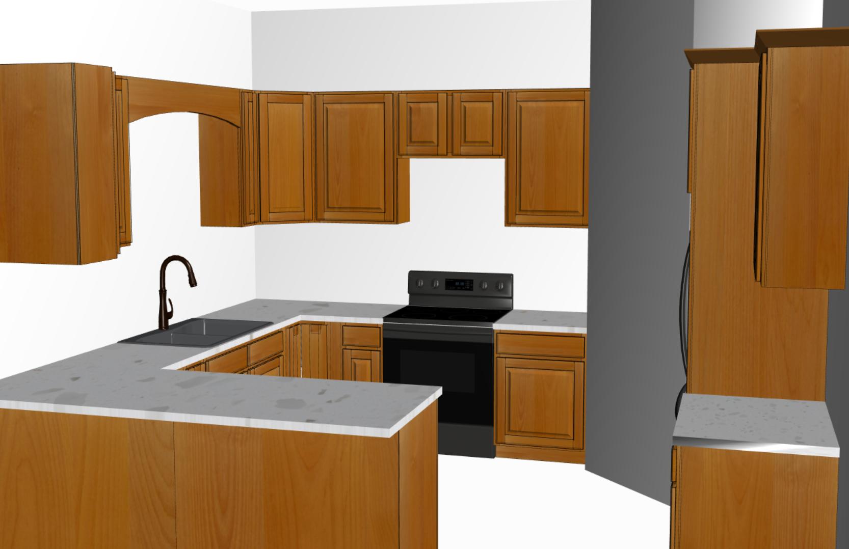
My manager and I (Team of 2 Devs) created a program for our sales team to be able to layout and design kitchens, select color and species and have it display the actual color and species. We've had samples made up and I'm taking pictures of them and having them display based on selection in our program. Here is the example of a few lighter stains below.

Example 1

enter image description here

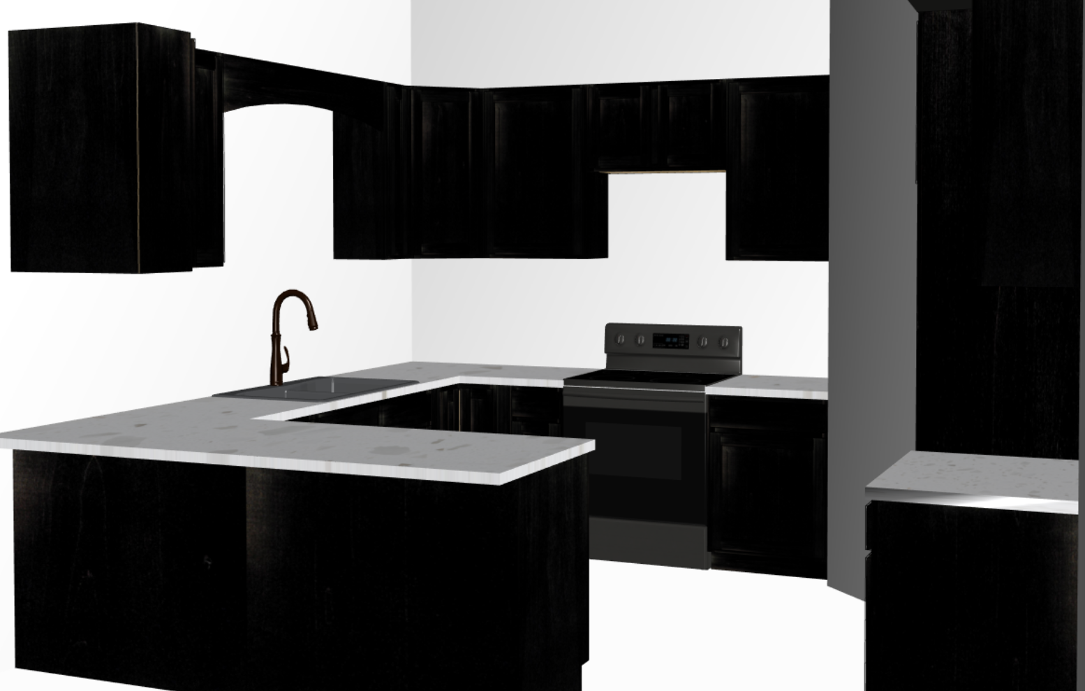
These are great representations of the colors that they actually are. Now, I take the darker stains in the exact same way I take these and this is the result. Its hard to see, it is definitely not that dark in person. What is the best way to lighten my image before I load it into our program for viewing? I've attempted just about everything I could read on the internet and this is my last hope.

enter image description here

I've been using Affinity Photo to try and make it appear a bit brighter so you can see the grain a bit better.

If it just screwed up because its dark and there is no way to fix it without making it look artificial let me know as well.

I've very novice when it comes to graphic design, images, photos, etc.

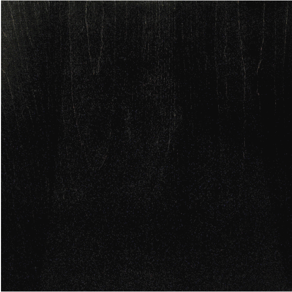
Here is one of my dark images. enter image description here

3
  • 3
    Hi. Welcome to GDSE. If these are the only images you have, there's literally no data in some of the black areas to recover. You can't recover something that isn't there.
    – Billy Kerr
    Commented Apr 23, 2020 at 21:45
  • 2
    You might want to edit your shaders a bit, and move away from 0-1 lighting models. HDR is your friend when rendering. Essentially all color should be captured with enough dynamic range to have details. Also nothing is that black, you need to have a autobalance too. But thats a topic for computergraphics.se
    – joojaa
    Commented Apr 23, 2020 at 21:48
  • Yeah, I agree with @joojaa, this is almost certainly a rendering problem with your software, or setup. Fix it there, not afterwards in post processing.
    – Billy Kerr
    Commented Apr 23, 2020 at 21:56

3 Answers 3

4

This question goes very deep into how you implement a rendering engine. Some quick pointers.

  1. Computer images dont have linear color. You need to convert your images to linear before calculating light and then back to the nonlinear state. If you dont do this you get that clunky 90's 3D look and feel.

    At minimum do inverse gamma before calculation and gamma on final image. 2.2 is standard RGB. But since the RGB transfer int exactly a gamma curve you may want to use a CMS instead. This has a huge impact on dark parts.

  2. You do not have any specular or bump. This becomes a strong part of dark surfaces.

  3. Lights. Since you dont have global illumination you need to use lights to fake the bounces. Make one weak light come from floor and one from opposite wall. Dont blow your image so much.

    Do not use infinite light sources, unless everything has a subtle bump.

    Maybe consider SSAO.

  4. Hdri. Also even darkest surfaces are actually dark gray. Them being black is not because they are black per see but the auto balance. Vice versa for white

    Ask photographer to supply you with hdri versions of images. Also ask them for bump and specular channels. Odds are you need a specialist photographer though. Or create your own.

  5. Auto white and black point.

  6. Geometry. Add filets to corners of your geomtery turn the normals to adjoining faces to create cheap fast rounds. If you must use infinite light adjust surfaces nonflat by adjusting normals out, slightly

But all of this is beyond the scope of this site go to Computergraphics SE and ask focused questions.

3

This is, I think, an example of an XY problem.

Your issue isn't what you think it is I'm afraid... when you look in the real world at dark stained wood in cabinetry, you see both GI (Global Illumination) reflections from all the other nearby surfaces, you also see a bunch of details in the wood itself you cannot simply capture with a single photo - several layers of specular grain flecks, sub-surface scattering along the wood grain fibres, some subtle colour and value gradations based on the wood grain and your angle relative to the underlying fibre direction... and all of those things make a dark stained wood look very alive to the eye in real life.

This is why applications like Quixel Mixer, Allogrithmic's Substance tools, and Foundry's Mari all exist - making really true-to-life shaders for CG is actually quite hard.

So if you're staying with a direct lighting only, forward renderer as your images show, you will have to fake these things for your darker wood specie - there's no real alternative short of re-writing your renderer to be PBR, and respect both PBR metallic and non-metallic workflows.

The process of faking it in the textures rather than setting up a PBR renderer will probably involve you extracting some images of wood grain from your lighter species, and overlaying it over your dark wood images, in a screen or overlay blend mode, with the colour shifted to an analagous hue to the dark wood's primary hue, but far lighter value.

Wood takes a lot to get looking good in CG.

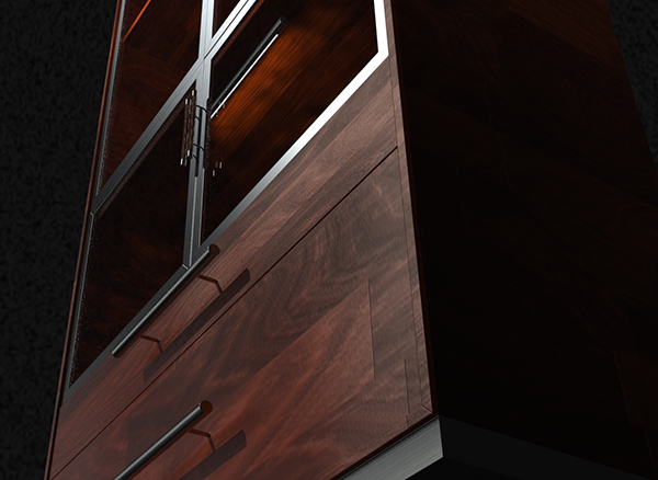
Here's a cabinetry render I did a few years back - took me quite a while to dial the wood in to look how I wanted.

enter image description here

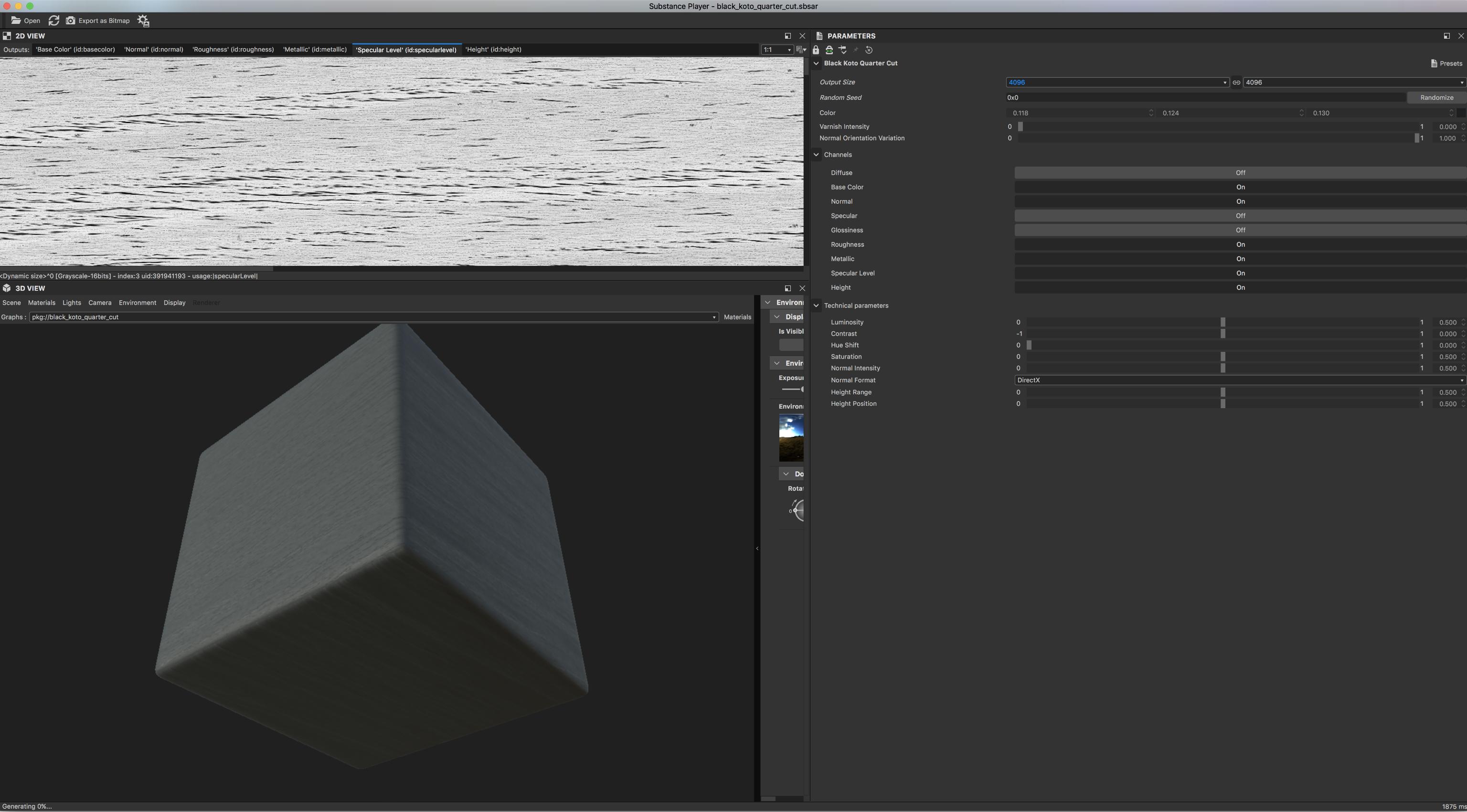
Here's a screengrab of Substance Player looking at a material of quarter sawn Koto:

enter image description here

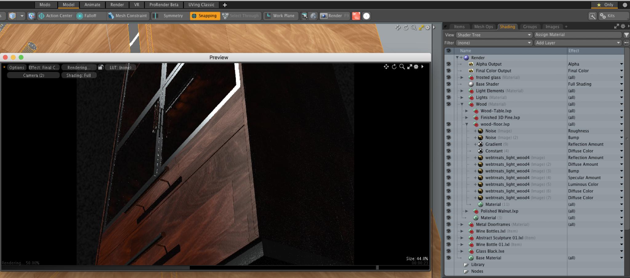
And here's a screencap of modo looking at that material from my old cabinet render:

enter image description here

These images are here primarily to give you a general sense of the depth of channels and data needed to get decent wood in renders.

Hope this helps.

1

I will not try to make a definitive answer, just some ideas.

I.

Your image looks darker than intended because you have a very white wall flaring into the image. The "ideal" is a neutral middle gray. You could change it to a darker background if the texture applied is dark.

This is the contrast. Every image will look darker if it is next to a light background.

II.

I do some real estate photography, product photography, and 3D rendering. It is all about where you put your light. I understand that your render engine is simple, but you can not emphasize the shapes of 3D objects using a flat light coming from the camera. In real life photography, it is better to turn off the camera's flash. If you can add some lights somewhere else, good. If you can put some lighter shades on some angles, better.

III.

The lighten part. This is too technical for me, but as far as I understand, renders should have a gamma applied before the final image is shown. I believe it should be a gamma function of 2.2.

What a gamma function does is to quickly lighten up the dark zones of an image (the blacks) and at a slower rate the already bright parts.

This will also modify the other images as well, so, the same as the wall, you probably need to add them if some dark textures are applied.

I can not quote a direct reference on how the gamma should be applied, it is just to give you a hint.


I do not know if you are generating the images in "real-time" or "on the fly" But if you are only rendering images and then on your app, loading them as any normal photo, you should probably use a photorealistic render engine, like Cycles in Blender. It is free.

Even if you generate them on the fly, you can prepare one "pass" of the shadows, gloss, etc, and simply add a "texture pass".

0

Your Answer

By clicking “Post Your Answer”, you agree to our terms of service and acknowledge you have read our privacy policy.

Not the answer you're looking for? Browse other questions tagged or ask your own question.