6

I have a scan of an old children's book that contains both graphics and text. I want to revive the book for my children, while preserving as much as possible from the original layout and illustrations.

I have a very limited experience in this field. I thought of using Photoshop, which I have used in the past for other projects, but none of this kind.

My approach was to try and segment each image, find the contours and fill the regions with new uniform colors, based on the original colors, such that I obtain clean illustrations. Also, if possible, I want to get the text such that I don't need to retype it (but this is only a minimal problem, since the book does not contain too much text).

I don't know if this can be semi-automatically done in Photoshop. I found useful the Trace Contour filter, but I assume that there are also other tools that can be helpful in achieving a good results with a least manual effort.

Here is what I achieved so far, by a direct approach using the Trace Contour filter in Photoshop, then by manually filling the regions with uniform colors from the original scan.

How would you solve this task? Any hint or advice would be helpful.

Original scan of the cover:
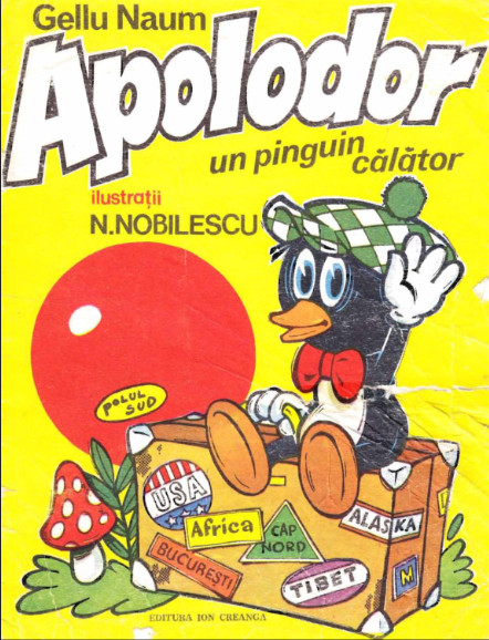
cover_scan

Partial result:

cover_result

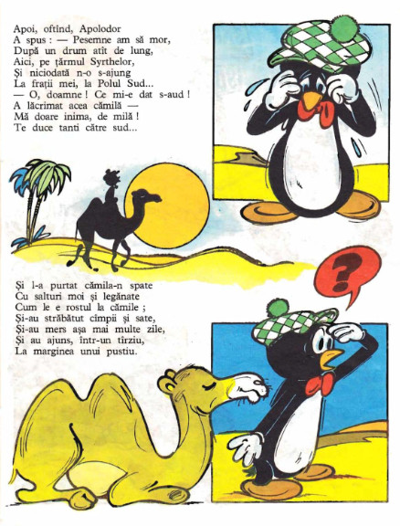
Two more scanned pages from the book:
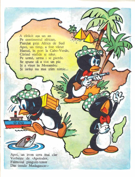
page 1 page 2

2
  • What the purpose? Personal? Professional? I ask because there are ways to improve appearance of the images you have, then there are ways to really solve issues permanently and correctly. The latter would take considerably more effort than the former.
    – Scott
    Commented Jun 16, 2013 at 17:25
  • @Scott: This task has only a personal purpose, no professional or commercial aspects are involved. Yet, I would appreciate a "professional" approach, meaning that am I eager to learn new skills and improve :-), since my experience is quite limited. Commented Jun 16, 2013 at 20:28

2 Answers 2

5

My "professional" approach would be to vectorize the whole thing. This would not be a trivial task and would require lots of time and dedication. If you're not familiar with the process, I think this would be a good project to learn with. Since you mentioned that you're eager to learn new skills, I'd give it a shot if I were you.

You talked about the use of Photoshop, but that's not the tool I'd use for to vectorize. Illustrator is much better for this sort of thing.

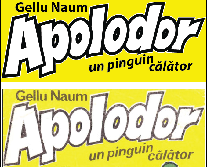
To give you a rough idea of the sort of deliverable you'd be able to produce:

Apolodor Vectorized Version
It's not perfect, just a quick demonstration!

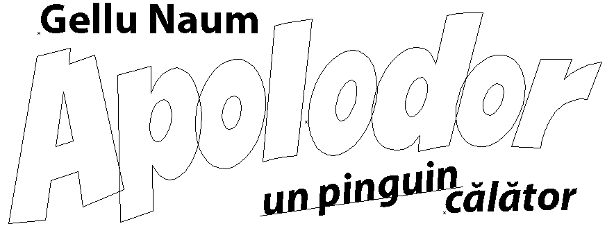
To vectorize, you'd primarily be using the Pen Tool to "hand trace" all of the shapes on each page. Here is what the vector shapes look like of the portion that I vectorized:

Outline View

There are also various other tools that you could use to help with the process. Illustrator has a tool called Live Trace that would be able to "vectorize it for you" (although some hand tuning would probably be required).

I think the most difficult part of this process for this case would be achieving the "watercolor" illustration effect, but with enough patience you would be able to create a very polished result.

1
  • 2
    This is what I was eluding to. Quick and dirty, you could use levels in Photoshop and the paint/repair bad areas. The optimum way would be to recreate the art in a vector application.
    – Scott
    Commented Jun 17, 2013 at 1:25
2

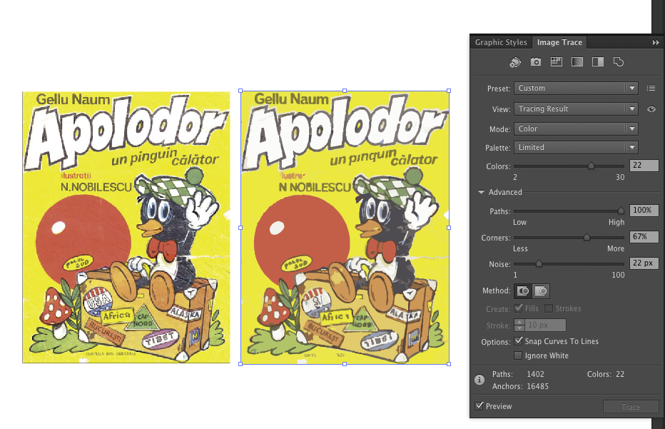
To add a bit more detail about saving a little time getting a head start using Illustrator's image trace featute, which JohnB alluded to:

It works well for getting a good start on the key shapes in the illustration and the layout. It's rubbish for text and always gets some details wrong, so you'll want to replace the text with real or hand-drawn text and you'll want to check the details. Also, tinker with the settings to get the best head start - but don't try to get something perfect, get the broad shapes then fix the details by hand.

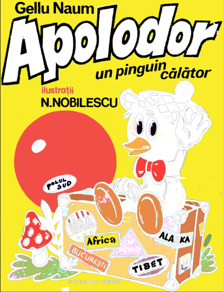
Here's an example illustrating the above...

enter image description here

A few specific example flaws needing fixing to note that are typical of auto-tracing:

  • Fudged colours like the duck's eye colour and the 'Tibet' sticker - change the fill colours by hand
  • Damage and noise turned into unwanted colours - e.g. the duck has acquired a camoflage pattern and a birthmark on its right foot. These can be merged with the surrounding colour (pathfinder window)
  • Incidental texture or resolution issues turned into shape distortion - e.g. the rough edge of the circle, which is probably best replaced with a simple elipse.
  • A lot of lines aren't smooth in the right places - some will be easier to just redraw, but most can be fixed with the path smoothing tool (hidden under the pencil tool)
  • Awful text, which needs replacing with real text or hand-drawn lettering.

...but a lot of it is very usable.


After applying the above fixes, you'll probably find you have something that is too clean and polished - too far the opposite direction. It's common to take the vectors to something like Photoshop to apply subtle texture and tweaks to get a finished result. Have a look for tutorials on applying watercolour or ink illustration like effects in photoshop.

Your Answer

By clicking “Post Your Answer”, you agree to our terms of service and acknowledge you have read our privacy policy.

Not the answer you're looking for? Browse other questions tagged or ask your own question.