26

In studying composition, we're told to pull the viewer's eyes into the frame using a strong focal point, and then lead his/her eyes into moving around inside the frame and hold his interest inside the composition.

Okay, but I'm curious. If the focal point has the most contrast and visually pops out most from everything else, why do your eyes move away from it to other elements?

4 Answers 4

12

To add a bit of science, here three things that are counter-intuitive but important to know about vision.

They explain why viewers navigate visuals by drifting from a focal point, following any natural flow - and why it feels so much more jarring when there isn't a natural flow to follow.

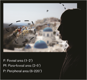
  • Your vision outside of the very centre of what you're focussing on is far worse that you realise. There's a tiny circle in the centre of you vision that is crystal clear, and everything else is blurry.
  • Unless you really stare, your eyes move far more than you realise: multpile tiny, very fast jumps per second called "saccades".
  • So, the clear, normal vision you're used to is created by your brain aggregating the information it gets from all these tiny jumps, and filling in gaps based on expectations and experience. It's a mixture of areas of clarity plus some massive assumptions, which is why it's possible to, for example, completely miss a dancing gorilla if it's not what you're focussing on.

Here's a rough diagram from an article about eye-tracking I found. I think this diagram is actually over-estimating the clarity of the area outside your main focal point - the P area really only notices movement and very strong shapes or colours:

enter image description here

Your brain chooses where to jump/saccade to next based on the limited information it's getting from the blur.

When quick unconscious saccades aren't enough, big shifts in attention happen - the ones you notice and are consciously aware of. These are much more effortful - whereas saccades are something your visual system just does unconciously.

Your brain doesn't want to spend too much energy doing too much processing or attention shifting, so it will try to do what seems to be the quickest sweep taking in those things that stand out in the fewest jumps, figuring out as much as possible by educated guesswork. It does need to identify all the key features that stand out, however - unexplained anomalies put the other little guesses in doubt - so it's natural for a focal point to not fix vision but to be a starting point for the eye's exploration via saccades.

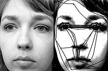
For example (from the saccades wikipedia article) here's what eye trackers show your eye is actually doing when you think it's looking straight and steady at a face:

enter image description here

This is why it helps not only for secondary areas to stand out clearly, but also, for there to be features like leading lines or a clear hierarchy, giving a path or stepping stones to guide the eye's natural movements the right way.

In a well composed piece, this exploration is a chain of saccades that finds its way naturally around the piece in the intended order without the viewer feeling like anything effortful has happened.

1
10

Simple answer: Curiosity.

Some detail;

It depends on the composition. @Yisela had some great examples of focal point (and balance) here, I'm going to use one to explain my thoughts on the eye movement.

So example:

enter image description here

Obviously you focus on the the people in the center immediately. But take a second to notice where you naturally looked next.

For me, it was to the logo on the top left, then the Stokes logo and then the contents of latest news.

Coincidence, I think not! If you join up the yellow on this page starting from the most dominant focal point (the people) and working your way down in terms of focal dominance you'll see that it essentially makes a diagonal yellow line from the top left, to the bottom right and flicked up to the 'latest news' section.

Essentially the way I think about it is if I were to remove focal point A, what would focal point B be. This tends to be the way the eye travels. Also people are naturally nosey so we do tend to look at what we think others are looking at (in this case, logo top left).

I guess it could also be considered a reverse divine proportion. Given that you understand focal point already. Consider that a person looking at the focal point will very naturally go to whatever it is leading them to 'next' people are curious and impatient :) and once you've seen and absorbed a focal point, the element that is next is what then becomes the focal point for you as the original focal point is no longer the 'most important'. (In those seconds of course, this is most certainly not to say that overall the focal point is not important).

It is this approach that makes some surrealism extremely effective.

This piece by Vladimir Kush for example;

enter image description here

What a beautiful sunset, right? A perfect fit for everything that we've learned a focal point is. High contrast etc. everything about the image pulls our eyes right to that giant glorious, golden egg yolk.

See how there's scafolding supporting the eggshell - now isn't that a clever way to guide our eyes there later - post beautiful sunset focal point :)

8

Interesting and very big question. Research with eye-tracking shows that people "take in" a visual object differently. If you have a black-and-white image with one red dot, many people will have great problems afterwards to tell you what else but the red dot was there. However, placing another red dot somewhere will pull the gaze towards that too, and most people will with greater ease "take in" or actually "see" the whole.

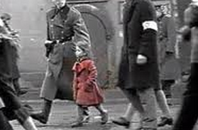
An example of almost the oposite is the film Schindlers list where a little girl is in a red coat, and the rest is black and white. However, the aim of this is to highlight the confusion, the masses of people and to pick out one to show that 1. they consisted of individuals 2. the viewer (Schindler) recognise her later as one of the bodies on a lorry. It is worth noticing that this effect is extremely deliberate, and also that this is film, so the pictures move, and our eyes are pulled around by the red coat.

enter image description here

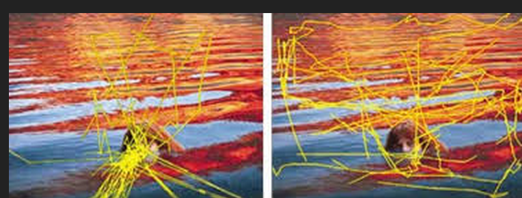
There are a lot of research done on the eye-tracking of art, images and web. People see art differently as their eyes wander over the image. Particularly worth noting is that artists "see more"; they take in more of the image, more of the detail.

Here are two examples of an artist and a "lay"person looking at a painting: enter image description here

enter image description here

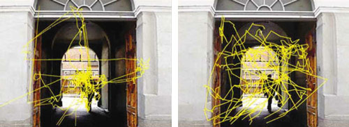
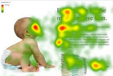
In recent years, this have been extremely interesting relating to web, and much research has gone into creating heat-maps of how we look at a screen and an object. Here are two examples:

enter image description here

enter image description here

In the case of commercial use, producers of products are very interested in how to guide our eyes to the most important things. If you are only looking at a product for a few seconds, they will try to make sure you focus on the two-three most important things. When spending more time, such as art or something you are already interested in; the object "has more time" to assist your gaze. To make this interesting, and to get people to see details outside the focal point, you need to guide them.

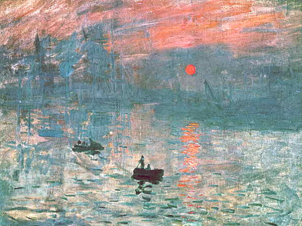
Edit: A small addendum: our centre of focus is very small. The impressionists used that and explored it. Here, Claude Monet: enter image description here

2
  • My down vote. I feel this gives a lot of examples without actually providing any answer to the question.
    – Scott
    Commented Jan 20, 2014 at 17:13
  • 3
    Sorry to hear that; i thought it was a good addition to the other two answers.
    – benteh
    Commented Jan 20, 2014 at 17:17
1

Weight, size, and the margins play a big role in how we scan. By adjusting these features, you can delineate someone's "visual digestion" of your content. Though you may arrange text in a syntactically correct order, the size, weight, and margins around the text are what guide the viewer's eye. As evidence, find a well-designed, text-heavy poster and take several steps back. From this vantage point, only certain details are clear and it's likely that these details are the "sell." "Write better code!" "Find a better job!" "Get a degree!" As you move closer, more detail emerges. "Download our tool." "Visit our website." "Come to University." A layout is like a conversion funnel, if I don't get your attention with the hook, "Write better code!" than the detail of "Download our tool." will be lost on you.

Another important consideration are the "user conventions." Consider this, it's natural for we English speakers to digest a layout from the upper left-hand corner down, especially when there is text.

Consider too where you aren't looking! I like to pretend that I have a mental version of AdBlock Plus installed in my cranium because without even thinking about it I am very effective at snubbing banner ads. Never put important content where people are good at tuning things out!

Your Answer

By clicking “Post Your Answer”, you agree to our terms of service and acknowledge you have read our privacy policy.

Not the answer you're looking for? Browse other questions tagged or ask your own question.