Does anybody know about a nice climate diagram visualization, incorporating more information than the example on Wikipedia:
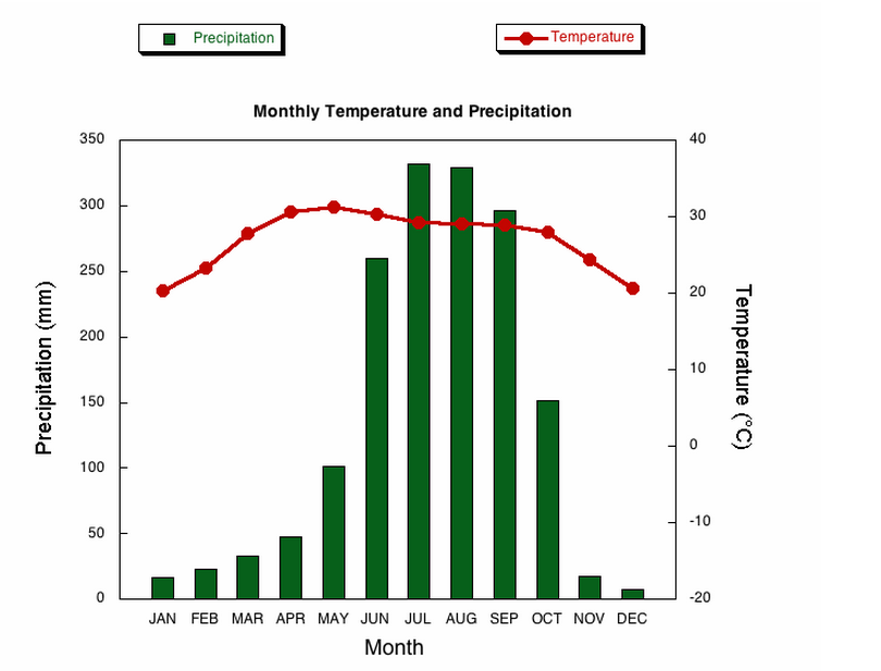
For example also data like, snowfall, humidity, hail, fog, thunder and so on ..
I appreciate any pointers!
Does anybody know about a nice climate diagram visualization, incorporating more information than the example on Wikipedia:

For example also data like, snowfall, humidity, hail, fog, thunder and so on ..
I appreciate any pointers!
What you are looking for is a multivariable weather chart. To my knowledge, there is no standardised model for what you are looking for specifically. If you study meteorology information sites, you will find that they usually use multiple charts to demonstrate what is going on.
Here is what to consider:
The use of timespan will greatly influence what sort of chart is used: the level of granularity (detail) is crucial.
If you mean that your data on storm/fog/thunder is important then the month-average might not be good enough as these are short-term events. If you on the other hand are mainly interested in roughly average thunderstorm occurence in july, or how average july compare to average october, you are fine with the basis that you have, then no problem.
But to see potential correlation between the events such as "low humidity + cold temperatures = snow but only in january, all other months not" "high humidity, low temperatures in april = larger potential for fog"
Your average month data will not be detailed enough to show these correlations.
To drill down in the variables a little:
This is your key variable. A simple, basically one numerical value (1=january, 2=february). However, the length of events also have a time variable.
Pretty easy: this is one numerical value (average per month)
Simple, one numerical value
This can be rain, snow, hail. So technically, this is three variations within the same variable.
On the top of my head, the rest of variables seems to be events of limited time (and in some cases, space). Again, depending on how much data you want to display (how many measuring points you have).
Fog is usually very localised geographically, but highly likely to be a correlations with humidity and temperature. You could lump thunder and typhoons under one umbrella called "storms". Again, with the level of detail.
First: all illustrations are just crude sketches; I apologise for the lack of alignment etc. My point is the concept, not the execution.
We are used to reading time from left to right, and reading temperature as vertically increasing so keeping this is sensible. As to the example in your post, I would personally switch precipitation and temperature, so that temperature would be on the left. This for no other reason than that is a "higher level information": a unit likely to be one of the first to explore. But no matter.
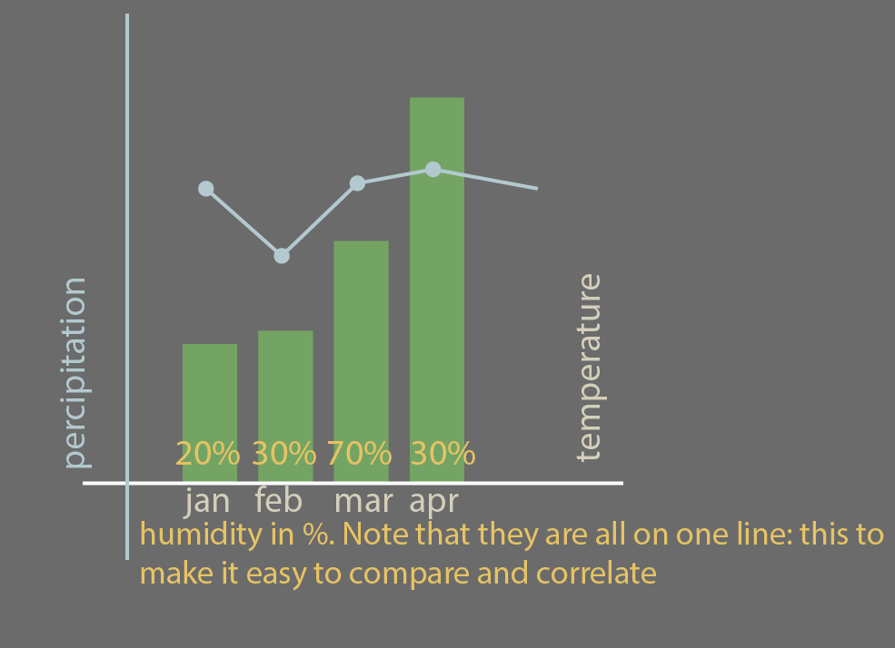
I would keep the basic model. In the temperature bars, they could double as elements that contain information on humidity, I can think of two ways: Put the numeric value inside the bars:
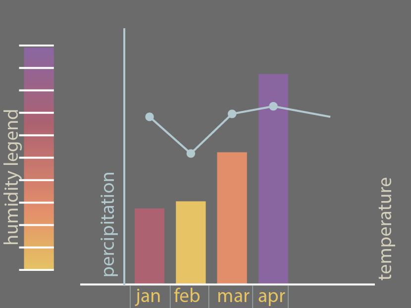
Make some sort of colour coded legend indicating humidity:
This is, in my opinion enough information in one chart. As for the rest of your events, I would simply make a new chart. But there is nothing that hinders you from tagging it onto the existing one. For example:
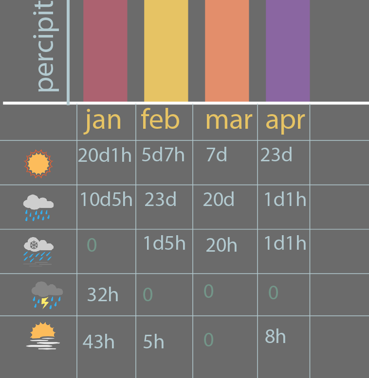
As you see, I have given events days and hours. "In january it rained for 20 days and 1 hour".
If you want to be wildly detailed, you could include overcast/cloud, UV, wind speed etc. And you could play with including the result of weather, such as , flooding, snow depth and forest fires. This needs to be separated out, as these are results of, not the weather phenomena themselves.
Having said all this: Do not underestimate the sensibleness of using multiple diagrams. Do not force too much data clutter into a single graph: you will make it messy instead of enlightening. The whole point of visualising something, is to show correlations not obvious in text/tables. Too many variables in one chart, and it is of no use to anyone.