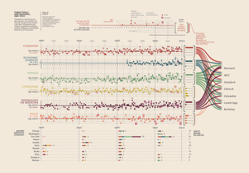
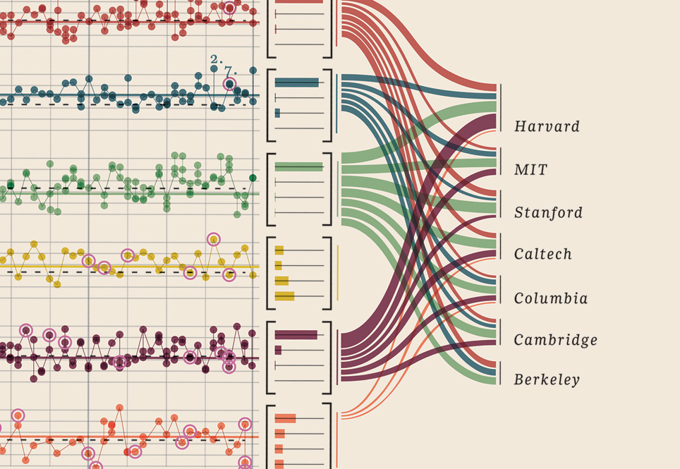
Edit III: I found an imensly gorgeous example of multivariable quantitative data visualisation, and had to add it. You will find it under the heading "Edit III (Nobel laureates)".
Edit II: there has been a little misunderstanding, and I have edited to try to clarify how I interpret the intended use of the data. I have replaced two images and added a section "Do you want fries with that?"
Graphics reveal data.
Edward Tufte:
Clutter and confusion are failures of design not attributes of
information. Clutter calls for a design solution, not content
reduction. Quite often, the more intense the detail, the greater
clarity and understanding, because meaning and reasoning are
relentlessly CONTEXTUAL. Less is a bore.
Why do we visualise data?
- Tools for thinking
- To show the result of intense seeing
- To understand a problem, to make a decision
- Show comparisons, show causality
- Provide reasons to believe
How?
- show the data
- induce the viewer to think about the substance rather than about
methodology, graphic design, the technology of graphic production or
something else
- avoid distorting what the data have to say
- present many numbers in a small space
- make large data sets coherent
- encourage the eye to compare different pieces of data
- reveal the data at several levels of detail, from a broad overview to
the fine structure.
- serve a reasonably clear purpose: description, exploration,
tabulation or decoration.
- be closely integrated with the statistical and verbal descriptions of
a data set.
A few definitions:
Data:
is generally thought of as "stuff that is sorted in databases". This can of course be numbers, images, sound, video etc. Data is what is collectable, often quantitative. In its rawest form it is hard to digest; just walls of digits. You know; the Matrix. Generally speaking, we do not have massive databases consisting of zeros, for all the stuff we do not have, even if sometimes the stuff we do not have are the stuff that are the most informative. So to see what we do not have, we need to visualise what we do have.
Information:
is what you can extract from data. By displaying data somehow, we can glean information. One of the examples I often use, is that if I give you a list of the countries of the world and tell you that two are missing, it is highly unlikely that you will find them based on that list. However, if I display this by colouring all the countries I have on a map, you will instantly see I have omitted the the Central African Republic and New Caledonia. This is "reducing noise" and telling a story in the most effective way possible.
Infographics and data visualisations:
I hesitate to call your example infographics. I know this is often seen as synonyms to data visualisation, information design, or information architecture, but I disagree. Infographics - to me - are a series of graphs, diagrams and illustrations that might well contain a bunch of biased statements on how to read the data. It is less objective, more prone to skip data that are not in the "interest" of the creator: you are guided towards a conclusion that someone predefined. They have entertainment value, and they often have overwhelming use of illustrations that takes away some focus from the data. This is fine but I think we should differentiate a little.
Examples
Big data:
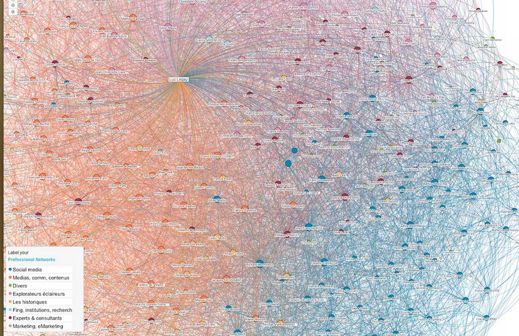
Bear in mind that big data is not the same as complex data. Lots of data can be just lots of the same, such as this LinkedIn map: the core data is the same, but there are filters (by tagging). There are two variables: geography and some sort of tag defining people into professions/interests/relations. Insane amount of data; but only two variables.
Multivariable:
Here is an example of multivariable visualisation of data. This is Charles Minard's 1869 chart showing the number of men in Napoleon’s 1812 Russian campaign army, their movements, as well as the temperature they encountered on the return path.
Big version here.
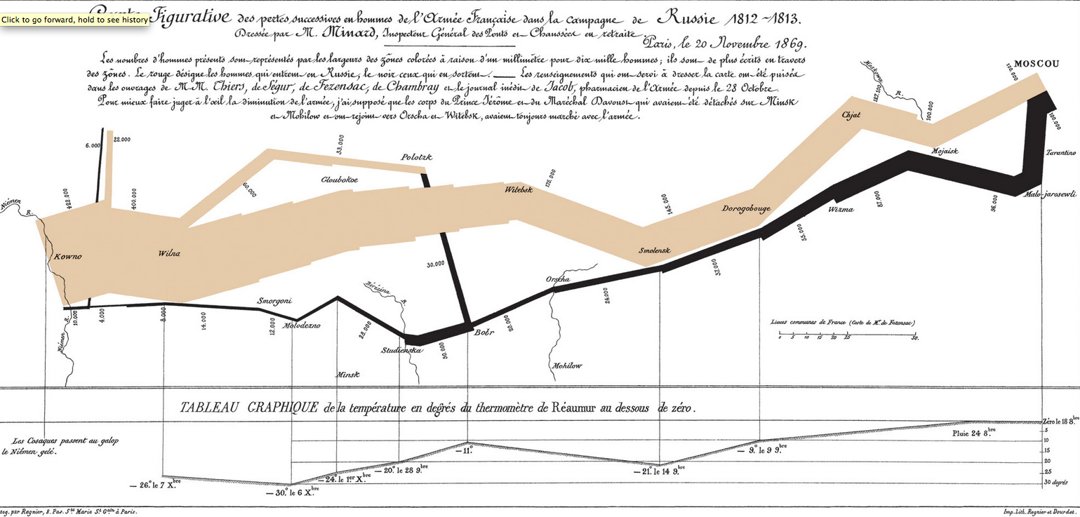
It takes a little time to crack the code, but when you do it is splendid. The variables covered are:
- size of army (number of live/dead)
- geographic location
- direction (east - west)
- temperature
- time (dates)
- causation (died in battles and of cold)
That is an amazing amount of information in a simple, two-coloured map. The geographical part is stylised to give room to the other variables, but we have no problem getting it.
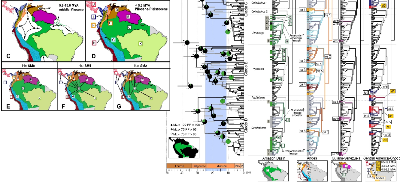
Here is a more tricky one. This will be a lot easier to read if you are familiar with basic evolutionary visualisations, cladograms , phylogenics and principles of biogeography. Bear in mind it is made for people familiar with this, so it is a specialist, scientific chart. Here is what it shows: A phylogeographic image of poison frogs lineages from South America. Maps on the left show the main biogeographic regions as they change through time and the image to the right shows the frog lineages in context of their biogeographic origins. (By Santos JC, Coloma LA, Summers K, Caldwell JP, Ree R, et al. [CC-BY-SA-2.5 (www.creativecommons.org/licenses/by-sa/2.5)], via Wikimedia Commons). When you "crack the code" it is wildly, amazingly informative.
Small multiples, sparklines:
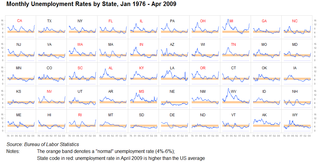
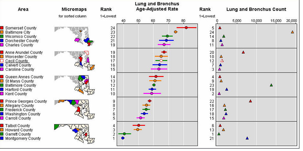
I cannot stress this enough: never underestimate the value of repeating information, or dividing it into separate identical visualisations. As long as it is reasonably easy to compare one graph with another, this is perfectly fine. We are pattern-finding machines. This is often referred to as small multiples. We have few problems analysing these images quite quickly, and cramming everything into one large graph is often pointless when ten small ones will work even better:
Another one:
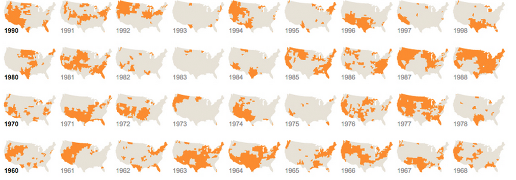
And one that uses different but repeating graphics:
Sparklines are a term coined by Edward Tufte, and also developed into a
fully functioning, fully customisable javascript library. They are basically tiny charts that can be inserted in text, as part of the text and not as an "external" object. Here is what the default look like:

Edit III (Nobel laureates)
I just had to add this data visualisation I found, it is simply too good: it shows Nobel laureates. What university, what faculty, subject, year, age, hometowns, wether it was shared, degree level. Beautiful evidence indeed. These are all quantifiable data. More here.
Your data
All of the questions @Javi poses are extremely important.
What you are trying to do is create a visual tool for thinking. To do so, you must extract the best quality of signal to noise ratio. What you are struggling with is how to correlate data that have different variables, into information. Here is a question: what needs to be approximately right and what needs to be exactly right? What is the aim?
I am going to assume that you want to display the data without too much bias: you want the reader to find correlations themselves, if there are any correlation to be had. Your aim is not to tell people that burgers are bad for them or that women eat less burgers than men, but to let them "see" it, if that is what the data contains (imagine if those three people were a family. That would swing our view on the whole burger-eating-graph a tad).
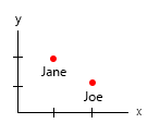
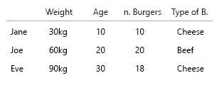
Your dataset is so tiny, you could simply put it all in a table and it would be fine. But of course this is about the general idea:
A little detail: time (age) tend to be something we see as
horizontal from left to right (timelines). Weight something that is
up-down, so switching your x - y would be a good idea.
1. What are the unique, fixed entities?
2. what are the (eh..) variable variables?
- Weight (kg)
- Ages (years)
- Number of burgers (integer)
- Type of burgers (integer)
Note: your data consists entirely of units. Countable, quantifiable
each on a separate mental scale. Kilo, age, weight and numbers. And in
database-speak, their names are the keys. When you start getting to make space-time visualisations, it becomes a real headache. Imagine that you should add birthplace, current home etc.
The only two here that has correlation is the number of burgers and
wether or not it is a combo. All the other variables are independent,
and only one is fixed (name). At some point, with large datasets, even
names becomes uninteresting, and gets replaced by demographic, age,
sex or suchlike.
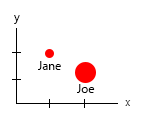
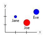
With that tiny dataset, you could get it all in one graph, for example like this:
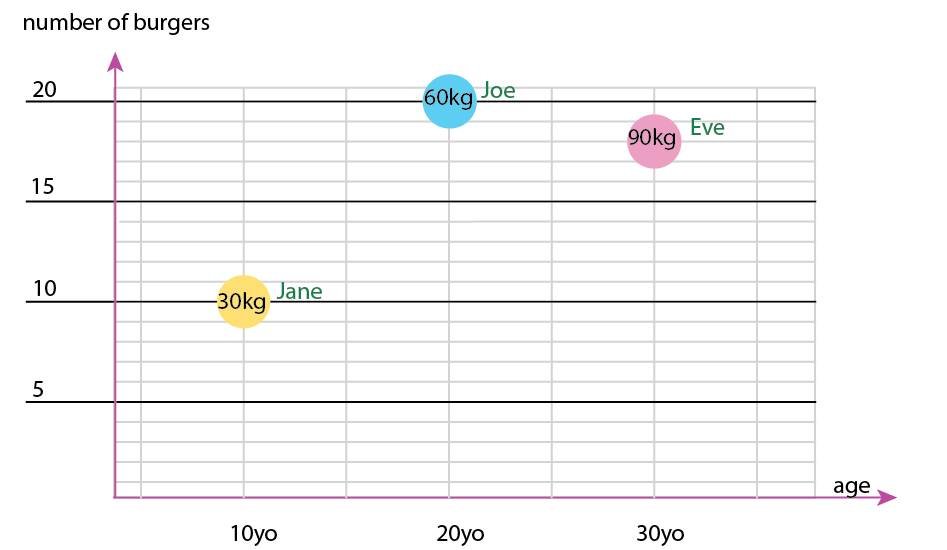
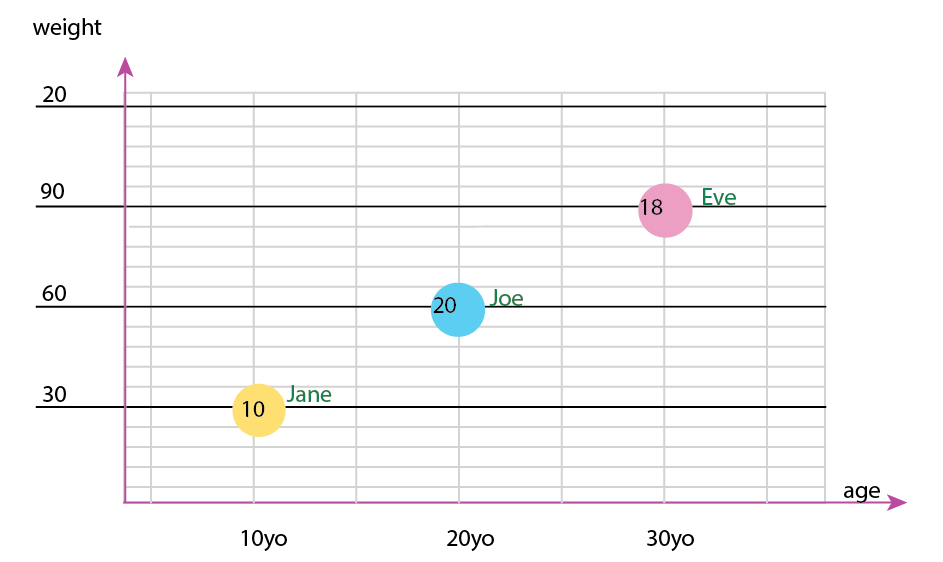
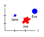
Or you could turn alter the axis and name-bubble content:
Personal note: I think this is the better of the two, because the x
and y contains "physical" properties of a human being. The variable in
the bubbles here are number of burgers.
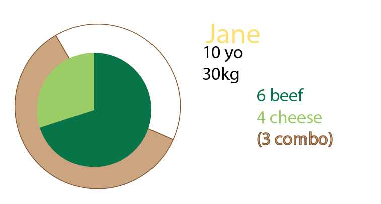
You could also add pie charts in addition to the graph, or even only have pie charts. Personally I would have both, as mentioned about small multiples:
Do you want fries with that?
My assumption was that we also wanted to know the ratio of burger to meal. Every meal contains a burger. Not all meals are combomeals.
- do we only want to know if a person sometimes eats combomeals?
- or do we want to know how many of the burger meals are also
combomeals?
If 1., a boolean applied to the name/key/id would do.
Jane sometimes eats combomeals? True/false.
If 2., we could apply a boolean to each meal:
1 cheeseburger, combomeal=true
1 cheeseburger, combomeal=true
1 cheeseburger, combomeal=false
1 cheeseburger, combomeal=false
1 cheeseburger, combomeal=false
1 cheeseburger, combomeal=false
1 cheeseburger, combomeal=false
1 beefburger, combomeal=true
1 beefburger, combomeal=true
1 beefburger, combomeal=false
That is very tedious, so we could break it down to:
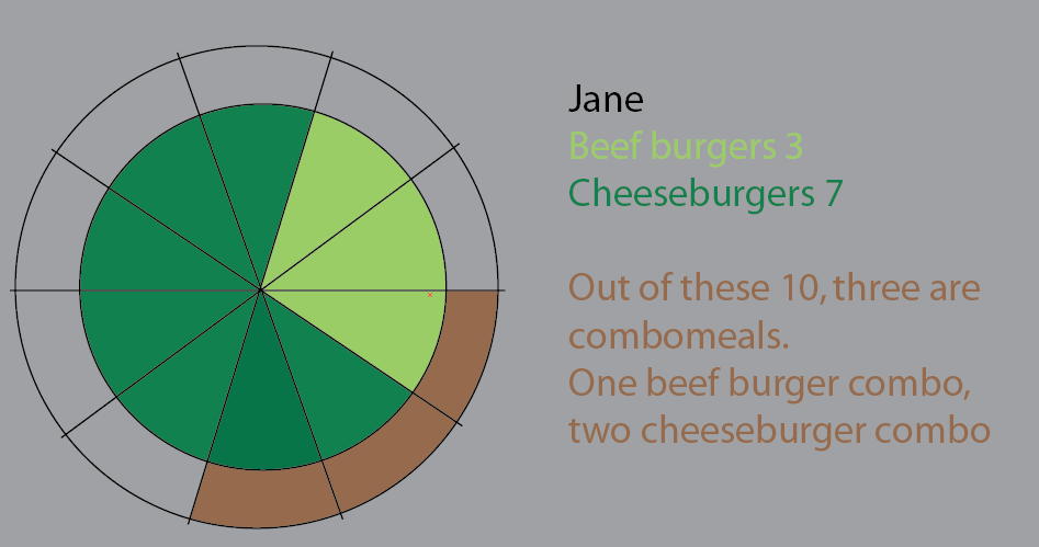
Jane eats 10 burgers. Of these, three are combos (”do you want fries
with that?”).
One of the combomeals are a beefburger menu.
Two of the combomeals are cheeseburger menu.
The rest are single burgers. 5 cheese, two beef.
This piechart was an attempt to visualise that. I have in this version kept the pie slices to make it clearer. The thing about this is that it would be no leap to start applying large datasets and %:
But I think the best way is to rethink.
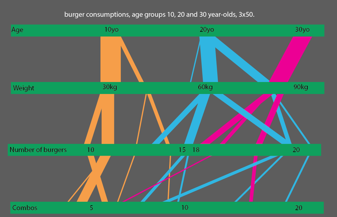
Another way of looking at it, is to do it really really simple. Here it is easier to see what age groups, what weight groups and all the data you do not "have" can tell us. The data you have are not space-related, it is units only (kg, years, numbers + key/id/name):
(Edit: Egg on my face: I have replaced these images with more correct ones, as to the "all meals are burgers, not all meals are combo")
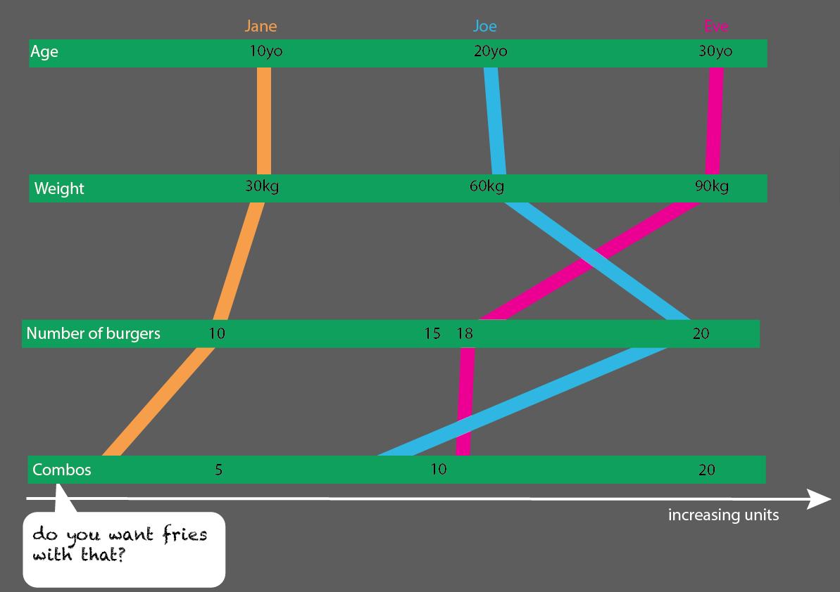 This would be pretty easy to expand with more people:
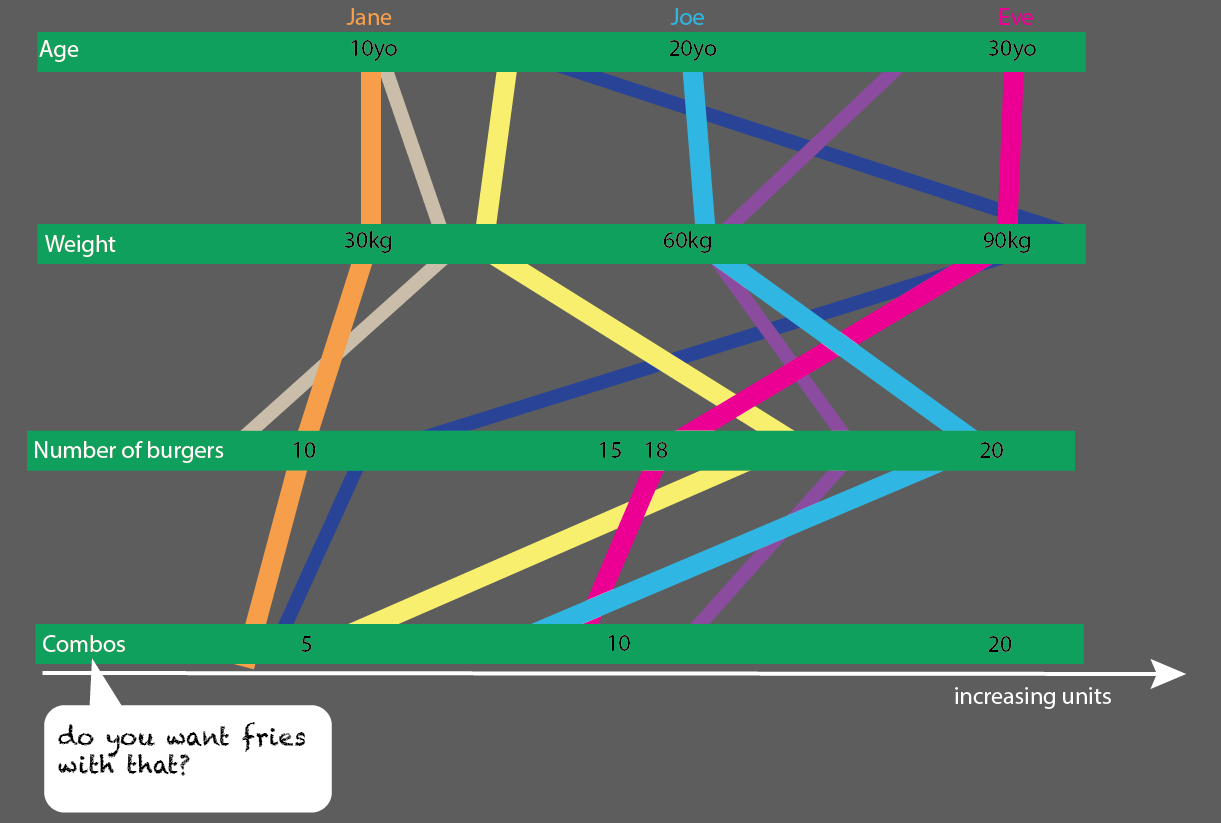 Or, even better, if you compare age groups 10, 20 and 30 year-olds, you could make a pretty simple to read statistic visualisation:

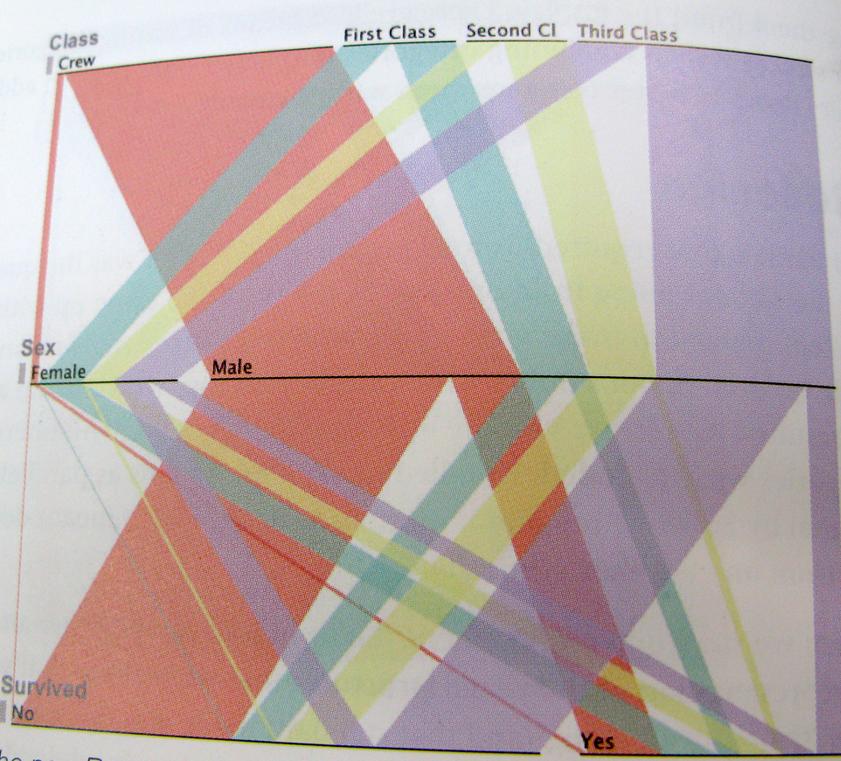
..And just to be as clear as possible; here is an example of this way of thinking. This chart shows the survivors of Titanic, ratio of crew, class, men, women.

There will be loads of other solutions, these are just a few thoughts.
I could go on and on, but now I have exhausted myself and probably everyone else.
Tools to play with:
gephi
Gapminder See this
phenomenal TED presentation by Hans Rosling - love that guy
Google charts
somvis
Raphaël
MIT Exhibit (previously called Similie)
d3
Highcharts
Further reading:
P.J. Onori; In defence of hard
Edward Tufte: Beautiful evidence
Edward Tufte: Envisioning information
Edward Tufte: The visual display of quantitative information
Visual Explanations: Images and Quantities, Evidence and Narrative
Male, Alan., 2007 Illustration a theoretical and contextual perspective Lausanne, Switzerland; New York, N.Y.: AVA Academia
Isles, C. & Roberts, R., 1997. In visible light, photography and classification in art, science and the everyday, Museum of modern art Oxford.
Card, S.K., Mackinlay, J. & Shneiderman, B. eds., 1999. Readings in Information Visualization: Using Vision to Think 1st ed., Morgan Kaufmann.
Grafton, A. & Rosenberg, D., 2010. Cartographies of Time: A History of the Timeline, Princeton Architectural Press.
Lima, M., 2011. Visual Complexity: Mapping Patterns of Information, Princeton Architectural Press.
Bounford, T., 2000. Digital Diagrams: How to Design and Present Statistical Information Effectively 0 ed., Watson-Guptill.
Steele, J. & Iliinsky, N. eds., 2010. Beautiful Visualization: Looking at Data through the Eyes of Experts 1st ed., O’Reilly Media.
Gleick, J., 2011. The Information: A History, a Theory, a Flood, Pantheon




 This would be pretty easy to expand with more people:
 Or, even better, if you compare age groups 10, 20 and 30 year-olds, you could make a pretty simple to read statistic visualisation: