2

I just finished developing a game for Windows Phone 8, and now I'm searching for some optimization. In particular, since I don't understand much about graphics design, I payed a guy to make me animations of a guy, but I've done the rest by myself. I'm not satisfied about colors in my game.

The game colors, essentially are based upon a background tint (a static image) and skyscrapers colors.

Background:
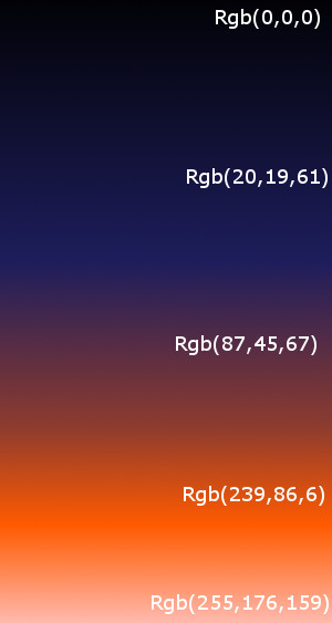
Background

Skyscrapers:

There are 3 types (from the color point of view): foregound (where you walk), middle and background. I made them in that order from dark to light. Every one of these three types also have different window colors. Each shape is generated randomly from a list:
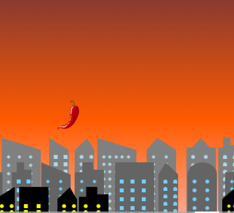
Skyscapres example

  • Foreground layer => Building color: Black, windows color: Yellow
  • Middle layer => Building color: Rgb(100,100,100), windows color: Rgb(113,209,249)
  • Background layer => Building color: Rgb(128,128,128), windows color: Rgb(173,216,230)

A screenshot of the player while farting.
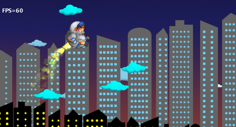
A global screenshot

A screenshot of top the game, where there are stars:
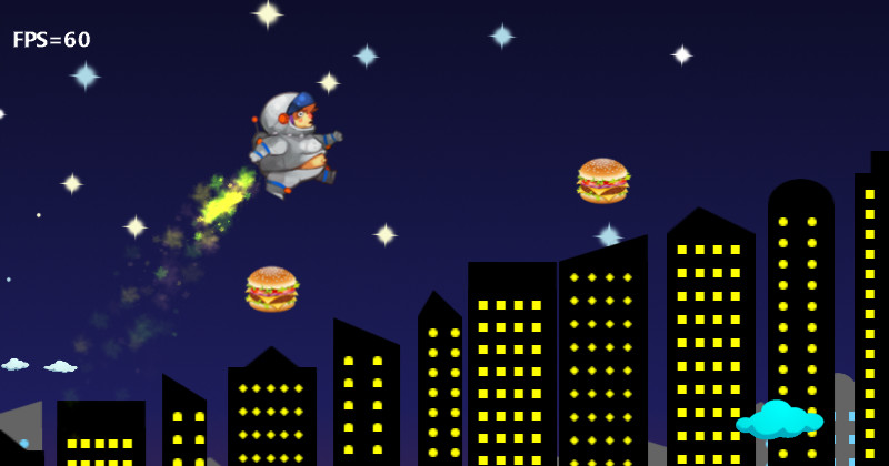
Stars

I am really not satisfied about the final result. I feel the colors innatural and too much "strong". I made the foreground layer of skyscraper black because I was thinking about sunset/night, and I make the other lighter to give a feel of depth. But it seems that colors aren't matching very good, and I don't have enought "eye" to understand what can I do to enhance game's feeling.

2
  • Just a quick thought -would be interesting to see if making the far distance skyscrapers black, middle distance dark gray and closes ones light. To me that would make more sense...
    – benteh
    Commented May 31, 2014 at 23:51
  • I made that because of this image for example: lucaeugeni.it/blog/wp-content/uploads/2012/04/blue.jpg
    – user24444
    Commented Jun 1, 2014 at 9:20

3 Answers 3

4

I think your example for why you used the darker colour in the foreground is showing much more distance than your game needs to. That's why it works so well for the mountains but not so much for the buildings.

I would also mention that your background is darker at the top and lighter at the bottom. This depth would be complimented if your higher buildings were to the back and darker while the smaller ones were to the front and lighter.

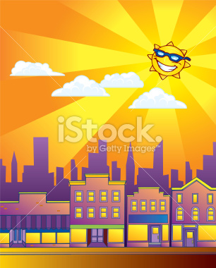
Here is an example of darker background buildings and lighter foreground; enter image description here

You'll notice that in this way there can be lots of contrast between the darker background buildings and the lighter ones to the front.

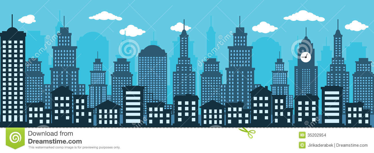
However if you want to show lots of distance with the darker colour to the foreground and the lighter to the back then you need to have less contrast with the colours, take this image (from dreamstime.com) for example;

enter image description here

Hope this helps you figuring out your colour issue.

Also, here are some colour theory resources if you are interested in learning a little more; 1, 2, 3

These resources will help you to decide a colour palette for your projects to avoid stumbling upon this issue again.

Best of luck!

2
  • Can you please post a link to an example of the other point of view, the one with lighter foreground and darker background? I didn't find anything as examplar as the image you posted. Thanks.
    – user24444
    Commented Jun 2, 2014 at 12:19
  • 1
    Just edited to include an example.
    – Jenna
    Commented Jun 2, 2014 at 12:57
1

The biggest problem with your color set is that all the buildings are completely gray scale while background is heavily colored. Also all the objects in your game such as main character and clouds are not toned to color of scene lighting. Naturally environment is strongly toned according to main light.

Just look at the images Jenna posted above, buildings on both images are toned to match sky color. It creates more natural and peaceful feeling to both images.

If I was you I would tone most of the stuff to have more similar color palette. The most important thing is that all the stuff in the image blend in.

2
  • Accord to what you said about color palette, I have a question. If you decide for example that the palette will be a "variations on blue colors" (like in Jenna's second example), everything must be in that palette, or, for example, I can choose a "divergent" color for some special object? (Watch, for example, the "jalapeno" in my first image).
    – user24444
    Commented Jun 3, 2014 at 8:26
  • 1
    Obviously you can use different colors, but you shouldn't use color such as pure red #ff0000. If you want object to be completely red you still need to tone it a bit to match scene lighting such as #ff2255. Also its obviously possible to break this rule if you have good reason to do so, such as make something really get gamers attention.
    – jjjuho
    Commented Jun 3, 2014 at 10:50
1

Very nice game you created for windows phone 8. But yes, you need to improve mixing colors. Every color has its meaning and usage, it is important to pick the right color to grab attention to your target audience. I suggest you read article about colour theory to understand more about colour usage and it meaning.

Your Answer

By clicking “Post Your Answer”, you agree to our terms of service and acknowledge you have read our privacy policy.