At this moment I have found only one enlightening discussion on the best practices of choosing of plotting symbols for scientific plots. It is in the book
Cleveland W.S. The Elements of Graphing Data (1985).
in the chapter "Superposed Plotting Symbols". From that short discussion I extract three main requirements for plotting symbols:
They should provide high visual discrimination with one another. It should be easy to perceive the points of a particular group as a whole, mentally filtering out the points of other groups.
It should be easy to remember the correspondence between the shape (the plotting symbol) and the key so that looking back and forth between the graph and the key is not necessary.
The symbols should tolerate overlap. It means that they should provide as much visual discrimination as possible even in the regions of significant overlap. It is unacceptable if they form uninterpretable blobs on the graph.
The third requirement apply only if plotting symbols on the plot significantly overlap. This additional requirement makes the problem significantly harder and should be considered as special case.
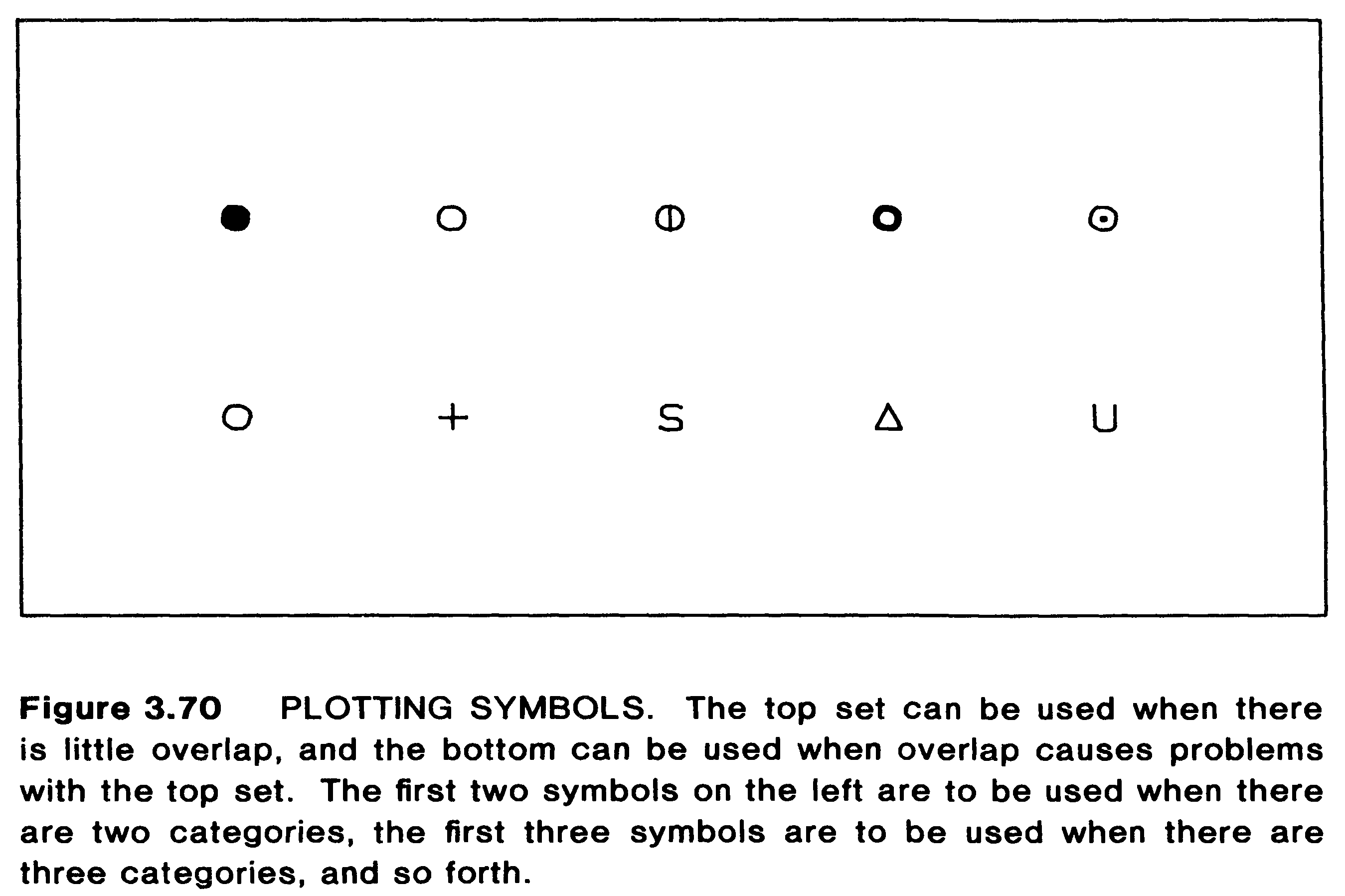
At the end of the chapter the following two sets of the plotting symbols are suggested:
The author conclude that the third requirement (that the symbols should tolerate overlap) "seems to restrict us to symbols consisting of curves and lines, with no solid parts, and with a minimum of ink."
The discussion is very enlightening but also very short and rather old. There should be more recent studies which suggest much more possibilities and insights into how to choose plotting symbols for scientific plots. Could one provide a reference or summarize own experience on the subject?
P.S. It is worth to note that the problem of selection of plotting symbols is actual also for color plots as it is highly recommended to design them independent of color vision.


pgfplotspackage, the package should do a good job at choosing symbols. Tufte's book may say something about this. (Please note that I don't have Tufte's book at hand, so I'm not 100% certain.)