1

I'm giving my sister a hand with a bunch of graphics for her thesis. She's dealing with 20 survey responses from a bunch of companies, and one of the natural things to do is look for correlation between answers.

Given that the survey was not the best ever (you gotta work with what you have, and she didn't make the survey), most correlations are strongly positive, and what little negative correlations are there are measly (strongest is -0.13).

Refresher: correlation measures how two measures are tied together. A positive correlations means that the higher a measure is, the higher the other measure is; for example, "uses Comic Sans" and "makes me want to stick a fork in my eyes" are positively correlated. Conversely, if the correlation is negative, the bigger a measure is, the smaller the other is. Correlation between 0.2 and -0.2 is considered negligible.

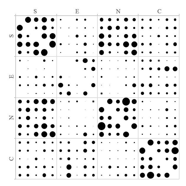
My idea for putting this data in the thesis is to arrange the correlations in a grid and show bubbles in place of numbers: the bigger the stronger. The problem is that I'm having a hard time deciding how the negative correlations should appear.

My first thought is that I'd have solid black circles for positive correlations and black-bordered white circles for negative correlations. However, the negative dots are so small, the black border takes over the circle filling and the net result is all dots appear to be black.

Since this is going to be printed, using any color outside of grayscale is... not a good idea. My current solution for now is to show a grey "halo" around negative dots (see the two dots at the very center), perhaps giving them undue attention. It's far from perfect and it highlights how all dots aren't even perfectly circular:

Current version of the graph

Another possibility is to make the negative dots grey altogether, but I don't know how those shades of gray are going to translate in print — and making test runs is probably too expensive of a BSc thesis.

What do?

6
  • Bonus question: the chart is symmetric. Should I still show both halves? ...maybe I could have one half only show positive correlation and the other half show negative correlation, but it would be very hard to get a good perfect result with Excel.
    – badp
    Commented Sep 6, 2014 at 16:05
  • Also: those pictures get converted to vector formats, so fancier solutions such as gradients or patterns are right out.
    – badp
    Commented Sep 6, 2014 at 16:11
  • Can you let us know what method is planned for printing this? If it's digital (CMYK) there is no issue with using color. If you're using a copier that is only grayscale, I understand. If you're printing it offset and paying per color, I understand. Please clarify. Commented Sep 6, 2014 at 17:35
  • @EddieA. I don't know exactly what kind of machinery the typing office will use (we're probably going to pick one at the last minute <__<), but I assume that they will want to be paid a nice premium for color even if they did use a printer that could do color natively. I'm running under the assumption that I only have grayscale available to me.
    – badp
    Commented Sep 6, 2014 at 17:49
  • Unfortunately while the university requires you to bring several copies of this 10k+ words document, each copy is unlikely to be opened more than once or twice in its lifetime, so there's little reason to pay for nice-to-haves... other than the binding. :)
    – badp
    Commented Sep 6, 2014 at 17:52

2 Answers 2

1

Here's my take at it.

Bubble Grid Scale

Your scale can obviously be whatever. I also wouldn't get too caught up if you use grayscale. As long as it's not below 50%. You could even put a crosshatch or 45º angle lines as a fill. You could also switch to square or a diamond for negative values. I believe there are many solutions here.

7
  • That's an awesome amount of effort, but I wonder if you have noticed that some of the dots are only a few pixels across
    – badp
    Commented Sep 6, 2014 at 18:17
  • This only took me a few minutes, not much effort. I would say using 2 separate shapes as mentioned above would work the best for you. ▴ ▨ ● Commented Sep 6, 2014 at 18:26
  • @badp sounds like you may have a resolution issue. Can you work larger?
    – DA01
    Commented Sep 6, 2014 at 22:41
  • @DA01 I can make vector files of arbitrary resolution, as this is going into a Latex PDF, but I dunno what kind of resolution printers can pull off
    – badp
    Commented Sep 6, 2014 at 23:01
  • @badp I'm actually referring to 'information resolution'. It may be that there's simply too much data in too small of a place to be clear.
    – DA01
    Commented Sep 7, 2014 at 0:24
1

How about making

  • negative dots black.
  • middle point half black and half white
  • positive dots white

enter image description here

Your Answer

By clicking “Post Your Answer”, you agree to our terms of service and acknowledge you have read our privacy policy.

Not the answer you're looking for? Browse other questions tagged or ask your own question.