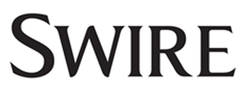
That particular font is a custom font for Swire called "Swire Roman".
I had a feeling that the font was customized; those rounded bottoms of the "W" are typical of how fonts are customized for brand logos.
I did a search on Swire's site for PDFs, thinking maybe I'd get lucky and find brand guidelines. Haven't yet, but I did find this newsletter, which, when opened in Illustrator or Acrobat, revealed itself to be Swire Roman.
While this is the correct answer, I bet someone else can come up with a more helpful answer for you. I'm guessing that this is derived from something else that is close enough for you to use if you're trying to look like Swire but not be Swire. I did notice that Swire has worked with Pentagram; perhaps Pentagram did the rebrand (which probably happened after 2004 and before 2011)? If you can find some PR about the rebrand you might be able to get more info about the font's process - not a bad rabbit hole to chase if someone else can't match a similar font.
Also worth noting that they use Optima as a secondary font a lot, and while individual glyphs don't really match up, the overall 'feel' of Optima and Swire Roman aren't all that far off. See this example from a PowerPoint:

Optima is below and it fits pretty well with the feel of the logo text.


