Short answer: No Photoshop can’t create responsive templates.
Long answer: To understand why, you need to understand the difference between normal, static designs (like you do in Photoshop) and what is needed for a responsive designs.
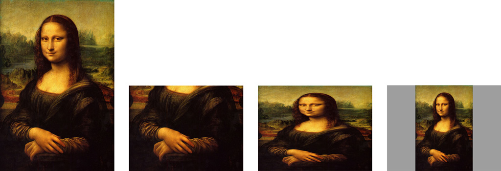
Lets take a portrait of someone that is in portrait format 4✕6. Now someone cuts of the upper half of the image, making it 4✕3 (landscape format). In a physical painting you would obviously loose the head of the portrait. On a computer there are two more things you could do, giving you three options:

- Crop it of (like with the painting, loosing part of the image)
- Scale it unproportionally (thereby loosing the aspect ratio)
- Scale it proportionally (thereby not meeting the given aspect ratio of the whole image and creating a border around it (the canvas is still there))
Except for altering the actual image there is not much else that can be done. While this might sound obvious and unsolveable, this is exactly the kind of problem that needs to be solved for responsive layouts:
Design something and when you are done I tell you which size it should be.
I actually like to think of responsive layouts as resolution independent layouts. Think of the size and aspect ratio of your image as an unknown value. Users today have a wide range of different sized devices (can also be turned/browser windows can be resized), giving you almost endless possibilities for final output sizes.
The reason why this can’t be solved be traditional paintings (or fixed, static layouts like you create with Photoshop/Illustrator/InDesign etc.) is, that they contain no information how the single elements in those designs relate to the size of the whole image.
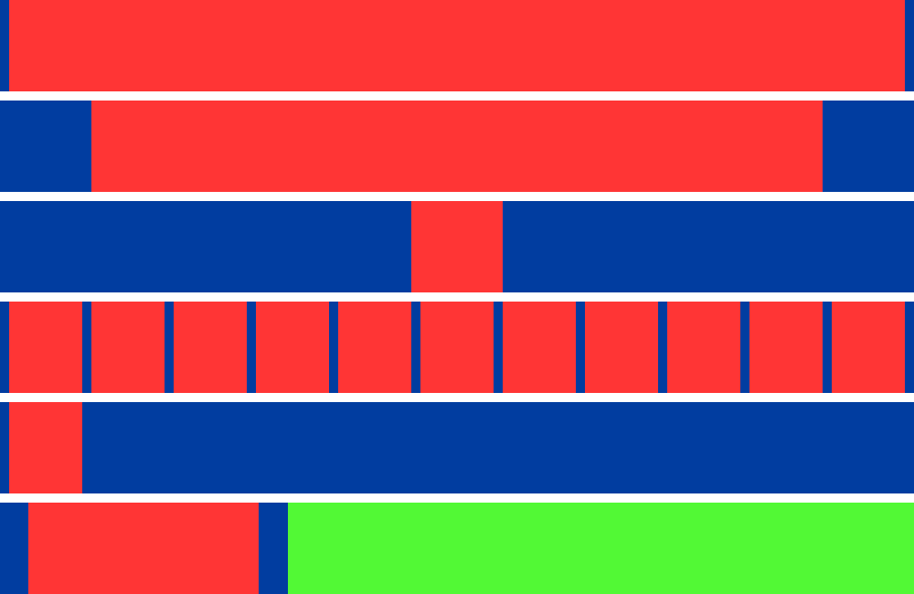
Here is another example: Lets you assume you have this very simple image:

Now what would happen if you would keep the height of this image but make it 10 times as wide. Here are just 6 different things that could happen:

- The blue borders keep their width, changing the width and aspect ratio of the red field.
- The blue borders and the red fields keep relative width to each other, making both wider and changing the aspect ratio of both
- The red field keeps its aspect ratio, making the blue border wider
- the initial pattern ist just repeated
- the rest of the image is just filled with blue
- something completely weird
All of these would be logical changes when transitioning from the initial image to a wider version. The problem with static programms like Photoshop or physical paintings is: there is no way you can tell from one image what it is supposed to look like with a different size and there is no way to specify it either.
Since the possible screen sizes can be considered to be almost infinite (not really but still quite a lot) just providing two or three images won’t do either. There would still be a lot of interpolation to be done, for all screen sizes that don’t exactly match your three designs.
To create responsive designs you need to specify if the size of an element is absolute (like 10px wide) or relative (like 10% of the total screen width) or ideally even a mixture of both (10% of the screen + 10px, but to a maximum of 500px or something like that). All normal graphic programms handle all sizes just as absolute (px, centimeter, inch etc.). When the image is resized they are all handled as relative, making no difference (because there is no way for you to specify.
Unlike Photostohp, the technology that is used to create websites (HTML, CSS, Javascript mainly) allows you to make such specifications, therefor allowing designs to responsive.
For you as a designer this means the following:
- Be aware of the gap between your design (idea) and the medium into which it needs to converted to work as a website.
- The final output size of your design is unknown to you, while you design
- Be aware that you not just need to choose what color the square is and which size it is, but also how it relates to the image size
- The size in which your design will be viewed WILL change, therefor your design MUST change, in one way or the other — the question is just: will you control how it changes or will it be just random.
- Don’t even try to do pixel perfect layouts
My honest recommendation would be: learn at least basic skills in HTML, CSS and Javascript and create your layouts in the actual medium in which they will later be viewed. In my opinion a hard seperation between design and technology can’t stand. Imagine a table-designer who has absolutely know idea about the structure and properties of wood and has never carpented in his live.
If this is not possible try to get your head around the idea that the final size of your layout can be seen as unknown and give your programmer instructions that are as clear as possible, whether you send him an HTML mockup or several annotated Photoshop/Illustrator/Indesign files.
And whats most important: If you want to stay in the web-/screen design business, be aware the responsive layouts won’t be a nice feature. They will be the way to go. There is no way on earth, that screen design will go back to a state where you can safely assume that everybody is using the same screen size and won’t resize their browser window.

