6

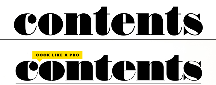
I found this beautiful Bon Appetit magazine (it's an iPad magazine). But I couldn't quite identify the font used :

![black and white ![other features contents Editor's letter

I've tried Fontspring Matcherator, WhatTheFont! & What Font is.. The closest typefaces are Thorowgood and Poster Display Monster , but it's not quite the right answer. The contrast between the thicks and the thins is not as pronounced.

2 Answers 2

1

If you put your images next to the word 'content' written in the thorowgood font you can clearly see this is the same font, the creator just played around with the height and width of the font.

enter image description here

1
  • 3
    It's very, very similar but you can see its not the same font. The stroke contrast is very different, the "s" is significantly different, the counters are different sizes etc.
    – Cai
    Commented Jul 5, 2016 at 12:03
0

It looks like Austin Ultra from Commercial Type.

2
  • It's still not the right one
    – ielyamani
    Commented Jul 20, 2016 at 17:58
  • When suggesting a font please include a screenshot.
    – user9447
    Commented Jul 21, 2016 at 5:36

Your Answer

By clicking “Post Your Answer”, you agree to our terms of service and acknowledge you have read our privacy policy.

Not the answer you're looking for? Browse other questions tagged or ask your own question.