2

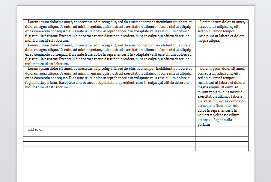
I want to find a way to create a table-like layout like this:

enter image description here

As you can see, this example actually made in word-like application. I want to make it in InDesign, but I don't know what is a best way to do it.

From my point of view, there are two ways, both very ugly.

The first way is just to use a table. But as I understand, that may bring some problems in the future. Why? Because, as I think, the document is not intented to be a large table, and so, there are may be some problems with images, nested tables, references and TOC. Since I'm novice in InDesign, I'm not sure, but I think it's true.

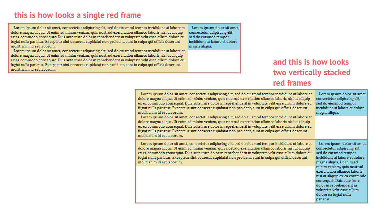
Another way is to use anchored frames, together with auto-resize height of frames. Here is the image. For better understandability, I colored frames into different colors:

enter image description here

The beige and blue are frames which are anchored to the red frame. (I should also note that beige and blue frames are not inline frames). The second red frame is also anchored to the first red frame. So we have 3 frames anchored to the first red:

  • beige frame

  • blue frame

  • second red frame

This second (anchored-based) approach is also ugly, because:

  • we have a lot of anchored frames (it looks like something very unstable)

  • it also hard to insert text (I want to insert text into blue frame, but when I click it, the text is entered into the red one)

  • I don't know a way to make red frame automatically resize it's height to match both heights of beige and blue. In other words, if I add or remove text into the beige or blue, as the next step, I must manually (not automatically) change the height of the red one.

Maybe someone know what is the way to make such layout without all this ugliness?

Cheers, John

1
  • I can't grasp what problems you're worrying about regarding tables. However, you should just dive right in and learn tables in InDesign, it's not rocket science. It is a very powerful and versatile tool. Head to indesignsecrets.com and find an article on tables or just google around.
    – HaraldCFS
    Commented Aug 22, 2016 at 8:04

2 Answers 2

2

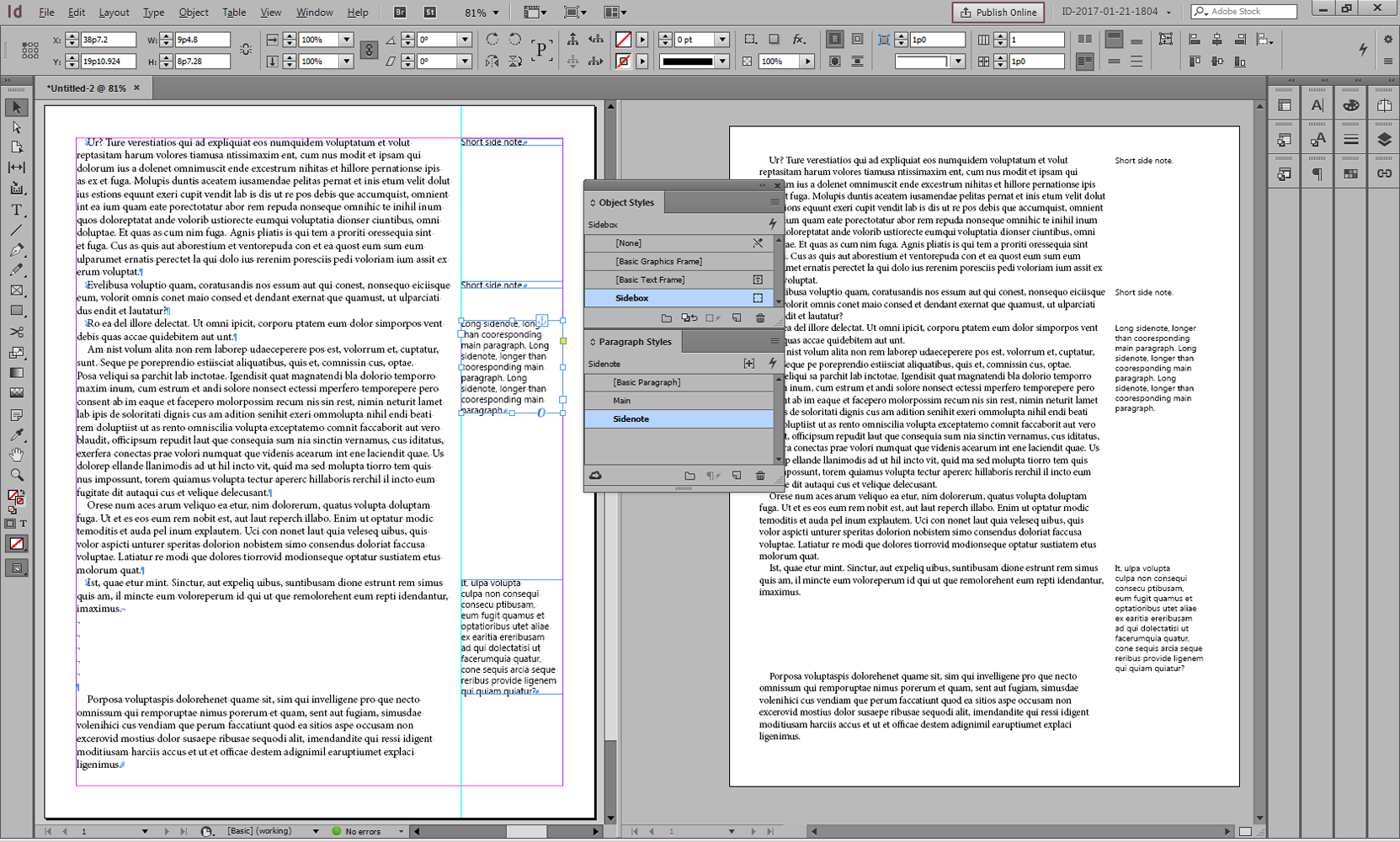
I came up with this method, which seems robust and flexible, keeping all elements live:

(Do Once):

  • Create a Paragraph Style called "Sidenote" as desired.

  • Create at least one Paragraph Style for your main (body) text with a right indent of 1.25", e.g. 1 inch, or whatever amount of horizontal space you will use for your sidenote, plus some padding.

  • Put a guideline on your master page for the inside edge of the sidenote textframe (approx 1 inch in from outside margin?).

  • Create an Object Style call "Sidenote Frame" as follows:

    • Text Frame Auto Size Options = "Height Only"

    • Anchored Object Options = Position: Custom, Relative To Spine (checked), Reference point leftpage=top/left, rightpage=top/right, Anchored Position Y-Relative To Line (Top Of Leading) and Y-Offset of approx 6pt (adjust as necessary depending on your fonts, leading, etc.)

(Do for each sidenote):

  • Create a text frame to hold your sidenote text.

  • Apply the "Sidenote Frame" Object Style to the frame.

  • Insert your sidenote text.

  • Apply the "Sidenote" Paragraph Style to the sidenote text.

  • Select the frame and CUT it.

  • Insert your text cursor in the main text at the beginning of the paragraph to which the sidenote corresponds.

  • Paste. The cut sidenote text frame will insert into the main text.

  • Select the (inline) text frame, make it the proper width (e.g. 1 inch), and position it in the space between the master-page guide and the outside page margin. Be careful not to re-position vertically; if you accidentally move it up or down (mis-aligning from the corresponding text in the main, paragraph) you should see an override on the Sidenote Frame" Object Style; re-apply w/clear overrides (Alt-Click).

  • Repeat for each sidenote.

One concern is how to format a sidenote that is vertically taller than its corresponding main-text paragraph. I suggest just letting the sidenote flow as it will. The alternate is to add extra space below the corresponding main-text paragraph; IMHO that blank space will not look good.

enter image description here

2
  • At first glance, looks really robust. I have not InDesign installed on my current computer, so I will check and accept an answer as soon as InDesign will be installed.
    – john c. j.
    Commented Mar 17, 2017 at 20:36
  • At second glance, I specced it only partially for a facing-page layout, so depending whether you have facing pages you might need to reverse some directions, inside/outside rather than left/right.
    – q23.us
    Commented Mar 17, 2017 at 20:58
0

To be fair, I don't understand your concerns about tables. However, there's a way to do that – but it has a limit that I haven't been able to overcome – the width of the columns must be the same.

First, create the beige and blue box using a text-frame with two columns. Create a paragraph style and add it to the first paragraph of each blue box. Set the paragraph style to make the text start in the next column (keep option - start paragraph = in next column).

Then make the text-box fit the height of the text. Right-click, select "Text-Frame options"; tab "auto-size", set "Auto Sizing" to "Height Only".

Anchor the second text frame. With an object style create the stroke of the text-box and change the appearance as you prefer.

Use this script to draw the line between the two columns, http://www.indiscripts.com/category/projects/InGutter

Your Answer

By clicking “Post Your Answer”, you agree to our terms of service and acknowledge you have read our privacy policy.

Not the answer you're looking for? Browse other questions tagged or ask your own question.