2

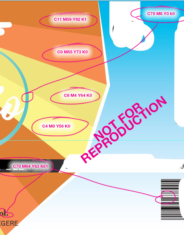
I've created labels that will be printed and the company requested that it be CMYK build but also asks for the following:

enter image description here

I've never really created something for print before so there is a lot that I'm learning. When they request the codes & colours to be on document for easy referencing, how do I go about putting the colours on the document.

They also ask to indicate which series as you see, I'm not sure what this means either.

Thanks !!

(deleted pictures because there was no watermark :) )

4
  • 2
    Sometimes I think printers deliberately word these things in confusing ways.. Anyway, the answer will depend on the content of your design. How many colours are you using? Did you start by picking Pantones or mix custom CMYK colours? Are you using images or just text? In an ideal world it would help to see the artwork (with anything confidential content redacted, obviously). Also, is this for you or do you have a customer who needs to approve the colour?
    – Westside
    Commented May 8, 2017 at 15:58
  • Westside, Do you really think they use words to confuse?
    – Rafael
    Commented May 8, 2017 at 16:13
  • @Rafael: Yeah, sometimes I think they do. There are definitely print companies who try to keep the field of prepress and repro shrouded in mystery so that creatives feel that they have to get the printer to 'fix' their files for them. Then they charge for the service. Obviously not ALL print companies are like this, the print companies where I worked as a studio manager were always lovely and helpful. Honest.
    – Westside
    Commented May 8, 2017 at 16:22
  • @westside if you see original question I've added in a few of the labels so I hope that helps in answering. I started with CMYK colours and did not first use Pantone. All images, and the text has been converted to outlines. The company my client is using require PDF proofs to make sure it will print properly I suppose. Number of colours varies from 5-10 looking at different labels.
    – Kristin K
    Commented May 8, 2017 at 16:31

4 Answers 4

3

I don't find any of the language confusing or "odd" as others do. Although, the CMYK sentence being between the Pantone statements is just poor positioning. It should list all the Pantone items, then the CMYK items, not mix them. "CMYK Build" is a synonym for a "CMYK breakout" or "CMYK percentages".
(But the UK spelling of "color" is "odd" :) )

I read this as ....

If you used a Pantone color, specify the number, according to the Pantone Plus guide for best results. You do not provide Pantone numbers if you aren't using Pantone colors.

If you are using CMYK colors, supply the percentage breakouts. This was very common before everything went digital and before color management was very reliable. Its not that common today, but I've seen it a few time - Mostly for higher-end print runs. The printer is asking you to supply numbers rather than relying on any embedded profiles.

In areas of large solid CMYK color coverage you supply the percentage of each plate for the color.

This is just a way of not relying on color management really. If you provide percentage breakouts, they'll match those percentages. Therefore if C60 M6 Y40 K0 is NOT the color you see on your monitor, it's not their problem if the print uses those percentages. It's really a "CYA" technique for print providers.

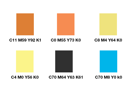
You can supply something like this:
enter image description here

or

![enter image description here
(Just a note, if you create an image like above, and are supplying it digitally, do not supply it it as a PDF or any remotely possible print format. Send it as a .png or even .gif, or crop it to a clearly unusable piece as I've done above, so it's not mistakenly used as a print production piece.)

For the orange gradients in the first image, supply the dark breakout and the light breakout.

In the old days, you'd have a color proof and use a pen or grease pen to write the percentage breakouts on the proof. You could still go this route as well.

This just helps the print provider match the colors you are seeing without relying on embedded profiles.

Truth is it's been a looooooooong time since I've had to provide breakouts unless a proof came back with the wrong color. Color management and ICC profiles are exceptionally reliable nowadays and essentially do this for you. But then, it's not impossible that a print provider has either included that statement to (1) "Cover Their A.." as I've posted or (2) are so far behind the times they don't use a color managed workflow or (3) they don't understand embedded profiles or (4) that's a very old part of the web site that hasn't been updated - at least the text anyway (it was a preferable way to work years ago) or (#5) they are an overseas print provider located in Asia somewhere. I see this with eastern print providers from time to time. My vote, would be for #1 .... they just want to cover themselves, maybe #4 if they've been around for 10-20 years or more.

2

Given the nature of the designs, there shouldn't be any need to supply Pantone references or to detail the cmyk splits. The multicoloured tonal complexity means that you would be there all day specifying the breakdown of each individual part. The printer should be able to treat this like printing a photograph, assuming that none of the covered up bits contain anything colour critical in terms of brand consistency.

The crucial thing would be getting something colour accurate for you or your customer to approve. A digital proof that has been output to a calibrated profile that the printer can match would be perfect. The printer can probably provide this for a relatively modest additional cost.

2
  • Would you have any tips for colour accuracy proof?
    – Kristin K
    Commented May 8, 2017 at 17:21
  • That's a complicated question because it depends on the print process and the substrate, amongst other things. My advise would be to ask the printer. The exception would be digital printing in which case the printer would be able to provide a single copy which will be a match for the full production run.
    – Westside
    Commented May 8, 2017 at 17:49
1

I can't really work out what that is supposed to mean. I have no idea what they mean by "CMYK build". The language they have used is a bit odd/non-standard to say the least.

Are you printing in CMYK? -This is also called "4 colour process" printing, or sometimes "full colour" printing. 4 colour process printing is the method used for most printing of full colour work (such as photographs and colourful graphics in books/newspapers/magazines).

In CMYK printing, four basic colours of ink: cyan, magenta, yellow and black are used to make almost any colour you can imagine. Each colour requires a printing plate, so in CMYK printing four plates are required. Although Pantone does have a guide book for choosing process colours, you certainly don't have to use one. You might want to choose a Pantone Process colour, if you want them to colour match it to a Pantone colour guide book. This might be important if a client needs a logo to match a specific colour.

In spot colour printing, a single solid ink is mixed - a pure ink if you like, and only 1 plate is required per colour. If you are going to print with a spot colour, then yes choose one from a Pantone Solid colour guide. They will use the swatch book to check the colour matches while printing.

It is also possible to print using CMYK + spot colours (solid colours). But it's usually more expensive, since it requires an additional printing plate, and either a press with 5 or more print heads, or additional passes through the press.

When preparing artwork using software such as Adobe Illustrator, or InDesign, there are Pantone Solid colours to choose from, or you can make almost any CMYK colour you can imagine. You can also choose from Pantone Process colours. Obviously the choice of colours, whether process or spot, will depend on what kind of printing you need to have done.

1

Printed samples

If you are working with a local printer, they can ask for a printed file as a reference. It can be a softproof printed on a calibrated plotter or in a less exigent workflow a simple color copy.

Why as a reference? It is usefull to identify what is on each plate. It is faster to see than to look for the tiny text the prepress writes.

Color proof

If the print is calibrated they can tweek the print to closely match your sample.

But in a more demanding workflow they are the ones that should give you the proof with the print calibrated with their own profile.

Remote provider

If you are not working locally, for example a printer in other city, where you can not authorize a signed print, and if the workflow is not really closed (A closed process is where they give you a specific color profile and both know the viewing environment is controlled) they could ask for a color reference, to have an idea of the colors and tweek them a bit.

This is a common practice on small workshops, because they are somehow insecure, probably insecure that you are sending the file correctly and this is a way to test the results.

On bigger printers they simply use a controlled density patch bar and measure the values with a densitometer.

Depending on how a document is prepared, using for example overprint can potentially alter the way a color is rendered, that is another reason they want a reference.

What to do

You could send an aditional page with some solid patches as @Metis is answering.

Aditionally you can mention that X color patch is simmilar to Y Pantone color.

If it is not the exact same color mention that.

A plus series

Pantone is continuosly changing the color catalog.

A Plus serise is simply newer version of the catalog.

1
  • So to confirm, it should be fine if I went ahead and attached a separate swatch document ? I can't see why they wouldn't be able to match if they requested a "CMYK build"....
    – Kristin K
    Commented May 8, 2017 at 17:56

Your Answer

By clicking “Post Your Answer”, you agree to our terms of service and acknowledge you have read our privacy policy.

Not the answer you're looking for? Browse other questions tagged or ask your own question.