0

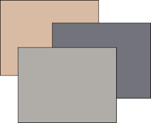
I have 3 colors, I need to find a 4th that is complementary of these three:

#d9bba3
#72737b
#b0aca8

I have so far found #d7d6db but it is only my guess, not based on any tool, is there a way to find a common complementary color? Do they have one in common?

enter image description here

4
  • 2
    Please be advised that in colour theory, a colour only has one complementary colour: its exact opposite. Examples are #00ffff : #ff0000 and #33aa77 : #cc5588. What you are asking for is a pleasing addition to an existing colour scheme, which is something completely different, and also way less exact.
    – Vincent
    Commented Dec 11, 2017 at 8:37
  • 1
    @Vincent a few years ago, I was using an online tool that was able to generate just what you are saying, starting from one color. I though it was complementary colors, thank you for clarification! I could not find that tool again :( but one similar is easyrgb.com/en/create.php not really sure if it is the same to be honest. Commented Dec 11, 2017 at 9:42
  • Two of these colors are very close to neutral gray. You can pick a complementary color for the top one and it should be alright. (A pretty random experiment worked for me: I swapped its R and B components, which happened to result in a pleasant pastel blue.)
    – Jongware
    Commented Dec 11, 2017 at 11:02
  • Related: graphicdesign.stackexchange.com/questions/352/…
    – curious
    Commented Jun 11, 2018 at 19:29

2 Answers 2

2

Kuler is a great tool online for color schemes, and you can easily find complements to any value.

Or in Photoshop you can try this:

Open your Color Picker and select #d9bba3 for example.

Go to the H value (27°), add 180° (for 207°) - there is your complementary color, #a3c0d9

If the Hue value is above 180° then subtract 180° instead:

207° - 180 = 27° (you are working within 360°).

If your colors were less friendly than this example you could try this with all of them to get a better idea of the range you are looking in.

7
  • I tried that but a background colored #d9bba3 with text #a3c0d9 is really hard to read, is it supposed to be like this as complementary? Commented Dec 11, 2017 at 16:38
  • Yes. A complementary color is directly opposite the base color in the color spectrum. If you increase the S value (saturation) it contrasts much better as a darker shade (75% pops a lot more than the 25% it started at) but this method is always going to be relative to your base color (which is also fairly desaturated in this example). If you have Illustrator you could peruse the color guide & various swatch libraries, and if not, try kuler as it will always give you additional colors. Sorry I dont know what your previous tool was but I hope this helps. Commented Dec 11, 2017 at 16:56
  • Kuler does not use a "standard" color wheel, so the complementary color it gives is not "standard". Is it an interesting tool? Yes, but not standard. n_n
    – Rafael
    Commented Dec 11, 2017 at 17:50
  • Thanks. ^^ trying to help someone solve for their own work, not for standards or theory. ;) Commented Dec 11, 2017 at 18:30
  • I am spamming my answer to another question :op Take a look at the appendix of this answer: graphicdesign.stackexchange.com/questions/85852/…
    – Rafael
    Commented Dec 11, 2017 at 18:53
0

Color is a complex issue.

Here is an answer I wrote to confuse you more: Is there a standard for color wheels?

So you need to choose which method to use.

Be careful on which color model you use, for example, there are some color tools online that do not use a standard color wheel (as you can read in the other post)

Try to use one RGB+CMYK one or as I call it RCGMBY one.

But also remember that color has three dimensions, so it is a solid, not a flat wheel.

As you used the tag Photoshop, here are two methods (among several others).

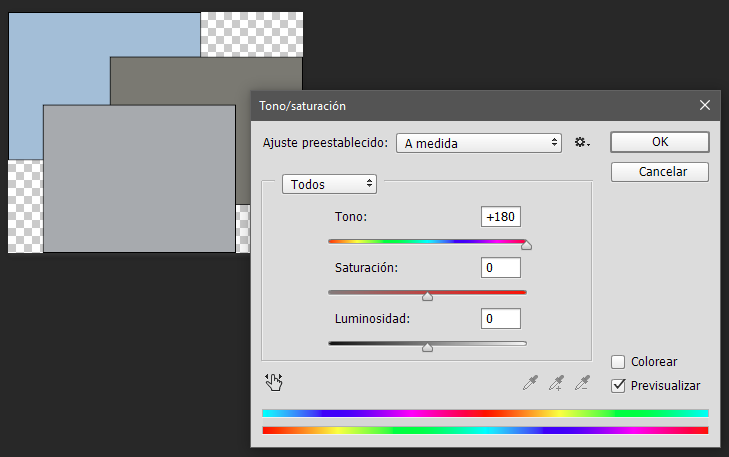
Open the image I prepared for you and press Ctrl+U or go to Adjustments>Hue/Saturation

And move the H slider +180. This will give you the complementary on the same plane. (Spanish class! Tono = Hue)
enter image description here

Or simply inverse the image. Here I am using curves:

enter image description here

This will give you the complementary in 3D, in a solid.


If you are looking for a color scheme, you can drop the two gray images. They are simply gray, and focus only in the blue.

1
  • Hi, I'm working in CMYK with FOGRA39 I think this is why Kuler was giving different values than adding/subtracting 180 ;) Commented Dec 12, 2017 at 19:10

Not the answer you're looking for? Browse other questions tagged or ask your own question.