1

I'm helping a friend out with a bird logo and I'm new to Illustrator.

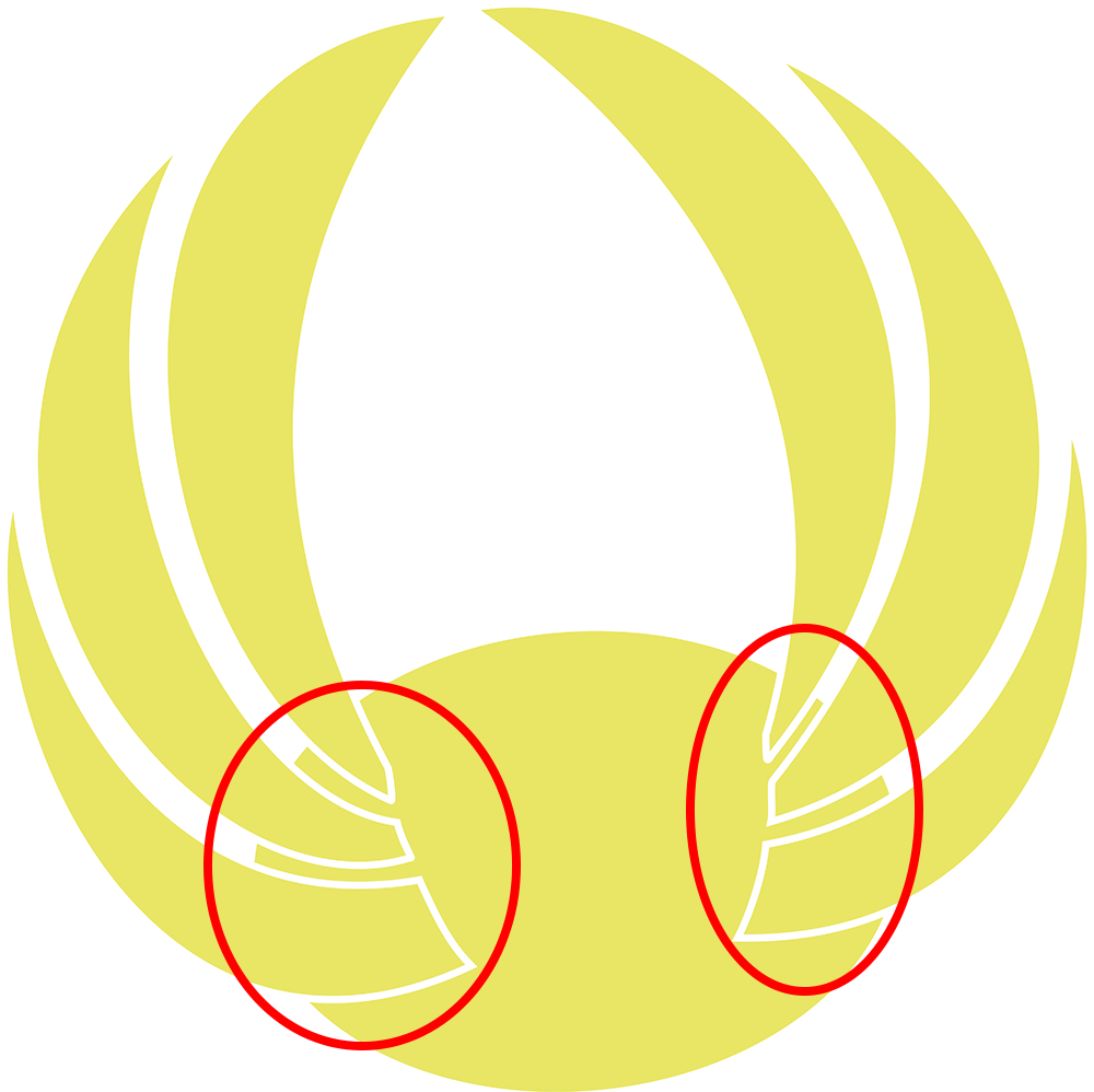
I need to increase the whitespace around the points where the wings intersect with the body ellipse, without changing the wing shape/size. The logo will need to be printed small, so I want the shapes to be visible clearly at the much-reduced size.

enter image description here

I was using a white Stroke but when I pump the weight/thickness up, it gets messy around the body/wing intersect points. Plus the wings get smaller with the increased whitespace all the way around the wing shapes.

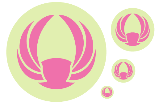
What's the proper way to handle this, so I only increase the whitespace where the wings meet the body (and not all the way round the wings).

enter image description here

Sorry, my terminology is off here - I'm pretty sure the effect I'm looking for is easily achieved. I just don't know how to properly describe the issue in order to get the right guidance back in my search results...

4
  • Because the widths of the "fingers" between the wings are small, your solution will involve creating ledges of a sort on the feather bases. Is this an acceptable modification? Another way of looking at it is that a hilt or handle to the sword (feather) will be created.
    – fred_dot_u
    Commented Apr 29, 2018 at 9:25
  • When using a white stroke, what are your settings for the stroke? You should be able to increase the stroke weight without impacting the appearance outside of the intersected area when using strokes that lie outside of the fill. Commented Apr 29, 2018 at 9:26
  • Also make sure to never use strokes in your final design of a logo (logos specifically). If you Logo is ever to be used in CAD programs, e.g. if your logo gets cut out on a plotter, strokes will mess with the "cutting route" of the plotter. Instead, go to "Object -> Path -> Outline Strokes". This will create a shape with the exact size of your stroke. Commented Apr 29, 2018 at 9:40
  • Thanks for the responses! Stroke is 8pt on that image. The challenge with "increas[ing] the stroke weight without impacting the appearance outside of the intersected area when using strokes that lie outside of the fill" if I understand it is the lack of yellow body mass. Larger stroke eats into/reduces the space between wings so the yellow isn't visible at reduced size. I'm starting to think redrawing it might be easier/better! :D
    – mindshaft
    Commented Apr 29, 2018 at 10:12

2 Answers 2

2

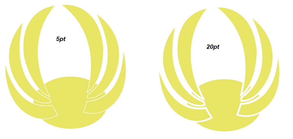
You can try using a non uniform width profile on the stroke. (use the default #4 which goes from thin to thick)

enter image description here

The problem is, with using the variable width profile - it won't produce the exact results wanted (in this case - see how it does get thinner on the wings) since the stroke goes all the way around.

To solve this will require some manual work:

Set the stroke to None

Using the Direct Selection Tool (A) select each line on the side of the wing and

  • Clone it (Ctrl+C Ctrl+F)

Make sure you click to select, not drag - this way it'll only select the actual line

(If there are multiple anchor points - click in between each anchor point and make sure to Right click → Join afterwards)


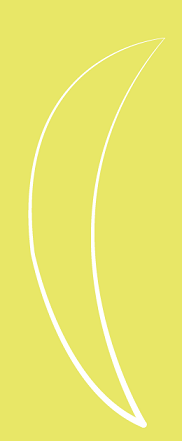
Now for each line individually, apply the width profile: (you can adjust the stroke up for more space - I did 10pt)

enter image description here

enter image description here

(Background color so you can see width)

1
  • Thanks for the detailed response! I'll give your approach a try. :)
    – mindshaft
    Commented May 1, 2018 at 7:28
0

My preference would be to handle this in one of three ways....

  1. Either treat the end caps of the "feathers" as a single object removing them from the ellipse entirely

    enter image description here
  2. Or... forget about separating the "wings" and combine all the shapes:

    enter image description here
  3. Or... separate the ellipse from the "wings" not vice versa:

    enter image description here

Which method would greatly depend upon the importance of the ellipse and if there were additional artwork related to this which you haven't presented here.


In the case of #1 above, I'd merely draw a new shape to indicate the piece to remove from the ellipse:

enter image description here

Then use the Pathfinder Panel to subtract those areas from the ellipse.

This leaves you with 1 color artwork and clear definition between the shapes at small sizes.

enter image description here


If the ellipse is imperative, then options 2 and 3 would be best for clarity and definition in my opinion.

0

Your Answer

By clicking “Post Your Answer”, you agree to our terms of service and acknowledge you have read our privacy policy.

Not the answer you're looking for? Browse other questions tagged or ask your own question.