6

I'm working on a logo and trying to give the logo shape a 3D'ish depth effect. Here is what I currently have:

Regular size: enter image description here

Larger size: enter image description here

The way I'm currently achieving this effect is by creating the diamond shapes with regular flat color fill and then I have another 'paste in place' diamond shape that's a gradient with the opacity being '100% overlay'. Like this:
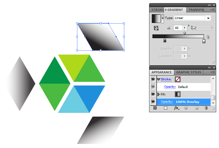
enter image description here

I'm not a graphic designer so I really don't know if this is the 'right way' to go about achieving this effect. I do find that with the second layer you can kind of see some hard edges on the triangle, I've seen it be more pronounced when printing it as well.

My question is, is there a better way to achieve this effect or even create a better more 3D'ish effect? Also, how do I go about making sure the logo is crisp and doesn't have any hard edges or imperfections?

My apologies if this is a rather ignorant question, I've never had any format graphic design training, figured this out just by playing around with Illustrator.

2
  • 1
    What are you trying to achieve? Which part should appear to be the most forward?
    – Ryan
    Commented Dec 6, 2012 at 21:48
  • I'm trying to create a somewhat visually playful effect using white space and shadows - imagine a hollow 3D cube with the edges being white (the white space), the centre of the image, where I have shadow now, is in the 'depths' of the cube, farther away from the viewer. In other words, you can think of the sides of the cube closet to the user as being transparent while the coloured sides you see are the inside of the cube, with the shadow being in the corner furthest away from the viewer.
    – M.A.X
    Commented Dec 6, 2012 at 22:06

3 Answers 3

4

The 3D approach

If you think of this as an actual 3D object (something like a pyramid) and consider how a light source would interact with it, you'll begin to see why your treatment is a little odd. How would you end up with the even gradated shadow from the top point around all sides? Consider your light source and then reevaluate your approach (a physical model may help).

Update in response to your comment ...
The thick white lines are killing your desired effect. If the gaps are desired, they'll have to be maybe half the thickness (even less in the larger format). The playful realism will be even better if you lose them altogether.

Instead of building the overlapped triangles, try building the planes of the cube in perspective. With layer blending modes (overlay perhaps) and/or transparency, you might start to see the overlapping effect you have in mind. Illustrator's 3D effects may be an easy way to get things correct, at least as a starting point or reference.

Or just for flair

Regardless of the accuracy of your effect, I think your treatment looks quite nice, especially for a non-designer. If you're going for completely stylistic (not necessarily convincing 3D), try some of these alternatives and adjustments.

  • Soften the transition of your current treatment: Make the dark to light transition less dramatic by extending it's length or making the color stops closer in hue and brightness.
  • Apply the gradient directly to each segment, aligning the gradient with the out-facing side of the triangle.
  • Apply the gradient as radial within a perfect circle, centered to the object as a whole.
  • Move this into Photoshop as a smart object and do the gradient there with some dither applied to it or a film grain effect. A little "analog" applied to your vectors can be quite nice.
6
  • In response to your first paragraph I think we need to know what M.A.X is trying to achieve. As it stands it looks like the white is in the foreground with the triangles going 'down' into space. The question is whether that is what he intended or not.
    – Ryan
    Commented Dec 6, 2012 at 20:11
  • What do you mean by 'soften the transition of current treatment'? Sorry, my graphic design vocab is somewhat lacking.
    – M.A.X
    Commented Dec 6, 2012 at 23:01
  • I tried to apply the gradient directly, but I couldn't get the colors right, not sure how to apply this type of shadow or to figure out what the colors should be if I was just to do a gradient based on two flat colors to achieve the shadow effect
    – M.A.X
    Commented Dec 6, 2012 at 23:02
  • Sorry for my cryptic description: By 'soften' I mean try to avoid any dramatic shifts in tone, make the change from dark to light less obvious. If you're not familiar with the gradient tool and how to control it's colors and transitions, take a look at this Adobe help doc. The "softness" of the gradient is controlled by the colors selected and the positions of the gradient stops and midpoint. Gradient stops at extreme opposite ends and midpoint at 50% is the "softest" a particular gradient gets. Commented Dec 7, 2012 at 0:19
  • Adobe tutorials are typically pretty stripped down. This ugly but good basic tutorial may also be helpful to you. Commented Dec 7, 2012 at 0:20
2

I know this is a very old question but it may help someone in the future.

My answer is only answering the "hard edge" problem from the gradient layers on top of the logo.

A better way to do this that won't create the hard edges is to firstly remove the gradient layers completely (or hide them if you want to use them in the future).

Then, separate the logo into 3 sections so that each "diamond" shape is on it's own layer: enter image description here

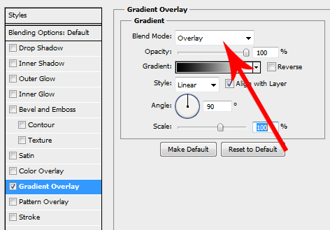
Open up the blending options (Layer > Layer Style > Gradient Overlay) for each layer and add a Gradient Overlay. You'll then want to make the blend mode of the gradient overlay to be Overlay like so:

enter image description here

After you tweak the angle of the gradient you will get the same effect as the extra layers you were using originally but now you wont see any "hard edges" as the gradient is being applied directly to the layer and not sitting on top of it.

Hope this helps!

4
  • 1
    Alternatively, you could also use inner shadow for a similar result.
    – John
    Commented Apr 8, 2014 at 17:43
  • +1! @John you could indeed but you would be limited a lot more with the angle of the gradient.
    – SaturnsEye
    Commented Apr 8, 2014 at 19:26
  • Question is asking for Illustrator though, not Photoshop.
    – Scott
    Commented Apr 8, 2014 at 19:54
  • @Scott I know, I must of miss read the question because I only realised it was for Illustrator a few hours later. Still left it as it's a useful tip
    – SaturnsEye
    Commented Apr 9, 2014 at 7:30
1

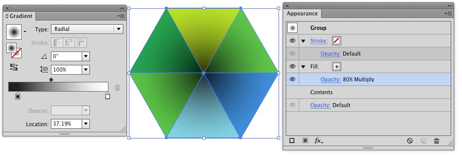
I would simply group the shapes and apply a radial gradient fill to the group.

enter image description here

Note.. for a logo.. and for print (CMYK) the "overlay" blending mode is not going to give you the results you think. For CMYK really the only blend modes to use safely are Multiply, Color Burn, and sometimes Screen. All other blend modes will give you generally unexpected results. You should work in CMYK for a logo destined for print use to avoid utilizing blend modes which won't hold up in CMYK.

Not the answer you're looking for? Browse other questions tagged or ask your own question.