Welcome to what is probably the Number 1 'gotcha' for people new to print design :-) and yes, people who encounter it for the first time not pre-warned almost always run into just before a deadline...
RGB black is simple. It's just no light coming from the screen.
CMYK black isn't simple. There's black ink (the 'K' in CMYK), but even with 100% black ink, it doesn't create a magic black hole that absorbs all light. There are a whole range of shades of printed CMYK colours that look black, but with a very slightly different edge or character to them because of slight differences in precisely what light the stacks of ink absorb:
- 100% K, 0% everything else, when printed in large areas, looks a bit dull and uninspired. But it's great for text and fine lines, because there's no risk of indistinct edges if the print plates are very very slightly mis-aligned
- There's "Rich black", which is a mix of inks intended to create a more vibrant black. There are as many rich blacks as there are print configurations - see here for more info.
- Some designers will sometimes create their own rich black for a project. If you want a slightly cooler black, more cyan. A slightly warmer black, add magenta. And so on. (beware
total ink - if you don't know what that is, google it, because that's maybe the second biggest print design gotcha and you don't want to learn what it is after asking the question "Help why do the dark colours in my print keep smudging?"... you probably don't have total ink problems, but you might create total ink problems if trying to fix rich black problems clumsily, I did once...). If doing this, always check proofs and work with the printer on this, they know their setup better than you can, never make assumptions.
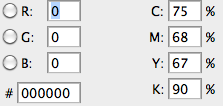
Rich black's colour balance typically looks like this (the Adobe default mix, from this related question):

The washed-out greys you're seeing are the software trying to simulate the range of possible blacks on a screen. That's near impossible to do well, but it's valuable because it shows you where two blacks have a different mix and would look different on the printed page. So, it doesn't look good on the screen, but that's fine, because if the document is CMYK, you're not designing for a screen.
Be very careful not to accidentally have two mixes of black up against each other unintentionally... It's a really common newbie error.
How to fix it? Depends on the file. Different black mixes in one file is not usually desirable, but can be okay so long as there aren't any sharp edges where one meets the other. Don't panic too much about how things look on the screen for the aforementioned reasons - assuming it's actually black, it shouldn't look as washed out or grey when printed. Get print proofs.
Try to track down where the differences came from. You might have picked different black swatches without realising it, or got black from the colour wheel somewhere and a swatch/dropdown somewhere else... If you can identify the different blacks you can go some of the way towards equalising them with careful use of Select > Color range. Or if you converted from RGB, you can look at the conversion settings.
One more related question on top of the two linked to above: How do I make screenshots look good when printed in CMYK? has some related material.

