0

I'm going to develop a new app for neighbors community and local business so in the app, the users will find some categories of services they can choose and inside every category the related services.

Now I'm thinking about the icons I want to make, and I was thinking to add a "hand" to every icon. I'll explain myself better with an example. Let's say I'm looking for someone to help me out with "furniture assembling": the options for the icon are 1) a simple screwdriver or 2) a hand holding the screwdriver, cause I thought the hand might better represent the help a person is giving.

Now, I got some concerns about this idea:

  1. Will the hand be too repetitive as an element?

  2. Will the icon be more scalable and understandable without adding the hand?

Thank you in advance for your honest opinions :-)


Click here for photo of hand holding garbage

trash bag

Just a quick example. I haven't made the icons yet.

3
  • Well...I don't know why but my "Hello" did not appear at the beginning of the post! HELLO YOU ALL!!! Commented May 7, 2018 at 18:26
  • To me, this can't be effectively answered without some visual examples. Conceptually the hand should be fine. But it really depends upon the implementation.
    – Scott
    Commented May 7, 2018 at 18:27
  • How can I add a couple of pics examples? Commented May 7, 2018 at 18:29

3 Answers 3

2

Icons in a user interface should be:

  • aesthetically cohesive
  • visually distinct from each other
  • intuitive

Typically, that means the simpler, the better.

While adding a hand to every icon may help with the first bullet point, you need to weight that with the other two bullet points.

There's no universal answer to this, though. Context is everything and it's all going to come down to the needs of your specific UI and the specific icons you come up with.

1

I don't think repetition is such a big problem. The point is the personality you want to give to your icons. I found few samples on the web, the explanation is always better with images.

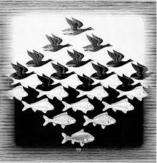
Escher made repetition an essential part of his graphic personality:

escher

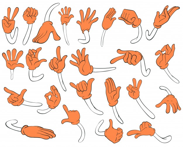
Repetition sounds like boring to the eyes. The image below is very repetitive but visually rich. There's a good graphic resource, the main image in color, the secondary image white with black outline. Imagine your hands as a secondary element and the main object in color.

hands 1

This could be the opposite situation. A tedious repetition that overtake the interest of the main object for each icon. The most relevant about this icon system differentiation is the color and i guess in your case color is not the most important. Bad choice for color blind users.

icons 3

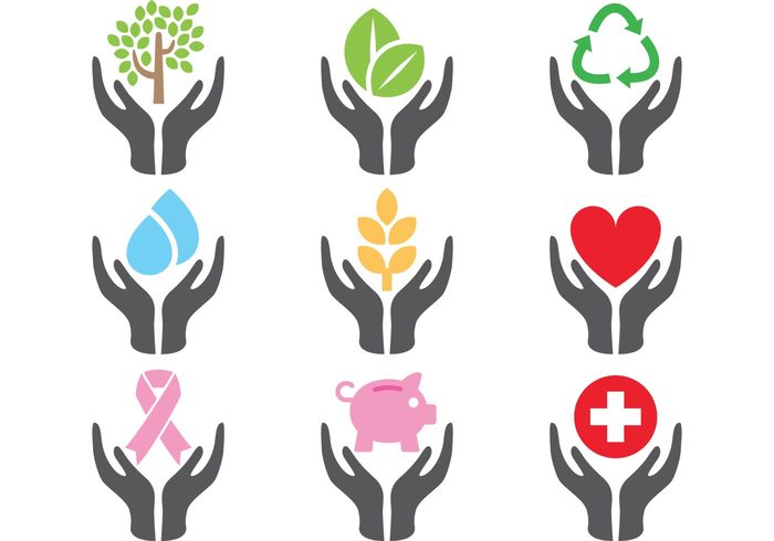
Below an intermediate point. Beyond the graphic result, (the hands look like deer horns), i think is a good decision for a repetitive element. Back to the main and secondary elements, the hands function as a icon frame. Maybe the dark color is not the right one.

ICON 4

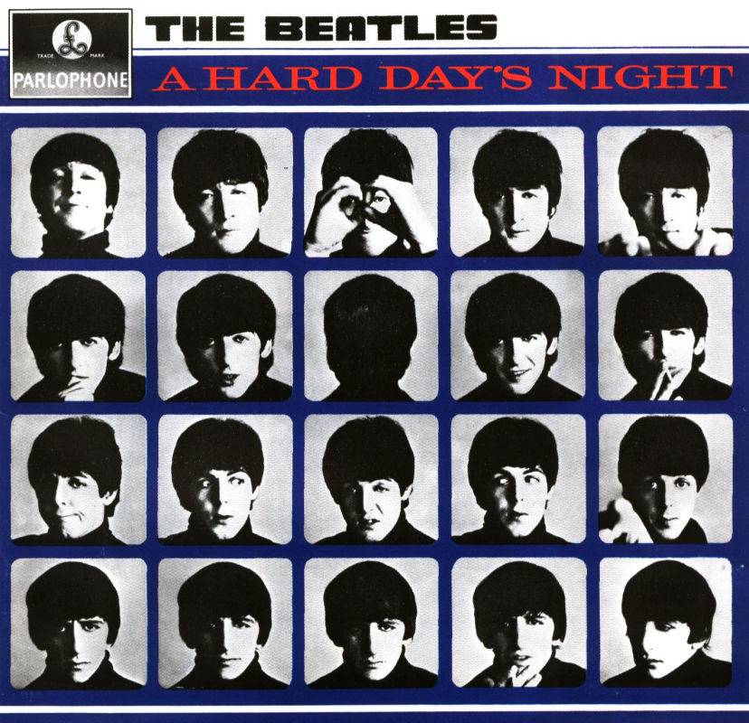
Repetition can be a good option if you find the way to give personality and may even be the personality of your application. If you decide to repite a hand in every icon, the problem is no to be repetitive, this is the axis of your icon system. The big problem is to find a good and functional graphic style. I hope to help a little.

Beatles

1

Repetition is not the problem. The idea is solid but complexity of the icon as you have it now will probably not scale down very well. The more you add to each icon, like by adding a hand, the harder it will be to understand the details at small sizes.

You may be able to solve this by making the icon flat and removing all of the dimensional aspects. One rule of thumb is that if the icon doesn't work in only 2 tones, then it will probably not be recognizable at smaller scales.

Your Answer

By clicking “Post Your Answer”, you agree to our terms of service and acknowledge you have read our privacy policy.

Not the answer you're looking for? Browse other questions tagged or ask your own question.