2

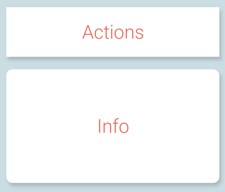
In graphic design (specifically for web and mobile) is it acceptable to combine elements that have rounded corners with elements that have sharp corners on one screen?

The purpose from of this from a UX perspective is to visualize that the rounded is for displaying information and the sharp is for actionable elements.

Is it acceptable from a graphic design perspective in to combine both rounded and sharp cornered elements on one page?

enter image description here


4 Answers 4

7

There are no rules. If it looks right, it's acceptable.

1
  • I'm not an expert but I thought there were guidelines, laws and theories? Commented Sep 27, 2018 at 9:37
2

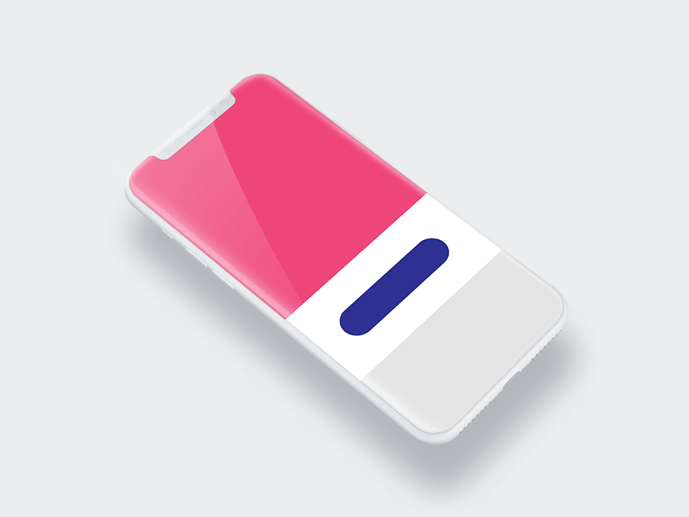
You can do whatever you want, but a better UX is to drag the straight line shapes all the way to the edge of the screen and keep buttons and such rounded. This will create a better separation between elements. Just look at Instagram and stuff, these guys are spending millions inventing 'the rule'.

enter image description here

1

From a basic UX perspective, yes. The logic checks out within the context that's been provided:

  1. I have two components.
  2. The two components are different.
  3. I should style them differently so a user knows they're different.

Though, without testing or validation there's no way of knowing if you've overcompensated or just barely met the mark.

From a graphic design perspective, there's not enough context to argue either way so, there's not going to be a finite yes or no beyond "you can do whatever you want."

I think, instead of asking "can I combine some elements in rounded containers and others in straight-edge containers?" ask:

  • "Can I create a complimentary design system that balances and empowers the contrast of straight-edge and rounded corner containers together?"

or even better:

  • "What emotions or general value am I projecting/adding by making these container edges different?"

It could go either way depending on how these styles contribute to the overall design system as a whole (which is far more important by the end).

Generally, it's difficult to balance contradicting styles so they're used sparingly, saved for larger banner/features/highlights, or for one-off artistic thought experiments. You can create a website using only fire truck red and blue lagoon... blue but it's going to be a challenge to create a complimentary, comprehensive, multifaceted design system that provides an intuitive, enjoyable experience. I would add more context by fleshing out the rest of the design system first. That should help reveal problem component styles, etc.

Hope this helps.

1

UX approach is something that is generally skipped past when making a design decision and on a large scale, this certain area is the actual game changer. It's still in debate if either two different shaping perspectives must be dealt with the same basic design approach or if it must follow a standard way under any rule or law but currently, it's really all about experimenting with the context of your design and its approach.

According to my knowledge and experience working for more than 7 years now in the field of design and planning, I believe it really does matter when you are choosing a certain approach. Mixing would be a matter of high-end brainstorming to actually come up with such an ideal design idea that must enable one's mind that the approach used is just right.

To consider this ideology, we can learn that approach from Uber's Base design system as it shows us how they managed to mix both smooth rounded components with layouts and containers using an edgy shape is the best example to relate this current idea.

Your Answer

By clicking “Post Your Answer”, you agree to our terms of service and acknowledge you have read our privacy policy.

Not the answer you're looking for? Browse other questions tagged or ask your own question.