There's a discussion on this same topic over on UX Stack Exchange.
Though usually considered a bit of a design no-no(as mentioned in the link above) I think that in this case it may be an ok idea - it depends on how the content sits. But it seems like it could be argued either way.
In favour
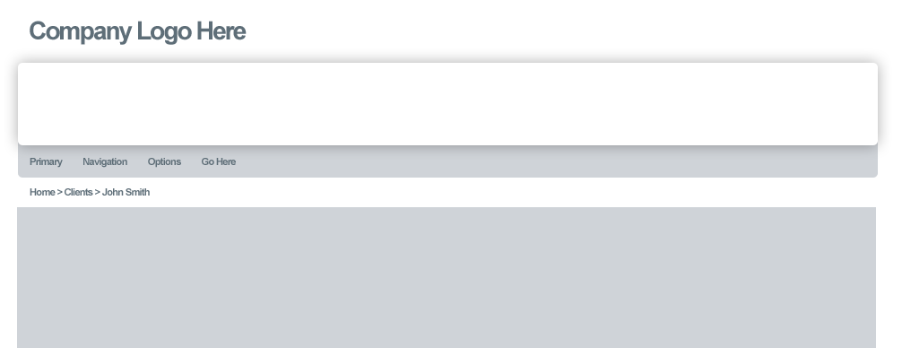
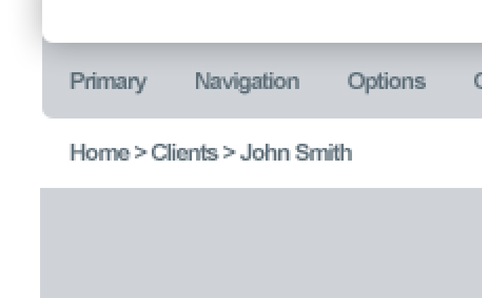
The menu bar is a separate component, having it slightly unique subtly sets it aside from content and is beneficial for navigation purposes - the primary goal in web design is to communicate information, having this difference in the menubar as a component makes it easier for the end user to navigate through that information. One could also state that the white space created by Home>Clients>John Smith creates a bridge between the two different corners so you don't actually have a mixture of rounded and squared corners, but rather rounded corners...accompanied by square corners.
Opposed
Mixing these two types of corners breaks the continuity of the aesthetic. It divides the menubar(as well as the banner above it) from the content on the page. This could create a feeling of a ready made universal template as opposed to that of a cohesive design particular to a specific brand - the banner and menubar don't 'fit' with the other content. (To clarify it's kind of like a 'one size fits all'). Any content for any website could be dropped below the bridge of Home>Clients>John Smith.
Without design continuity you also risk breaking the natural flow of navigation as though a user may not know why, they could be distracted by the break in flow rather than the natural navigation that would most likely occur they could click elsewhere...though admittedly this is a more extreme example. I can't imagine that in this particular case the user flow would be broken based on the corners - but then again crazier things have happened!
Personally I don't really mind it in the design as shown, I'm not particularly fond of it but as a realist unless the content sits badly or creates more of a contrast between the rounded and squared elements, I could deal with it. As a designer it kind of bothers me because I like continuity, patterns and cohesion!


