8

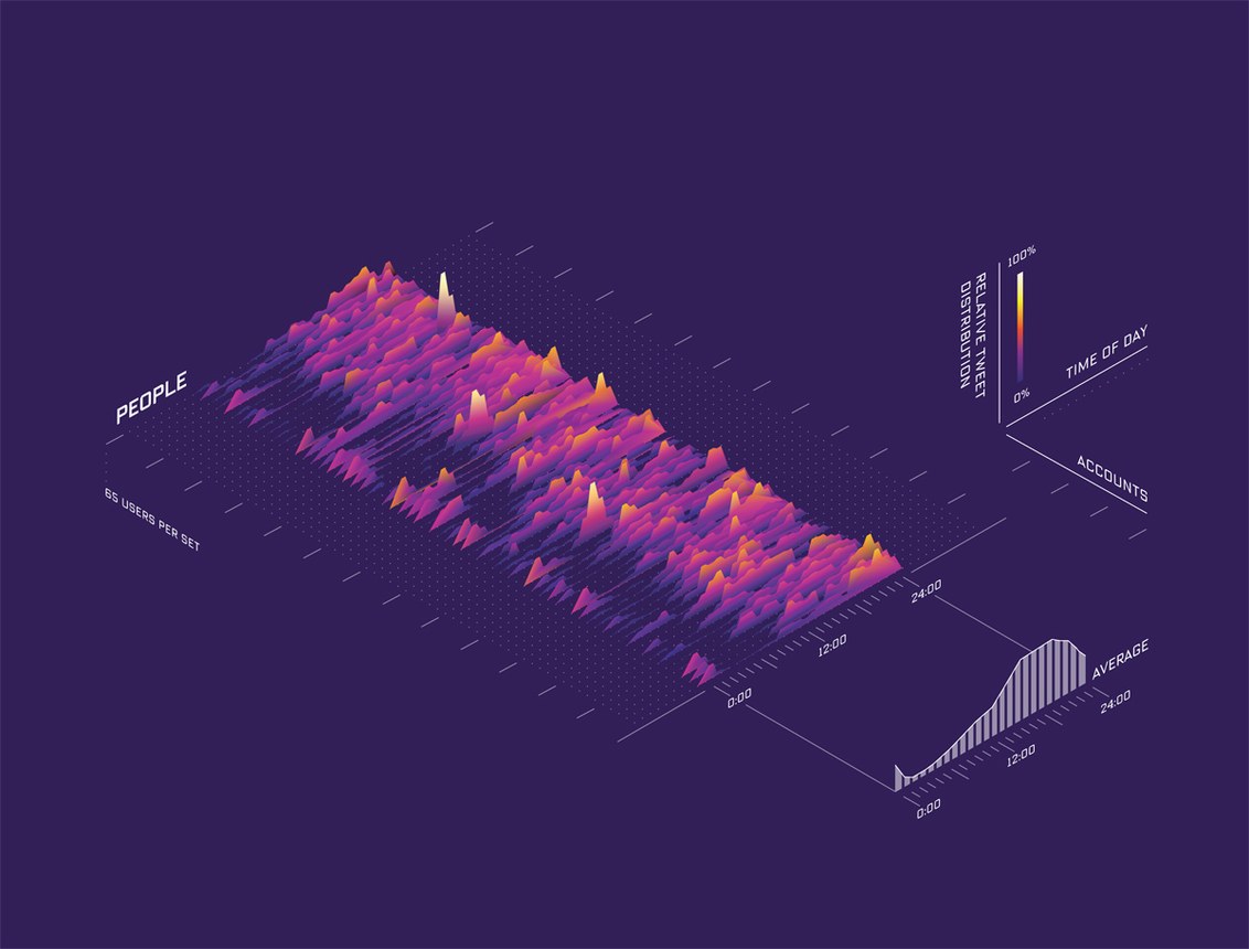
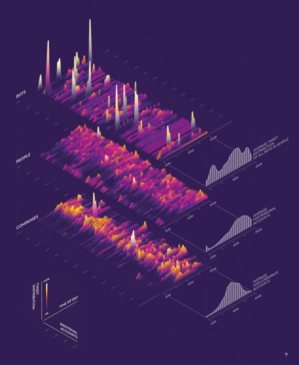
I am looking to make a plot where:

  • Plot is composed of a group of 2D plots, stacked in 3D.
  • The height of the line is indicated by the color.
  • The mean of the wave of each plot is indicated by a dashed line to the axis.

How is this type of graph called?

Simplest / fastest way of doing something similar (less complex than in the image, I don't need 3 of those, and the black and white waveforms to the right etc.).

enter image description here

1
  • 2
    Do you want to visualize some numeric data or do you only need a flashy looking chart for decorative purposes? The chart presents one value as a function of 2 variables. At least one of those 2 variables seem to have only quite few discrete values. The sparse variable can simply be the number of an observed target or time series and the presented function actually has only one variable.
    – user82991
    Commented Apr 17, 2019 at 17:17

4 Answers 4

10

This type of graph is called a 'Waterfall Plot'

It can be used to plot arbitrary data in three axes (as in your example), but it is most commonly used to plot the results of a time-frequency analysis.

You mention waves/waveforms so I'm guessing you are interested in time-frequency analysis. Here is an example process to produce a waterfall plot of an audio signal:

  • start with a signal (a collection of times and amplitudes)

  • divide the signal into n equal parts

  • for each part:

    • compute the Fourier Transform to extract frequency and power

    • plot frequency vs. power as a 2D plot

  • rotate, skew and translate the plots so that they form the 3D effect in your example image

Now that you know the phrase 'waterfall plot' you can probably find some implementation in whatever software you are using to process your data. Matlab has a waterfall function exactly for this purpose.

Your options in order of preference are:

  1. Use a waterfull function provided in your software

  2. Use a 'make 2D plot in 3D space' function provided in your software

  3. Make a bunch of regular 2D plots and manually arrange them in some program like Inkscape or Illustrator

You will almost certainly need to do some post-processing in Inkscape or Illustrator to get something as attractive as your example.

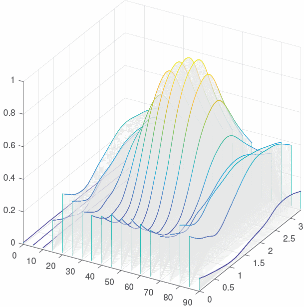
Here is an example of a waterfall plot that I generated in Matlab. I used the "make 2D plots located in 3D space" method because I wanted extra customisations.

Example of waterfall plot generated in Matlab

5

Scaling law

The name in its original publication from WIRED magazine

enter image description here

The scaling-law definition according to sciencedirect.com

Scaling laws are relations between physical quantities in which all the physical quantities appear in terms of powers, whereby a power of x is expressed in the form xα where α is a real number.

and

The scaling laws for 2D geometry can be extended into three-dimensional (3D) case


About how to make something similar, I think it's a mix of charts made in an application that allows a graphic representation by data dump plus a montage in a vector program to generate the isometric perspective and data/references adding.

In a practical way, I could tell you if I had to make that poster, I would ask all the charts to assemble the design in Illustrator. The original image looks too neat to have been made in a program that is not vector drawing:

enter image description here

1
  • 6
    A scaling law is a mathematical relationship between variables. It is not the name of this form of visualisation, which could represent variables connected in many other ways (for example, each series could represent a density plot or simple histogram). These sorts of charts have recently been termed ridgeplots or (briefly) joyplots in the data science world: serialmentor.com/blog/2017/9/15/goodbye-joyplots Non-3d examples here: google.com/#tbm=isch&q=ridgeplot or as an another answer here suggests, waterfall plots. Commented Apr 18, 2019 at 2:00
5
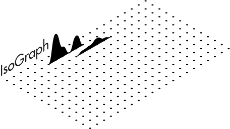
%!PS-Adobe-3.0 EPSF-3.0
%%BoundingBox: 0 0 400 400
%%Title: Isometric Graph Drawing
%%Creator: Janne Ojala
%%CreationDate:  2019-04-17
%%EndComments

/up {dup translate} def
/down {neg up} def
/isometric-bottom {[30 cos 30 sin 150 cos 150 sin 0 0] concat } def

/isometric-back {[30 cos 30 sin 90 cos 90 sin 0 0] concat } def
/c {newpath 1 0 360 arc closepath fill} def


/Arial findfont 24 scalefont setfont

100 160 translate
gsave 
isometric-back
    0 0 moveto 
    /FuturaStd-Medium findfont 18 scalefont setfont
    (IsoGraph) show
grestore

gsave 
0 1 12 { 
    pop
    150 cos -10 mul  150 sin -10 mul translate
    gsave 
    isometric-bottom 
        0 10 200 { 0 c} for
    grestore
} for
grestore

150 cos -20 mul  150 sin -20 mul translate

gsave 
isometric-back
  newpath
  50 0 moveto
  55 0 55 33 60 33 curveto
  65 33 65 12 70 12 curveto
  75 12 75 0 80 0 curveto
  85 0 85 16 90 16 curveto
  95 16 95 0 100 0 curveto
  gsave
     closepath
     stroke
  grestore
  fill
grestore

150 cos -10 mul  150 sin -10 mul translate
gsave 
isometric-back
  newpath
  80 0 moveto
  85 0 85 3 90 3 curveto
  95 3 95 4 100 4 curveto
  105 4 105 8 110 8 curveto
  115 8 115 3 120 3 curveto
  125 3 125 0 130 0 curveto
  gsave
     closepath
     stroke
  grestore
  fill
grestore
%%EOF

enter image description here

1
  • Thanks so much! how do I make the height represented in color as well? Commented Apr 17, 2019 at 21:50
2

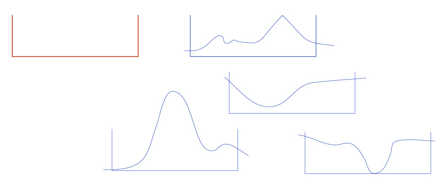
For decorative purposes you draw one manually.
enter image description here

The red frame is a mold to get equally wide subgraphs. I have made a few blue copies of it and with the pencil I drew a few curves. Be sure that the curve nowhere turns back to left.

The areas can be filled with the shape builder:
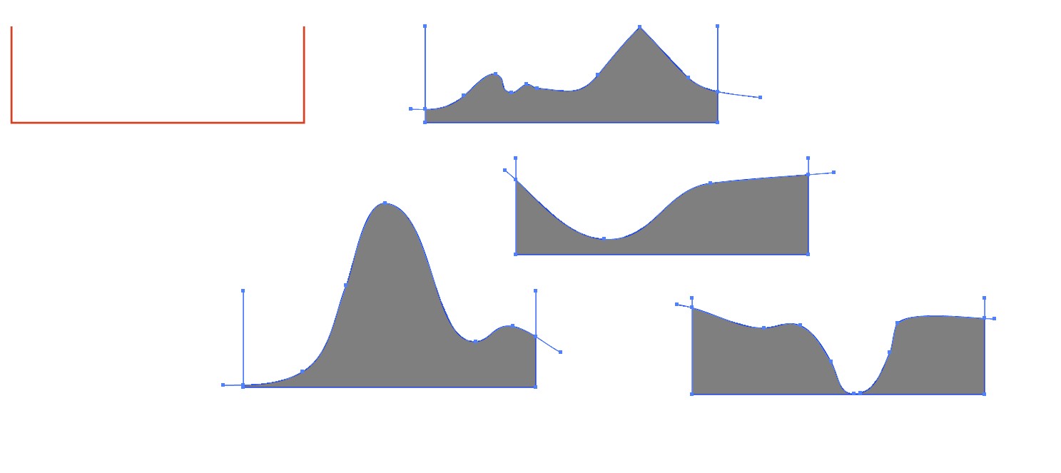
enter image description here

NOTE1: You can double the production rate if you have a rectangle as your mold. Only remember to flip the upper halves.

NOTE2: Select from tool options how much the pencil smooths your drawing. If you want polylines with corners, you can click with the pen instead of using the pencil

Select all filled areas, copy them to the clipboard, delete the mold remnants and paste the filled areas back. Align them, remove possible strokes:
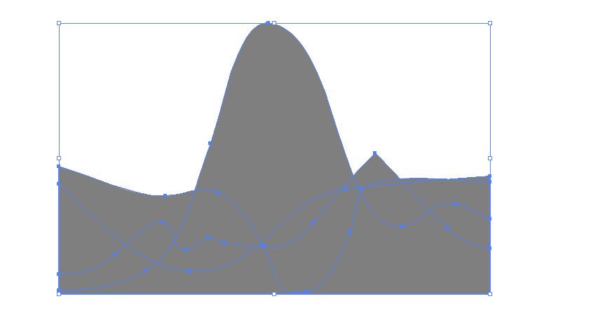
enter image description here

Make a gradient and fill all with it:
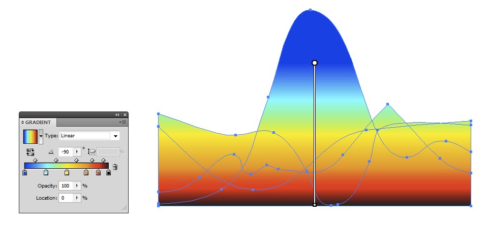
enter image description here

Take the Shear tool and skew the shapes. Hold shift to prevent rotation.
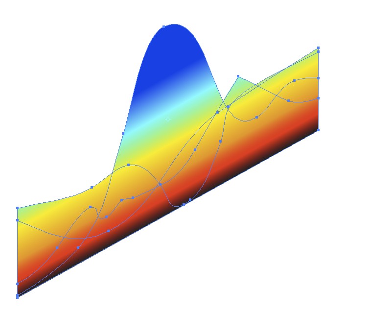
enter image description here

Make a placement guide for the shapes and place them. I drew a line, applied a couple of times Object > Path > Add Anchors to it. That duplicated the anchor points twice and inserted them with equal spacing. I placed the corners of the shapes on the anchors:
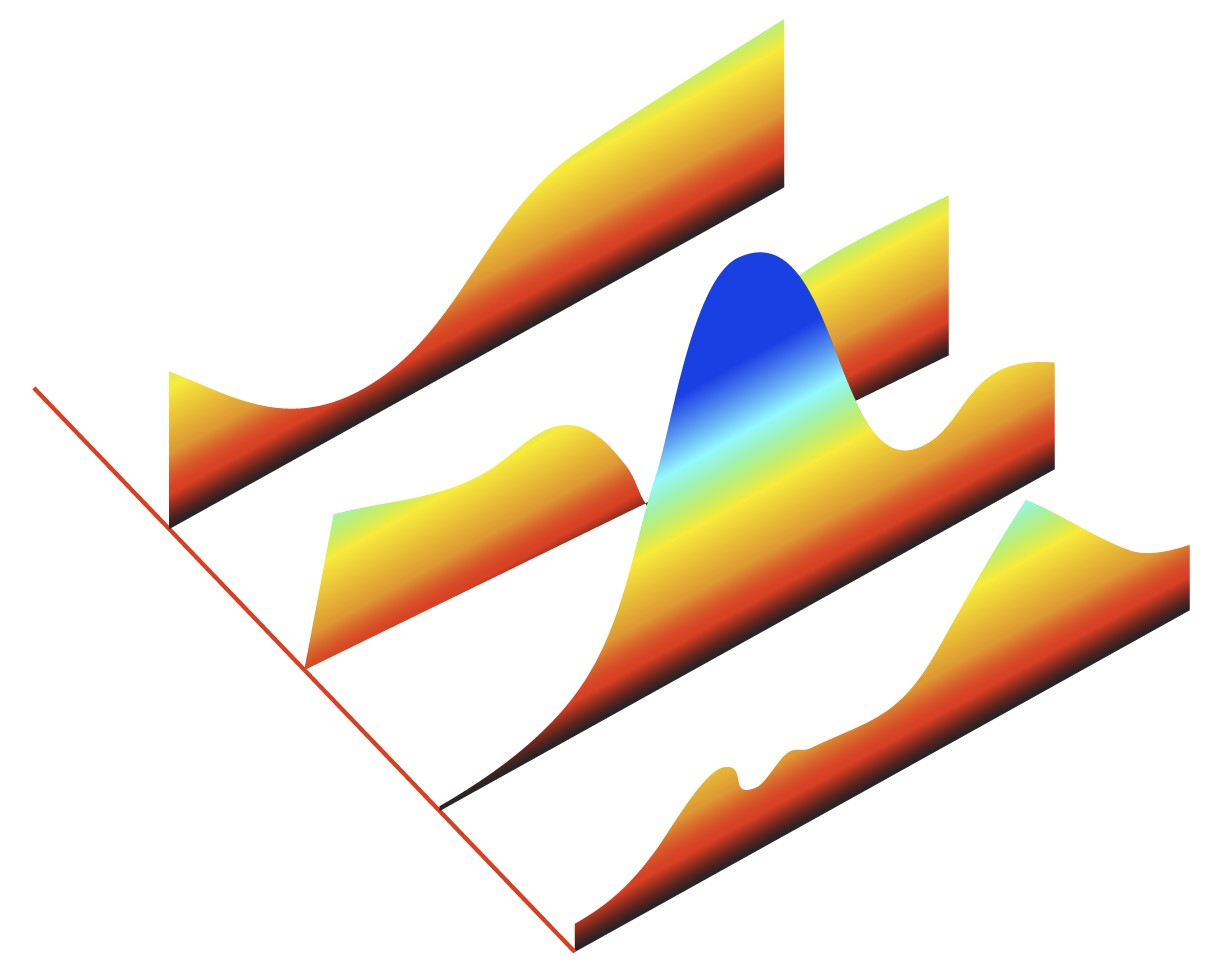
enter image description here

Have smart guides and snap to points ON, select a shape, drag the corner with the direct selection tool, it snaps and the rest of the shape follows.

Use a common shearing angle, you need it to make texts. I believe traditional isometric shearing is a good choice.

Your Answer

By clicking “Post Your Answer”, you agree to our terms of service and acknowledge you have read our privacy policy.

Not the answer you're looking for? Browse other questions tagged or ask your own question.