4

Is there a plugin for any of the Adobe apps or in general that adjust on-screen colors for custom color blindness deficiencies?

This way the affected designer can design seeing the colors clearly and the output would be accurate or correct for normal users and/or printers.

Ultimately, having something on the MacOS level would be the best thing and this way you wouldn't have to on a per-app basis.

8
  • 2
    I don't quite understand this request. If the designer has, for instance, Deuteranopia, no amount of red/green exaggeration is going to make them capable of differentiating red from green.
    – Tetsujin
    Commented Apr 26, 2019 at 16:41
  • Aren't there glasses for red-green colour blindness? I'm sure I've seen them demonstrated on youtube. Ask your optician about them. I suppose it would depend on what kind of colour blindness you have.
    – Billy Kerr
    Commented Apr 26, 2019 at 17:31
  • @Tetsujin My thought behind the questions is the ability to adjust color levels to accurately reflect (to the designer) the correct color. Perhaps, there is a test/calibration visually that the designer goes through before using the plugin. I know they have that kind of thing for sound. They go through a test/calibration so that certain frequencies are adjusted for the best possible listening experience. I figured, why not for color blindness. Perhaps I'm looking at in too simplistic terms but never hurts to ask.
    – ErickP
    Commented Apr 26, 2019 at 17:57
  • @BillyKerr Yes, they do. The one I'm aware of is called "EnChroma". But not sure if that is the best solution. I personally havent' used them so can't vouch for them.
    – ErickP
    Commented Apr 26, 2019 at 17:59
  • 1
    Found this about the EnChroma glasses. phys.org/news/…
    – ErickP
    Commented Apr 26, 2019 at 18:20

3 Answers 3

3

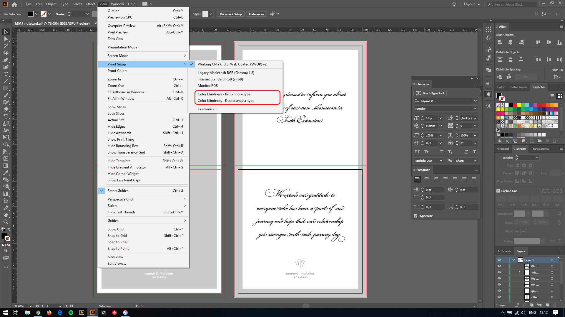
There is a way where you can preview the design and see how it would look to a person with color blindness. There is an automatic way built inside the Adobe Illustrator CC 2020 (ver 24.0.2). Go to View > Proof Setup enter image description here

1

Yes, there are several ways to check this.

0

There is no automatic way. And this is probably due color is a subjective thing. You probably are facing specific challenges that need to be solved by different means.

Some options:

  • Prepare custom pallets, that you know that work in general.

  • Study in depth color theory, especially chromatic contrast, harmony, etc.

  • Convert from time to time your files to black and white. To see how they work, then add the color theory on top.

  • Submit a preview to some college for a quick review, take notes and adjust your palettes accordingly.


I insist that programs like Photoshop try to add unnecessary tools, instead of adding some other useful ones.

One tool they lack is a vectorscope. In video, it is used to find the coordinates of the skin tones for example.

Take a look at this specific case: https://photo.stackexchange.com/questions/59595/how-can-i-correctly-adjust-skin-color-in-photoshop-when-i-have-a-color-vision-de/82987#82987

1
  • SUPER delayed response but Life. ;) Thank you for the thoughtful answer. I'll look into it.
    – ErickP
    Commented Mar 24, 2023 at 13:24

Your Answer

By clicking “Post Your Answer”, you agree to our terms of service and acknowledge you have read our privacy policy.

Not the answer you're looking for? Browse other questions tagged or ask your own question.