2

I am using a font called Veneer. It works fine in Illustrator, but it slows down InDesign (2020) and Corel Draw 2019.

If I zoom in, pan, or move the text, the latter programs freeze for a minute before I can work with them again. It's the same if I convert the fonts to outlines and if I reduce the render/preview level.

Is there a way to speed it up?

2
  • 5
    Could be because Veneer is a grungy font with a worn look. It has many more vector points than "ordinary" clean fonts.
    – Wolff
    Commented Dec 2, 2019 at 23:48
  • I disagree with the close votes; actually @Wolff your comment is the start of a good answer, can you expand on it?
    – Luciano
    Commented Dec 5, 2019 at 9:32

1 Answer 1

3

Without having access to your computer, my best guess is that the font is slowing down your applications because it is a grungy font which contains many more vector points than ordinary fonts.

One of the advantages of vector graphics compared to raster graphics is that they don't take up as much disk space. The downside is that they need to be rendered again every time you zoom or pan your document. This can be very demanding if the graphics are complex.

Let's have a look at how many points a letter from Veneer has compared to a standard font like Times New Roman. In Illustrator I expand an "A" from both fonts and compare the number of points using the Document Info panel.
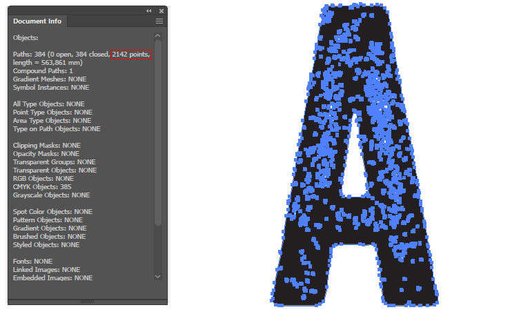
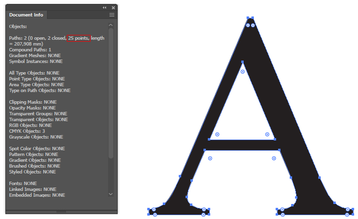
As you can see the Veneer "A" has 2142 points and the Times New Roman "A" only has 25 points! So Veneer has about 85 times as many points. Depending on how long texts you write, it can quickly become very heavy to render such complex graphics.

If you are set on using Veneer and you need the font to be editable, I don't think there is much you can do. Otherwise I can suggest some workarounds:

  • If you are making something to display on screen or you don't care about the text being vector sharp on print, you can rasterize the text at the resolution you need.

  • If it has to be vector but you don't care about it being editable, you can expand it and see if you can simplify it to decrease the number of points without affecting the look too much.

  • If you need it to be editable text you might be able to find a similar font without grunge effect and apply the grunge as a separate vector or raster layer.

8
  • One thing that might help in InDesign is to close your Pages panel or at least disable Show Thumbnails. Those tiny thumbnails can really make things slow in complex documents.
    – Wolff
    Commented Dec 5, 2019 at 21:28
  • I should have made clear the capability of my computer, its an 8-core laptop with plenty or RAM, the AMD card does have compatabilty issues with Corel Draw, however that doesn't explain the problems in InDesign. My older computer, which was a 4-core, lesser processer, but N-Vidia card, performed a lot better with this kind of font.
    – Aasim Azam
    Commented Dec 6, 2019 at 10:31
  • Despite that fact, I appreciate your answer and have decided to rasterize the type as the end product is for print.
    – Aasim Azam
    Commented Dec 6, 2019 at 10:32
  • Maybe the difference in performance comes from the different GPUs? Just so you don't misunderstand me: I said if "you don't care about the text being vector sharp on print, you can rasterize the text". Normally you would want text to be vector on print, but it's impossible to say if it does much difference in your case without having seen the artwork.
    – Wolff
    Commented Dec 6, 2019 at 13:04
  • the text will be read from a short distance, for car graphics, so the rasterisation won't be an issue.
    – Aasim Azam
    Commented Dec 8, 2019 at 21:57

Your Answer

By clicking “Post Your Answer”, you agree to our terms of service and acknowledge you have read our privacy policy.

Not the answer you're looking for? Browse other questions tagged or ask your own question.