4

I'm new to web design. I learned the basic stuff like layout, contrasts, the difference between RGB and CMYK, etc., but I struggle to apply this well in practice:

Picking good colours that work well with one another.

For instance, say I choose a pantone red for the logo, a near-black for text and a simple grey for borders.

What would a seasoned web designer do if they wanted to introduce new colours into the web page to highlight a button, while making sure that the new colour fits well into the current palette?

6
  • 1
    This is a design and art question, not user experience.
    – Rob
    Commented Jun 29, 2020 at 11:03
  • 2
    @Rob The accessibility and semantics of colors should also be taken into account, so it's an UX question as well. But maybe a bit broad to answer.
    – jazZRo
    Commented Jun 29, 2020 at 11:31
  • are you building functional software, or mostly consumption software, such as marketing websites?
    – Mike M
    Commented Jun 29, 2020 at 13:14
  • Functional software. Web apps that have loads of dynamic parts. Commented Jun 29, 2020 at 20:41
  • 1
    @Scott kind of, but the answers below are much better and focused on functional software, which this question is about. Commented Jun 30, 2020 at 10:22

3 Answers 3

3

Know your audience

It starts with knowing what you design and who you design it for. The color palette considered suitable for a funky new social networking site for young cat lovers in South Asia might look very different from the colors that would be considered working well for a new financial online service for young families.

Psychology of colors

There are six basic principles of color psychology:

  • Color can carry a specific meaning.
  • Color meaning is either based in learned meaning or biologically innate meaning.
  • The perception of a color causes evaluation automatically by the person perceiving.
  • The evaluation process forces color-motivated behavior.
  • Color usually exerts its influence automatically.
  • Color meaning and effect has to do with context as well.

The quoted principles are from Wikipedia. Understanding those helps to understand the importance of color, but also that there is no silver bullet. The last point is essential.

Read on in the same Wikipedia article to lear about the specific influence of certain colors on a brand or site. There are many good articles on the psychology of colors that can help to pick the right base colors (example – I won't quote here, too much content and too much of the same can be found on the web even if this particular article became unavailable).

Aesthetic aspects

This might be the main question you have. Color palette generators might be helpful. There are numerous services: random colors, colors matching your favorite color, colors that surely don't fit to one another, colors palettes generated from photographs, etc.

Even though these color palette generators bring up nice combinations, it may be interesting to dig deeper into research, e.g. the aesthetic response to color combinations or consumers' product‐specific colour meanings.

Accessibility

Last but not least: Color and contrast accessibility. Making an offering accessible matters first and foremost to people with disabilities. For some countries there are even legal requirements in place.

There are tools available to help you check color schemas against accessibility guidelines – search for keywords like accessibility color check.

1

Here's a few things you might want to consider when picking your colours.


Contrast

Make sure your information stands out against backgrounds are contrasting enough to be easy to ready.


Environment

Also with features like dark mode, you can consider the environment or time of the day your website will be used during.


Accessibility

Make sure your colours aren't problematic for colour blind audiences. pick colour blind safe colours https://www.tableau.com/about/blog/2016/4/examining-data-viz-rules-dont-use-red-green-together-53463#:~:text=Use%20a%20colorblind%2Dfriendly%20palette%20when%20appropriate&text=For%20example%2C%20blue%2Forange%20is,blue%20to%20someone%20with%20CVD.

Also this maybe not exactly about colours and more onto animation, but consider your design safe for epileptic users https://www.reuters.com/article/us-britain-olympics-logo/london-2012-logo-footage-withdrawn-amid-epilepsy-fears-idUSHO63873520070606

In short as a user experience designer, you should be having your target user in mind for many of your design decisions as possible. Choosing colours might seem trivial and more towards the aesthetics, but the consequences of choosing the wrong colours are too high to ignore.

1

What would a seasoned web designer do if they wanted to introduce new colours into the web page to highlight a button, while making sure that the new colour fits well into the current palette?

In color perception psychology and the history of color names, the primitive tribes found names for three colors:

  1. First black and white. Not directly with those names, but in reference to duality, to the binary, such as good and bad, light and dark.
  2. The third color that had its name is blood, either out of fear or devotion.

Hence the basic selection of colors is usually white, black and red.

Uncertainty arises about the fourth color and this is where external factors to the human being appear: the environment.

  • Jungles and forests offer many naming alternatives for greens.
  • Primitive tribes of areas close to polar ice used to have many definitions for whites, grays, and blues.
  • While the habitants of desert areas, on the contrary, have many names for yellows, oranges and ochres.

The neoplastic painters who used to orient their art towards a maximum abstraction in composition and realization used these three base colors: white, black and red. Gray, as an alternative to white. And lately, blue and yellow in saturated version to the maximum.
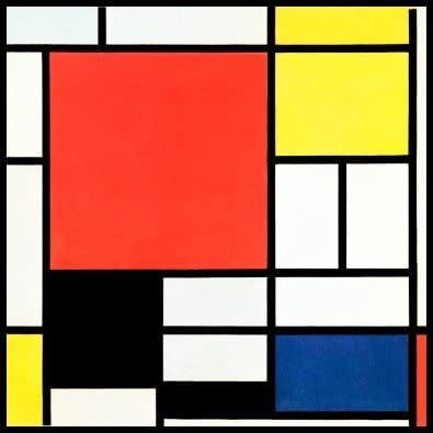
enter image description here

Piet Mondrian (Wikipedia)

All this explanation refers to the fact that without the information about the medium where your web page moves, it's practically impossible to find a color as an answer. Or rather, the answer is: any color.

Removing that it's a website, you can put the same question in "fashion": what color of sneakers goes well with black pants and a red t-shirt?

In graphic design there are guidelines that can help you find the answer immediately like:

  • What is the target audience of the website?
  • What product or type of product do you promote?
  • What kind of functionality will it have?
  • It's a website for a private company, institutional, educational, medical, tourism, gastronomy ...

Surely answering any of these two questions you'll find the color palette immediately. If you still needing more help, add a detailed information on the medium where your website it will be.

1
  • I would +1 for the color naming history part but lack the reputation points on this site to do so. Commented Jun 30, 2020 at 9:41

Your Answer

By clicking “Post Your Answer”, you agree to our terms of service and acknowledge you have read our privacy policy.

Not the answer you're looking for? Browse other questions tagged or ask your own question.