You need to differentiate between personal choice and a more objective approach.
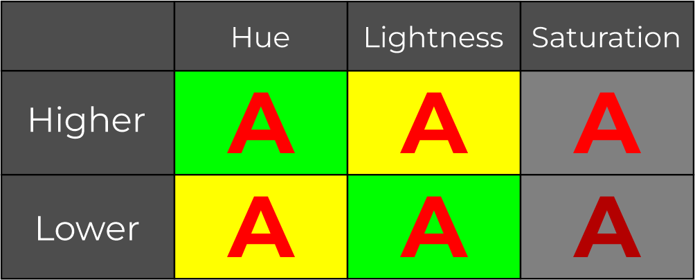
Contrast depends on many things, not only on hues (red, green), but also on lightness contrast, and saturation contrast.
Let's see some examples.
Depending on the color model but in general, green is further away from red than yellow, which is nearer. But you can see that red-yellow is more contrasting than green-red giving the same saturation, because of the lightness contrast.

The last column represents saturation contrast. However, it is difficult to isolate it from lightness.
There is also a contrast in size or area.

It also depends on the color model you are using. RGB, CMYK, Lab, RYB, HSL, HSB. Different models have different opposite colors. Green is opposite to Red on Lab, but it is Cian on RGB.
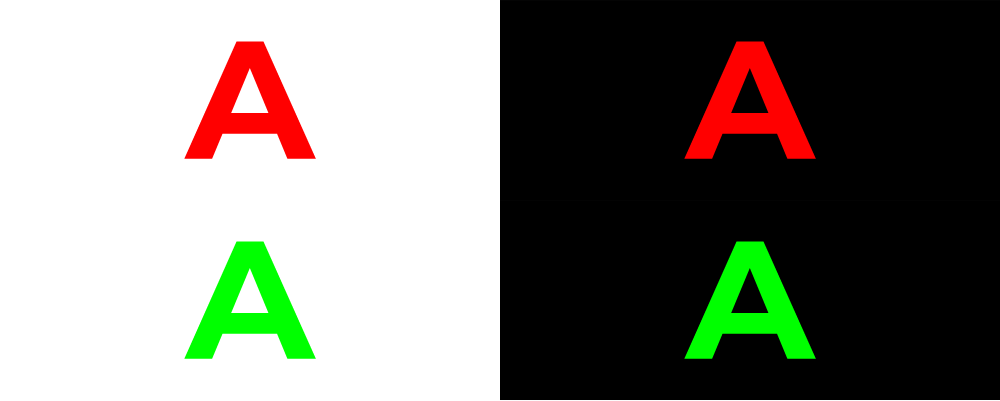
Here are the purest greens on RGB and CMYK models. Does dark green count as green?

Pure saturated has a different contrast using white as the background or black.

So the answer is a combination of contrasts. Combine hue, lightness, saturation, and area to maximize your contrast, not only hue.
Related: Are the primary colors (red, green, and blue) the most contrasting colors?
When incrementing the number of colors in your palette, to keep them separated you need to add spacing between your variables.
Related: How to get 10 different colors that are easily recognizable
On that post, I have an image where you can see that a mechanical selection does not give the best contrasts.

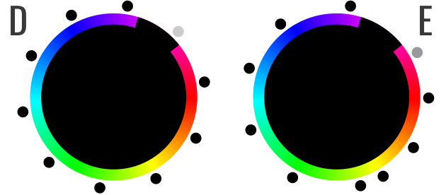
The green zone is too wide, but the contrast near the yellow changes rapidly, especially on the oranges.
So it is difficult to define a mechanized parameter to define contrast without narrowing your variables.
As I see on your profile, you like math, so let me add complexity to the alternatives.
Here are 3 examples of relations between a starting color (A) and some other colors.

If A is white, then the other colors are pretty easy. dark gray (black?), dark blue, dark red, dark green, dark purple, or whatever dark.
But things get more complicated if you have another base color (B) Do you need to keep a good contrast between B and the others? What about the contrast to A?
Is A reversible as a background with B, C, or D? And we can add more and more complexity, reducing our alternatives on each combination.

