4

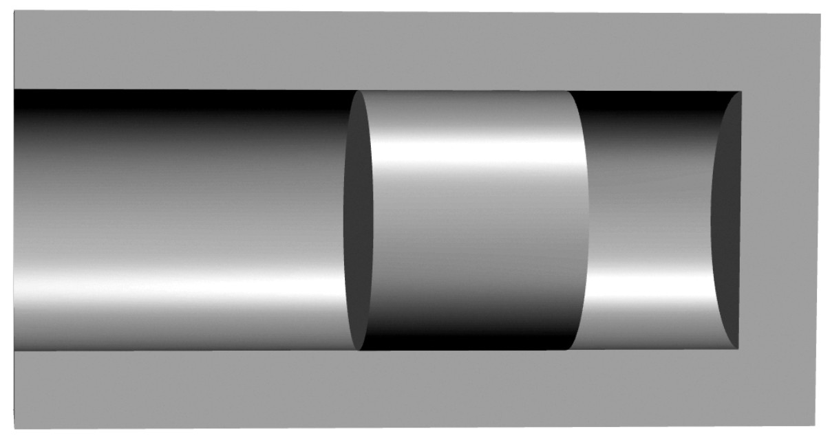
I'm trying to diagram a metallic piston inside a metallic bore and I am struggling to get a coherent 3D effect using gradients. Following image shows my attempt:

Attempt to diagram piston in bore

This is a hemisected bore with the piston in the middle of it. (The piston fits the bore, meaning the inner diameter of the bore is the same as the outer diameter of the piston.) So from this view the piston is a convex cylinder, and the visible interior of the bore is concave. If it's the piston alone then the gradient shown is adequate (but not great) to show that it's a convex metal cylinder, but with the two together it's unclear. How can I improve this?

4 Answers 4

6

Not Inkscape specifically, but....

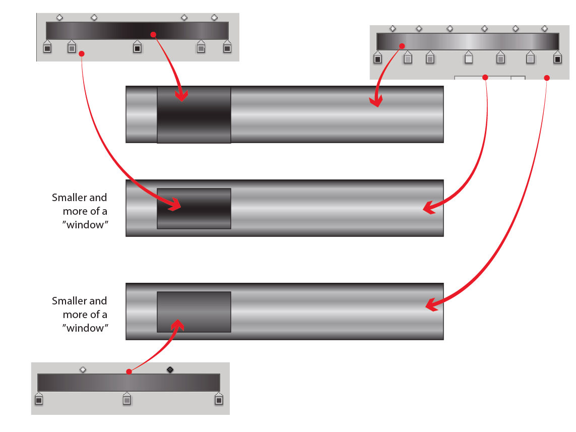
A couple more color stops helps convey "metal" more in my opinion. Having concave on top of convex can be visually confusing. I typically reverse the colors and remove some color stops for concave - essentially simplifying it to some degree. And obviously, if it can be displayed more as a cut out or hole, that helps.

enter image description here

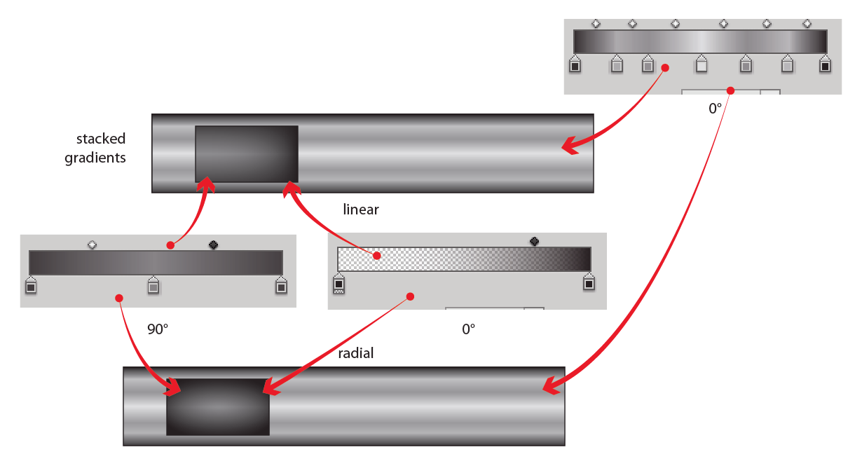
I also think stacking multiple gradients can help considerably (concave inside convex).

enter image description here

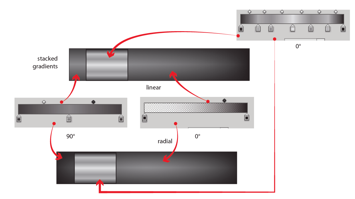
And simply reverse the fills for opposite directions (convex inside concave)...

enter image description here

6

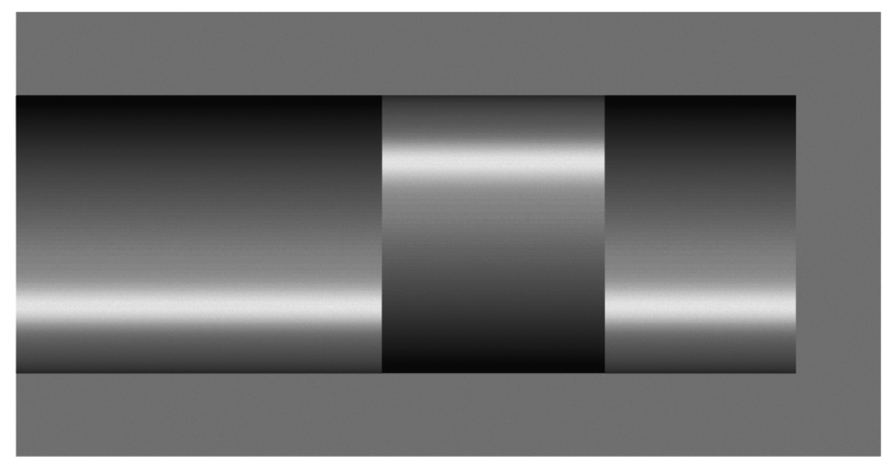
Metallic look so that it also looks cylindrical and concave contains a difficult problem. Reflection from a polished surface is a distorted image of the environment. I'm afraid it doesn't get better than your own attempt if you try a gradient. Here's my version of the same:
enter image description here

The piston has the opposite gradient. The surface is convex, the distorted image of the environment is the opposite to what's reflected from the concave cylinder.

But are the surfaces cylindrical? I use quite simple a gradient with one highlight zone. That's how matte cylindrical surfaces usually are drawn. It's useful also for polished surfaces which are not full mirrors, but polished mostly by rotating around the symmetry axis. I made the contrast high and try in that way persuade the watcher to think "It's a metallic piston in a half of a metallic concave cylinder". But in math that's nonsense. The right environment for just these reflections is improbable, secondary reflections are omitted and nothing tells which part is convex and which is concave.

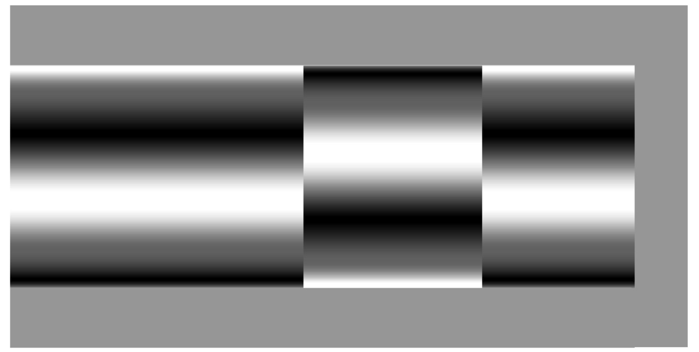
A common trick (it's seen numerous times also here) is to use a complex gradient for metallic effect:
enter image description here

It may look more metallic, but now its even more unclear if it is really cylindrical and which part is concave.

You can make it much more convincing by adding some other hints of the geometry. A perspective image shows more. In the next image the piston is still straight on the face, but the ends of the cylinder are seen a little sideways due the perspective:
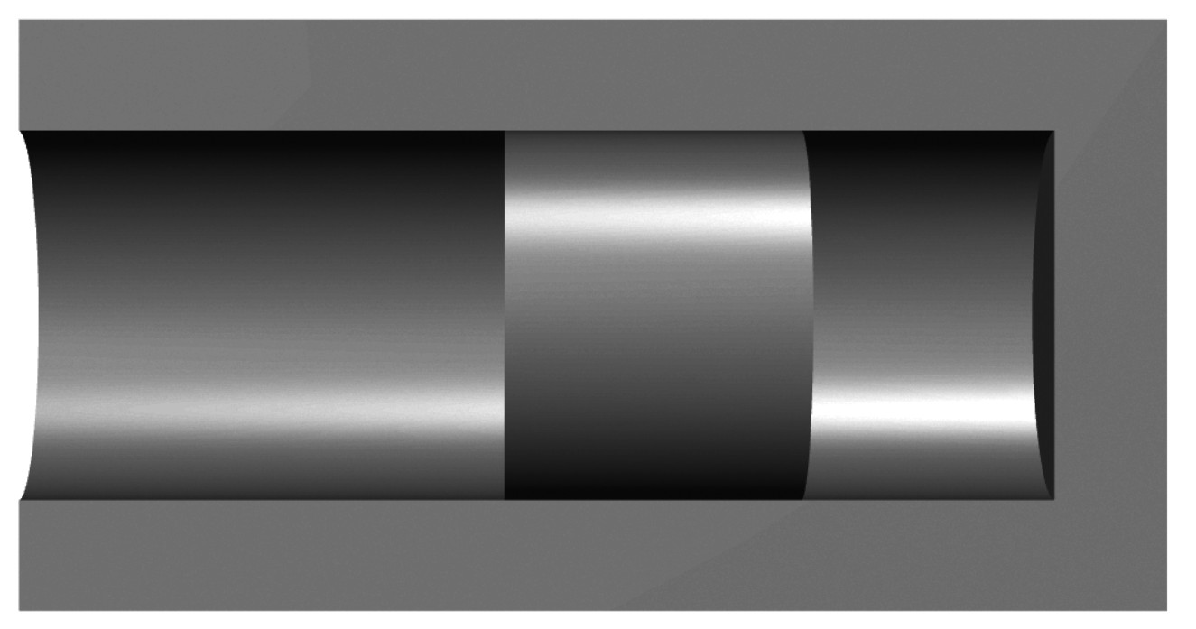
enter image description here

Or like this:

enter image description here

I suggest you to use this "additional geometry hint" trick and a simple one highlight gradient as you already have done in the concave part. The "additional geometry hint" pieces (ellipses) are easy enough to be made in a 2D program like Inkscape.

2
2

User's "user8922027" is a good answer. I want to draw attention to another part of your diagram

The piston fits the bore, meaning the inner diameter of the bore is the same as the outer diameter of the piston.

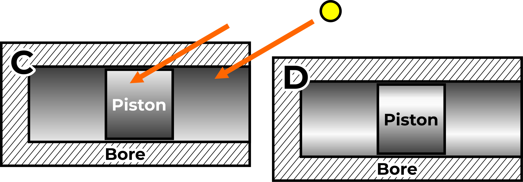
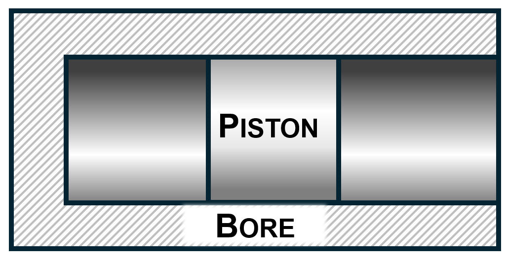
Yes, but it is a diagram. The outer lines do not exist in real life, but they do in a diagram. So IMHO you have two options for consistency.

A. Make the outer line of the piston collide with the inner line of the bore.

B. Leave a small gap consistent with other thicknesses of your series of diagrams (in orange)

enter image description here

Regarding the gradient. Keep them as simple as possible, because of the style you already have.

C. If the material is not important (It is not important on a diagram) you could work with a 2-point gradient. As "user8922027" said, just use the opposite gradient for concave-convex shading. The orange arrows indicate a simple far-away light.

D. But the gradient you already have is simple and good, so, use the opposite.

enter image description here

Do not add more gradient points to mantain a simple stylistic look.

1

Although I think the other answers are good enough I would like to add more info for you so that you can solve similar issues in the future without asking. Think of this as a long comment.

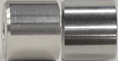
Start by looking at reference. In this case I have just taken a aluminium spacer that I have turned with a lathe, and photographed it from 2 distinct directions. This is a good starting point as piston cylinders are turned, and the anisotropy of the surface is more of a contributing factor than the color of your material.

enter image description here

Image 1: A turned piece of cylindrical metal. Same piece in different orientation to an area light source.

First thing we see is that the anisotropy of the material makes it behave differently in different directions.

Second we notice that there is typically a reflection on the bottom of the piece. Now in reality since it's inside a cylinder there would not be any light so it wouldn't really look like anything. So you need to conceptually show it as if it was a piece that has light. So typically you'd add the ground reflection so it feels familiar to the viewer.

4
  • But the "reflection" could be the reflection of a black floor. :) google.com/…
    – Rafael
    Commented Jun 13 at 14:30
  • 1
    @Rafael could be. but usually the floor is atleast half as bright as a lightsource. Even nonreflective items would reflect some of the ground color.
    – joojaa
    Commented Jun 13 at 14:48
  • Just remember one thing. This is a diagram. It is not meant to be a next-gen realistic render engine.
    – Rafael
    Commented Jun 13 at 17:47
  • @Rafael yes but you should conceptually show what people expect to see. Study what is then simplify. If you dont have multiple lines is typical in typical rooms that are not in outer space. This was the big mistake all the early 3D graphics people made. Which is why they looked so tacky. Even without full light bouncing simulation youd still would have been fine if you had used some bounce lights. So its easy to think how things would look like in space, just wouldnt be very appealing in reality.
    – joojaa
    Commented Jun 13 at 18:55

Your Answer

By clicking “Post Your Answer”, you agree to our terms of service and acknowledge you have read our privacy policy.

Not the answer you're looking for? Browse other questions tagged or ask your own question.